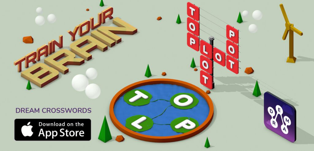
Elevate Your English Vocabulary Through Fun and Learning
Client
Zynga
ROLE
Experience Design,
Art Direction
Timeline
2019 – 2020
Shorter Version of the Case Study
Dream Crosswords: Architecting Cognitive Engagement in Casual Gaming
Executive Summary
Leading the experience overhaul for Zynga’s Dream Crosswords, the objective was to transform a rigid, underperforming casual word puzzle game into a scalable, highly engaging product. Operating with a lean skunkworks team under tight budgetary and timeline constraints, the product strategy, UX, and art direction were overhauled to pivot the game from its stagnant initial version (V1). By introducing predictive behavior models and leveraging cognitive biases, the team successfully increased the average session length from an anemic 6 minutes to a robust 17 minutes, achieving 37,000 organic installs in the first 60 days of soft launch.
Slow Level Up: Why Gaming UX is Not Progressing with the Rest
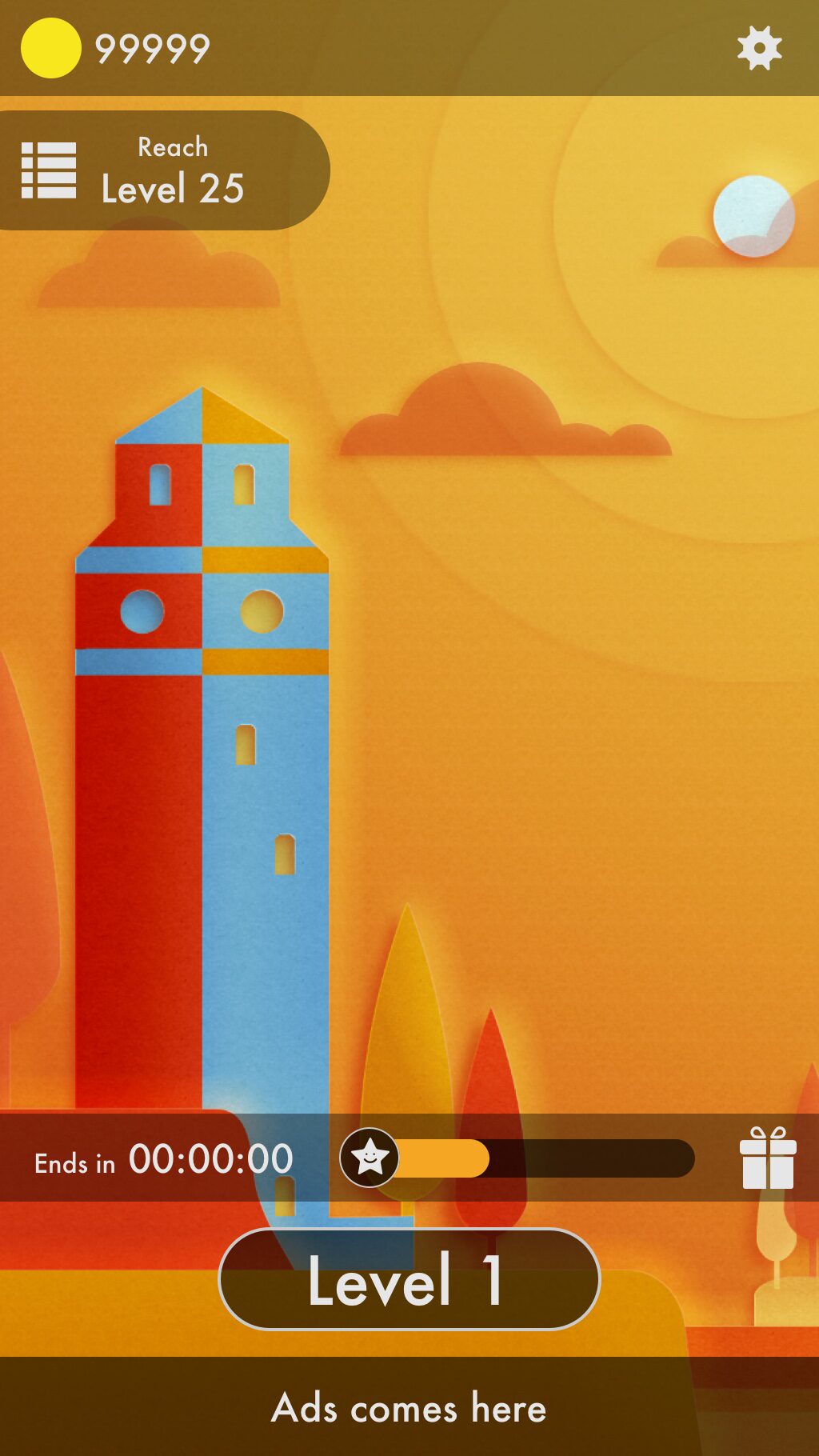
Often, casual game development relies on conventional, uninspired mechanics, leading to a disconnected player experience. The V1 MVP of Dream Crosswords was a textbook example of this stagnation. Built for non-competitive play, the development stack was unoptimized, causing performance drops even on high-end devices.
Players were abandoning the game before hitting the internal benchmark of Level 7. The “Click & Go” interactions felt dull, the visual theme across the initial 60 levels was monotonous, and the 12-level first-time user experience (FTUE) felt more like a chore than an invitation. The overarching challenge was to utilize the existing tech stack while completely reimagining the game’s core loop and visual identity, all within a 4-month window to soft launch.
Strategic Research: The Praxis Framework
To move beyond superficial UI fixes, an in-house framework called Praxis was deployed, shifting the research focus from static traditional personas to dynamic ‘reference groups’ and ‘predictive behavior models.’
Through user interviews, competitive analysis, and guerrilla ‘tube testing’ (random samples in local transit environments), it became clear that players craved immediate immersion. They didn’t want a 12-step onboarding sequence; they wanted to learn by playing. They required friction that felt intellectually rewarding, rather than progression that felt artificially forced.
Design Execution: Redefining the Core Loop
With a clear behavioral mandate, the UX team took full ownership of the art direction and interactive strategy to strip away unnecessary friction:
- Zero-Friction Immersion: The traditional ‘Home’ screen was eliminated entirely, establishing the ‘Play’ screen as the foundational layer. All secondary navigation elements were overlaid contextually to keep the user anchored in the gameplay.
- Ergonomic Focus: Interactions were redesigned to prioritize single-handed ergonomics and visually stacked, responsive layouts optimized for both iPhones and iPads.
- Cognitive UX Integration: Behavioral psychology was systematically embedded into the core mechanics to drive retention:
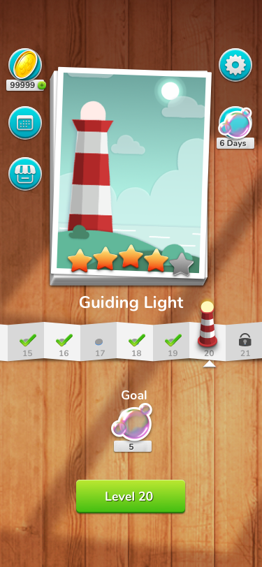
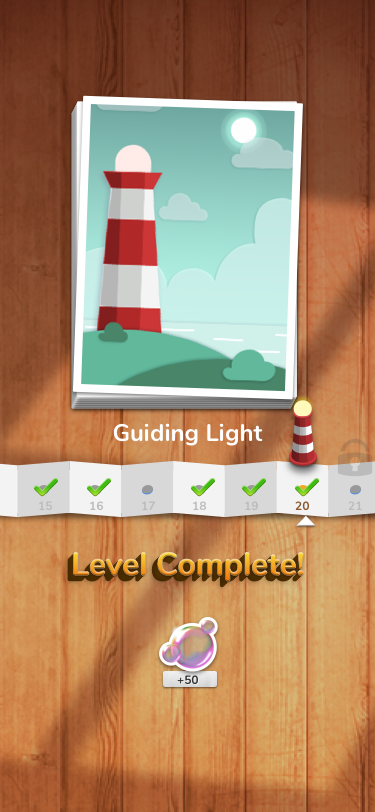
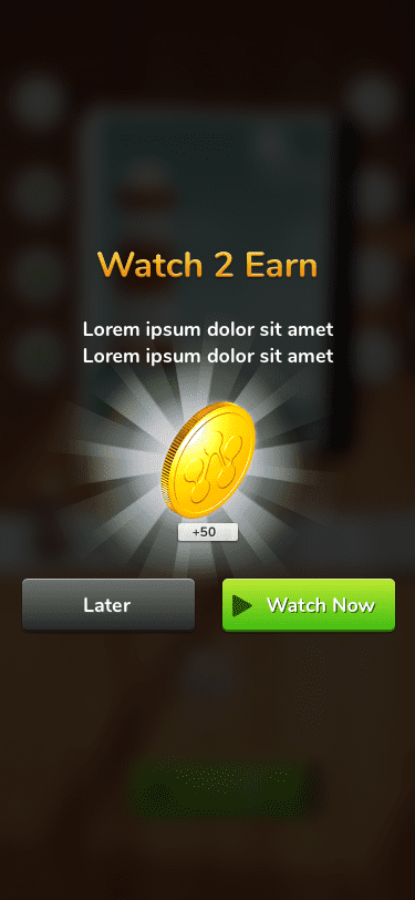
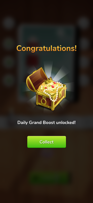
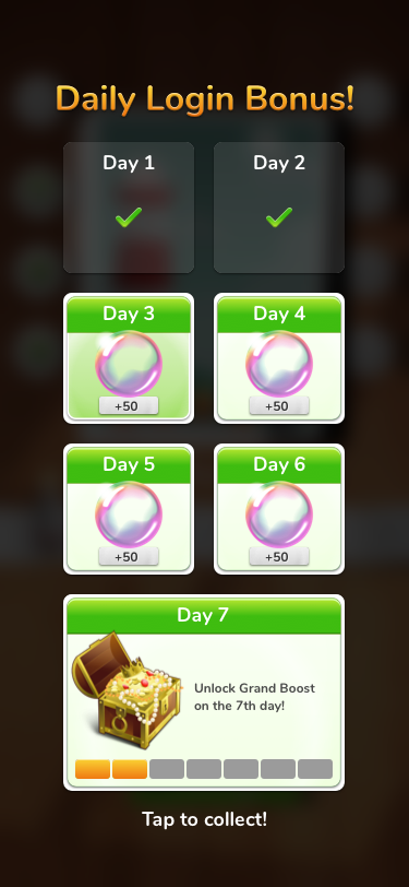
- Goal Gradient Effect & Endowment Effect: Visible progress bars and the continuous accumulation of in-game currency created deep player investment.
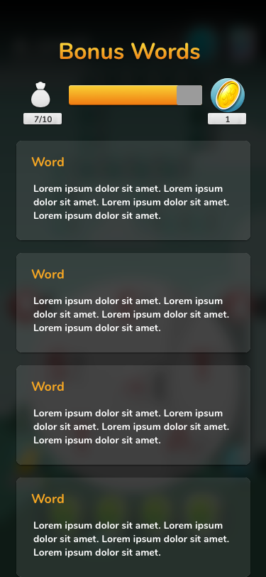
- Progressive Disclosure: Vocabulary complexity scaled naturally, maintaining a flow state without early-stage cognitive overload.
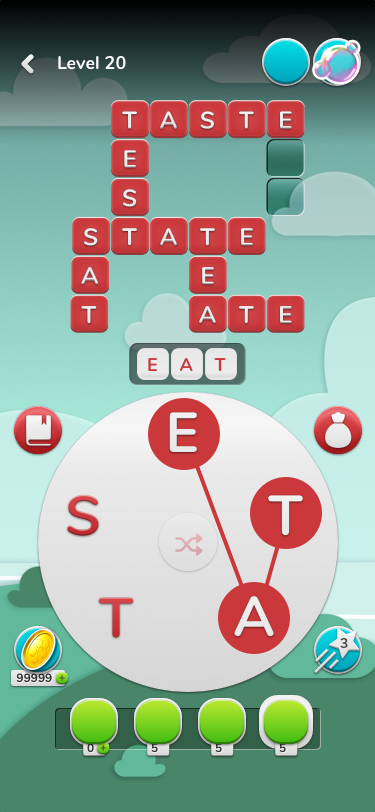
- Immediate Rewards: Satisfying micro-interactions, such as words instantly illuminating green upon correct guesses, provided continuous positive reinforcement.
Impact & Business Outcomes
The redesigned architecture, V1.2, was soft-launched in stealth mode across North America, Canada, and Europe. By establishing a scalable design system equipped for a 2-year automated release cycle of levels and events, the results were definitive:
- Session Duration: Skyrocketed by 183%, jumping from ~6 minutes to an impressive 17 minutes per session.
- Acquisition: 37,000 organic installs within the first 60 days on the Townsend Publishing platform with a $0 CPI.
- Player Progression: The maximum level reached by the player base surged to Level 620, validating the efficacy of the scalable difficulty model.
- Retention: Achieved strong Day 3 (D3) retention, supplemented by controlled experiments with replayable levels and special events to bolster Day 20 (D20) engagement among power users.
Learnings & Future Exploration
While the game successfully proved its UX model and was prepped for future IP re-skinning, the journey underscored that balancing rapid innovation with familiar casual gaming tropes requires rigorous, iterative testing.
Moving forward, exploring deeper integrations of variable rewards and subtle nudge theories, such as dynamic hint animations that activate just before a user experiences frustration,could further optimize late-stage retention. Expanding these behavioral models to include competitive social proofing mechanics, like localized leaderboards or community-driven puzzle events, represents a compelling frontier for future mobile gaming ecosystems.
Expanded Version of the Case Study
Welcome to Dream Crosswords, the ultimate word puzzle game designed to boost your English vocabulary and knowledge in an engaging and interactive way. This innovative game blends gradual training with dynamic events and gamified learning to make vocabulary building both enjoyable and effective.
Challenge yourself with thoughtfully crafted crosswords that adapt to your skill level, while participating in exciting events that test your knowledge and keep you motivated. With each puzzle, Dream Crosswords transforms learning into an adventure, combining education and entertainment seamlessly.
Whether you’re a word enthusiast or just looking to improve your language skills, Dream Crosswords offers a captivating and rewarding experience that grows with you. Dive into a world of words and watch your vocabulary thrive with Dream Crosswords!
My responsibilities encompassed UX Design, Motion Design, Art Direction, Visual Design, and Product Strategy.
The initial version of the game, V1, was developed over six months with a focus on non-competitive, casual play. I joined the project to revamp the experience layer by integrating feedback from both internal test audiences and globally distributed players on the Townsend Studios publishing platform.
Fact Sheet
- 2 Product Managers (shared resources)
- 2 Engineers (full time)
- 1 QA (full time)
- 2 UX Designers (shared resources)
- 500+ levels, multiple themes
- New weekly events
- Limited time, resources and budget
- $0 CPI
- Scalable design system
- Responsive layout for iPhones and iPads
Process
1
Small skunkworks team with a lean UX process.
2
Redesigned the existing game during the testing phase, incorporating multiple new features.
3
Engaged in iterative research, ideation, design, development, and testing, both in-house and through remote live testing.
4
UX designers took full ownership of art direction and were actively involved in creating art deliverables.
5
The entire team participated in dogfooding, guerrilla testing, cross-promotion marketing, and App Store Optimization (ASO).
V1 Designs
Tools: Sketch
Home
Game UI
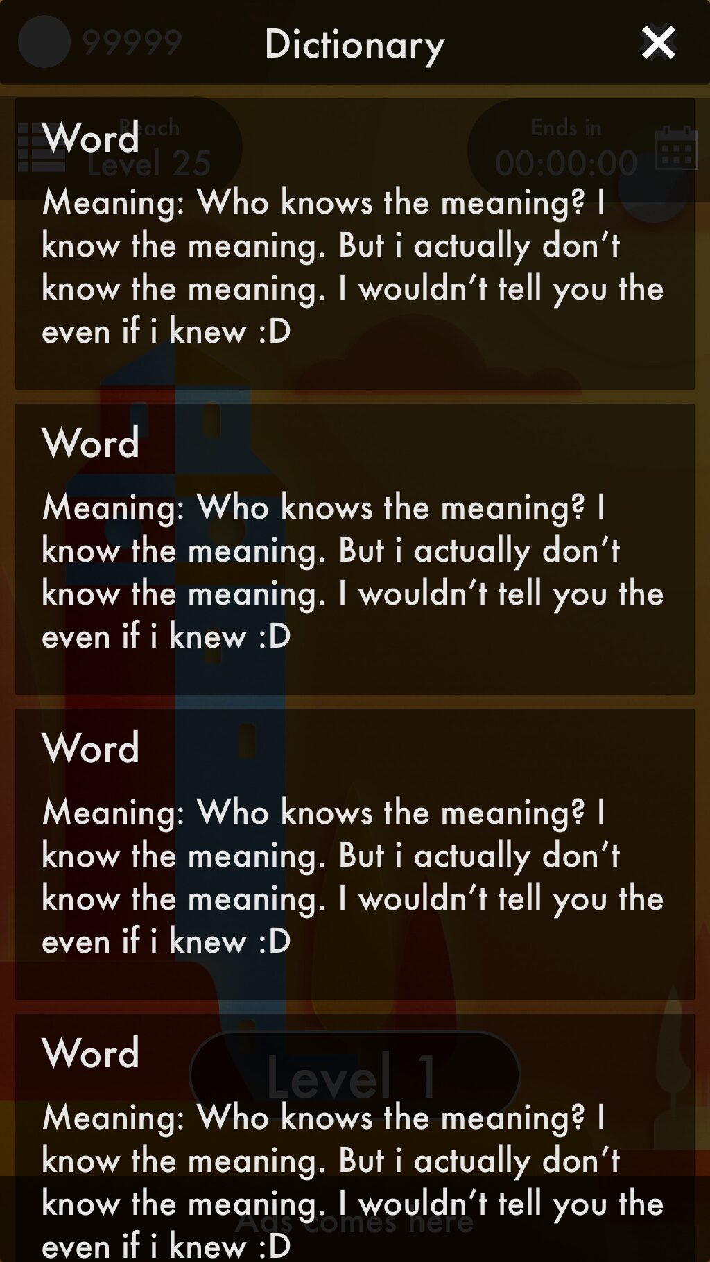
Dictionary
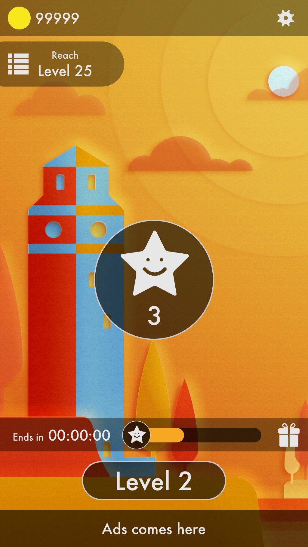
Congratulations

Points Collected
Theme Browser
V1 Problem Statement
- V1 prototype (MVP) was limited in scope for scalability in terms of accommodating new features and long term live-ops.
- The dev stack was not optimized and hence the game performance suffered even on high end devices at the time.
- The team was asked to utilize as much as possible from the existing dev stack and redesign the game.
- The time to soft-launch was 4 months and +2 months for live testing, optimization.
- The players dropped off earlier than the internal benchmark of Level 7.
- The session duration was significantly lower at ~6 minutes, before the players switched the app or completely dropped off.
Pros
What can be taken forward
- Simpler design
- Simple navigation
- Intuitive game play
- Designed for single hand ergonomics
Cons
What can be made better
- Click and go interaction
- Limited color palette
- Linear game play
- Inconsistent contrast, bad accessibility
- Non responsive layout
- Poor readability
- Limited scalability
- Ad banner
- Not designed for meta systems
V1 Interactive prototype
Tools: Figma
Research
- Research Objectives: To identify player pain points and enhance the duration of gameplay sessions.
- Methodology: Conducted user interviews, internal surveys, playtests, and performed competitive analysis.
- Findings: A summary of the key insights and data gathered during the research.
- User Personas: Instead of utilizing traditional personas, a framework called Praxis (which I had developed in-house) was employed to create ‘reference groups’ and analyze user behavior through ‘predictive behavior models.’
V1 Observations
- The test samples indicated that the ‘Click & Go’ interaction in V1 felt dull.
- The core gameplay was considered intuitive.
- However, gameplay became repetitive after just a few levels.
- A consistent visual theme was maintained across all 60 levels tested.
- Players found the difficulty insufficiently challenging.
- Progression felt forced rather than natural.
- Participants experienced a sense of defeat and felt the game did not aid in improving their skills.
- The simplistic visual design failed to engage the test samples.
- Players expressed that there were too many initial steps to start playing.
- The first-time user experience (FTUE) extended through level 12.
- Participants requested a skip button for the onboarding process, as it felt overly lengthy.
- Players preferred to dive straight into gameplay and learn along the way.
- They felt unable to gauge their progression.
- Visually, the levels lacked distinctiveness, resulting in a monotonous appearance.
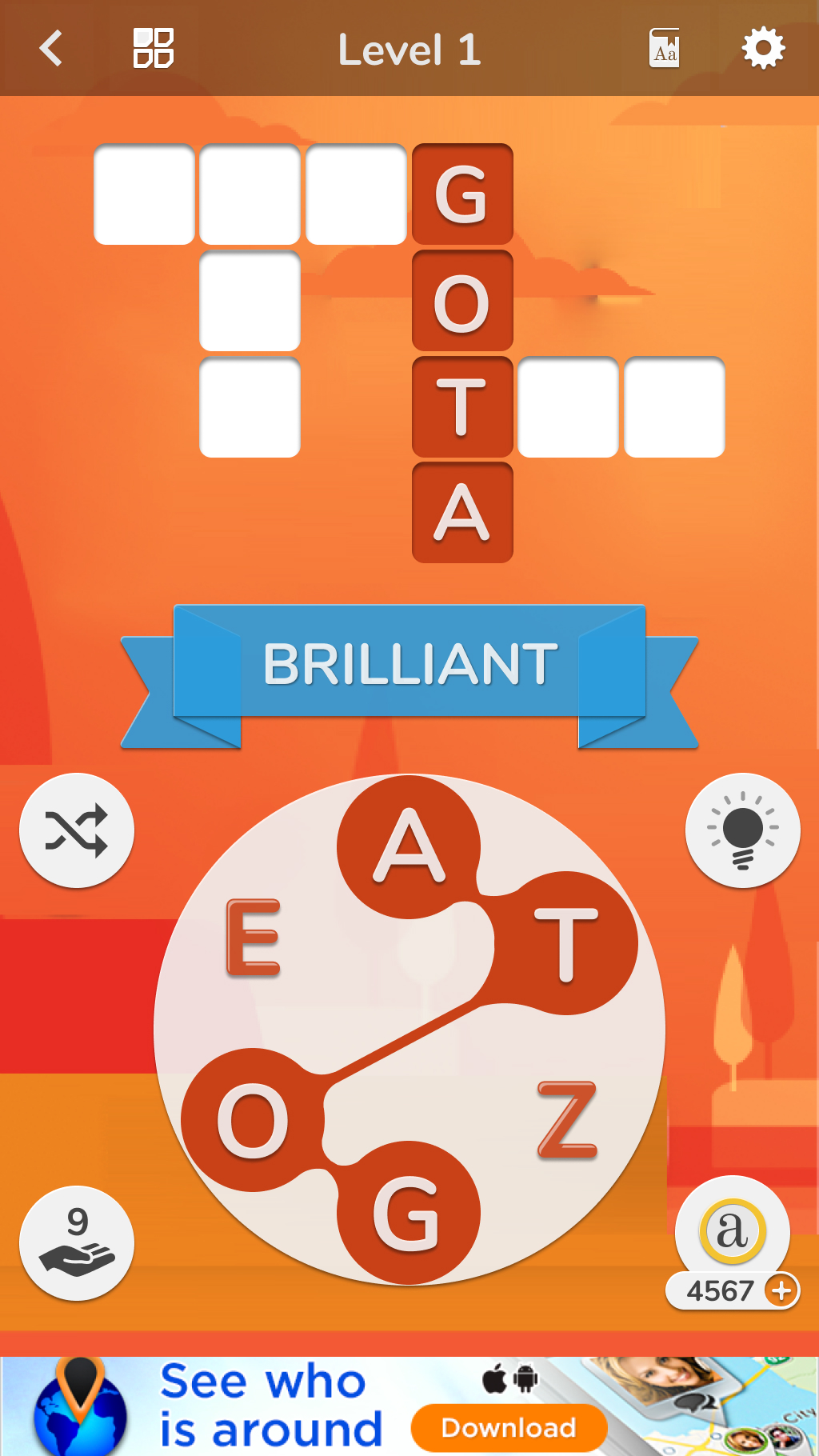
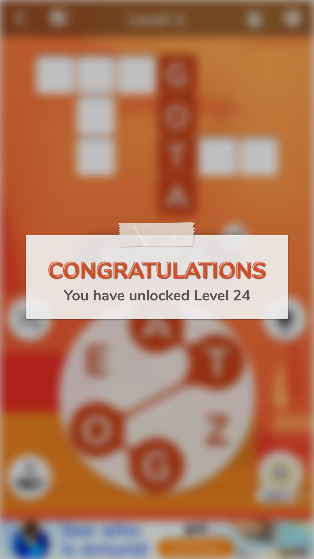
V1.1 New Architecture
FTUE
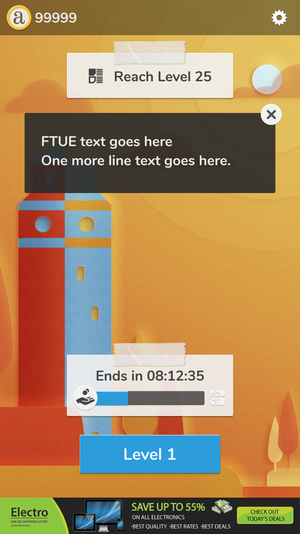
Game UI
Congratulations
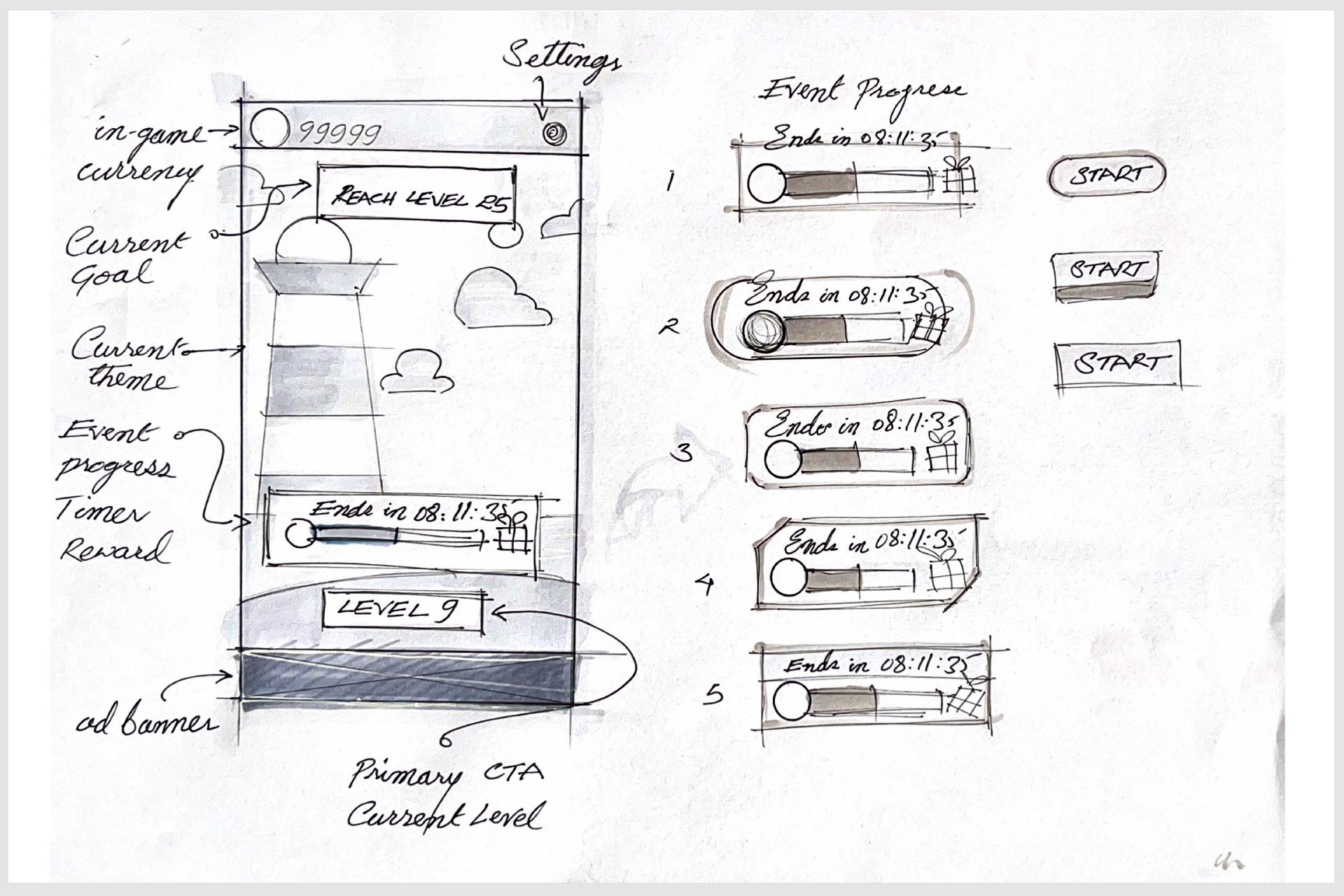
V1.2 Wireframes and Visualisations
Tools: Paper Sketches, Whiteboarding
- Eliminate the ‘Home’ screen.
- Construct the interaction framework centered around the Play screen as the foundational layer.
- Remove the ad banner.
- Incorporate additional meta systems.
- Design interactions to accommodate single-handed ergonomics.
- Ensure consistent visual stacking.
- Implement navigation breadcrumbs without requiring additional text.
- Overlay all other navigation elements on the Play screen.
- Visual stacking was tested using a table prototype with internal samples.
Sketches_1
Sketches_2

Sketches_3
Sketches_4
Sketches_5
Sketches_6
Sketches_7
Sketches_8
Sketches_9
Sketches_10
V1.2 Redesign
Tools: Figma, Sketch
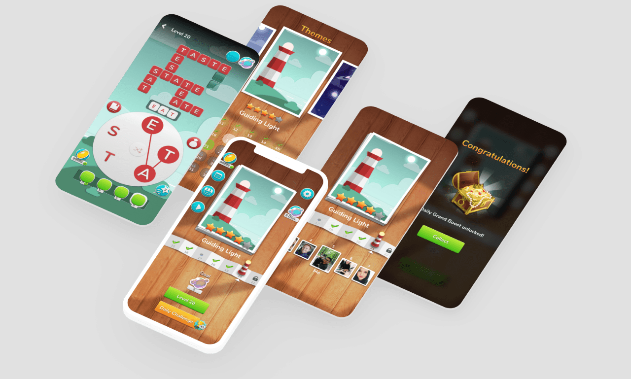
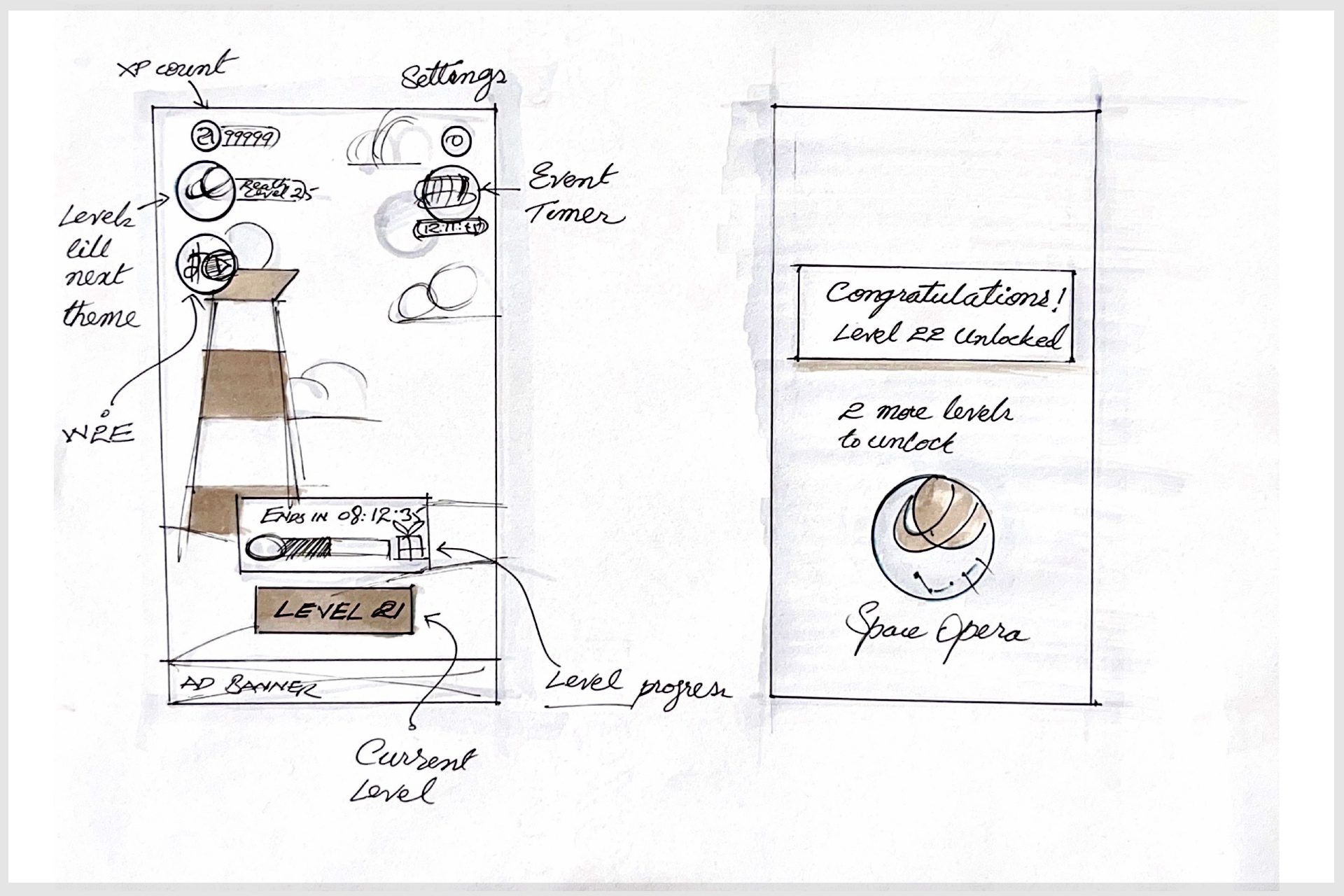
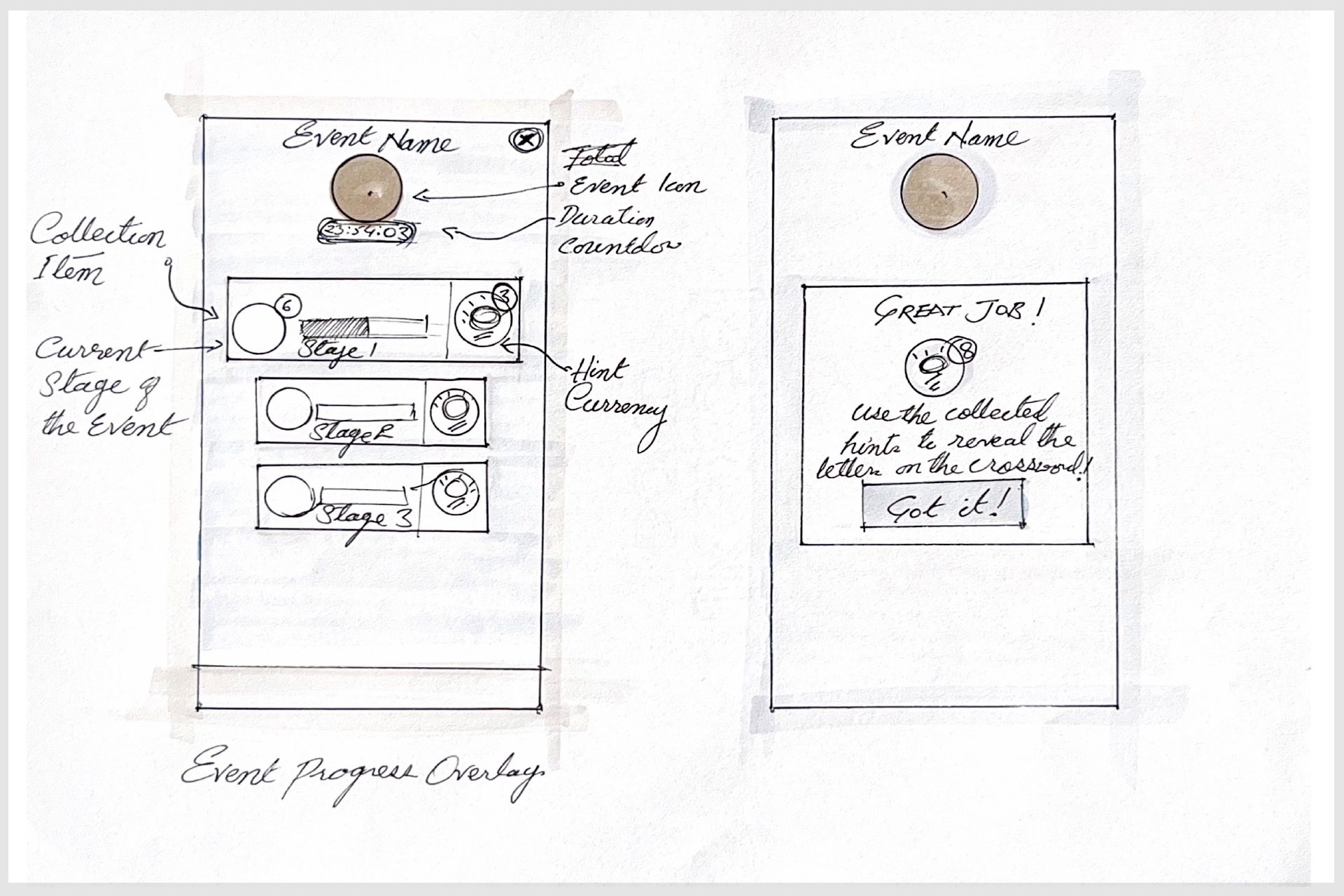
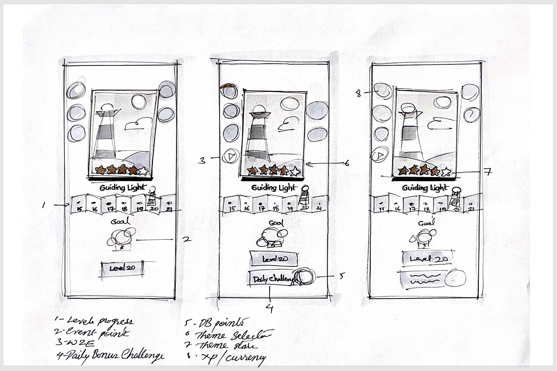
00 home 0
01 Play
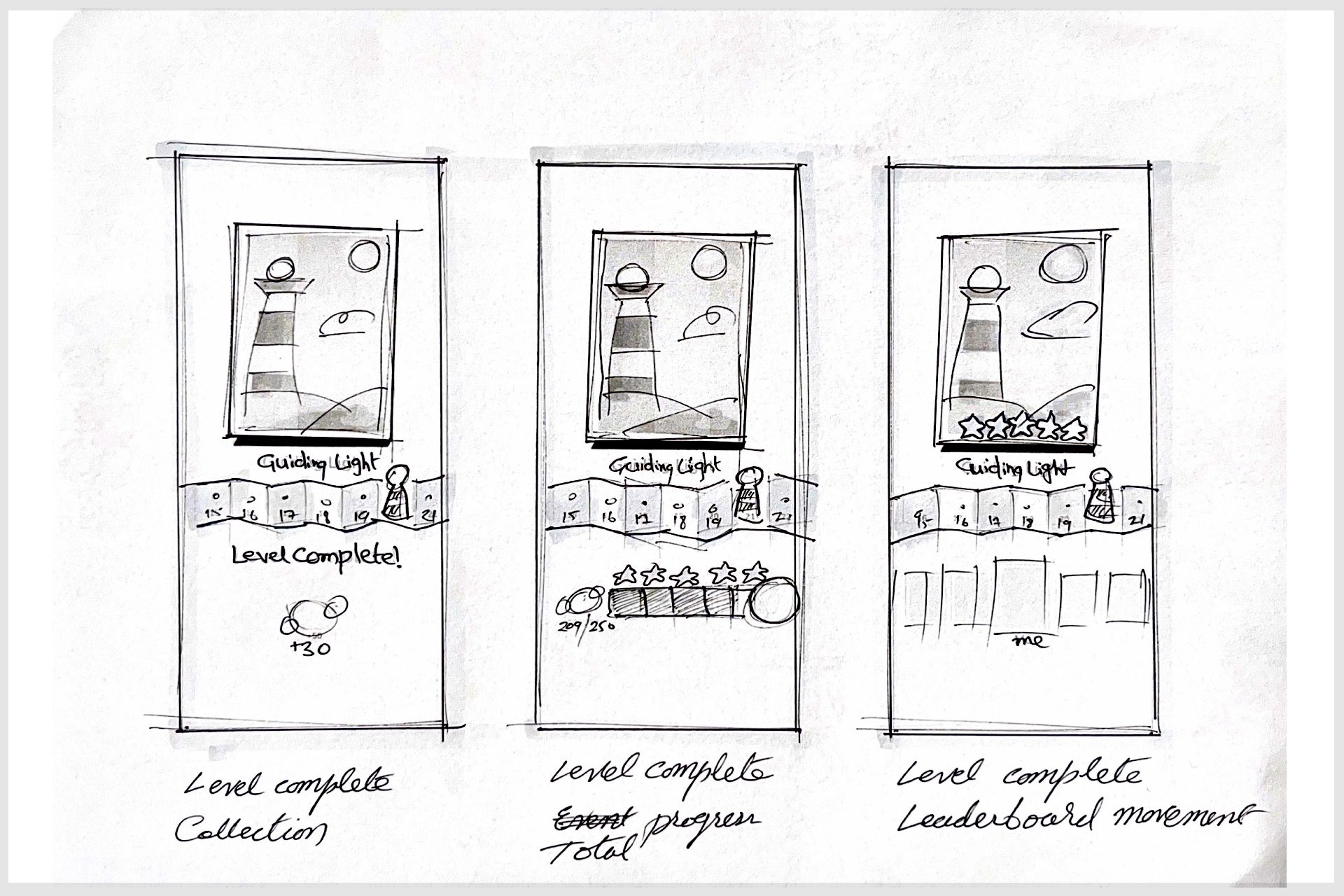
02 level complete 1
02 level complete 3
02 level complete 2
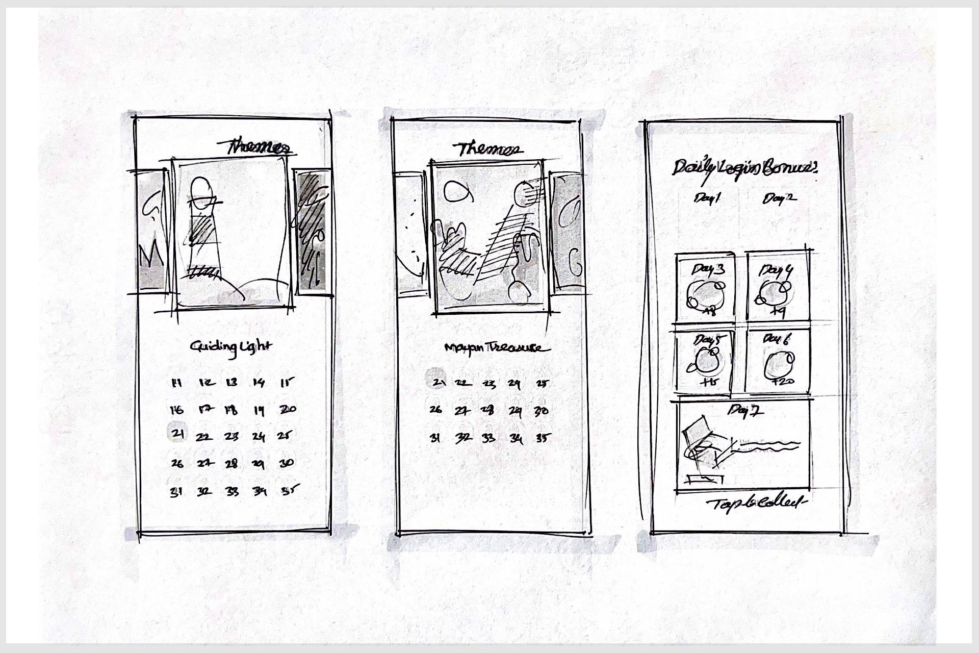
04 Theme Level Selector 1
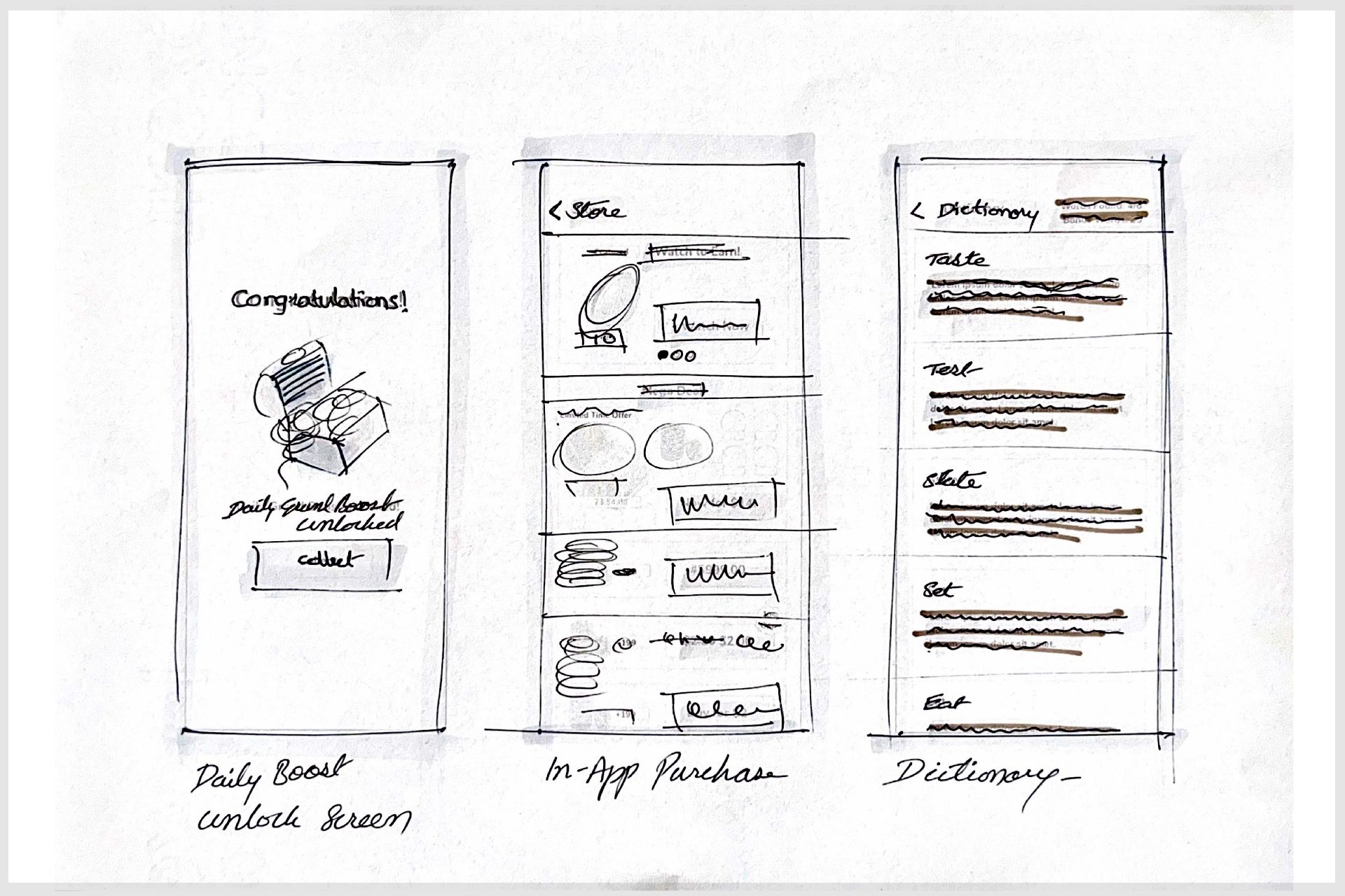
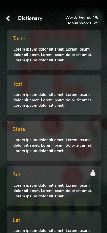
09 Dictionary
10 home deal of the day

14 W2E 1
05 DLB 2 Collect
07 IAP

13 Bonus words 3
05 DLB 1
12 Profile Settings (WIP)
00 home 1
1. Context and Objective Analysis
- Sector: Mobile Gaming
- Branch: Puzzle Games (Word Puzzle)
- Industry Category: Casual Mobile Games
- Goal Understanding: The primary objective of this game is for users to form words from a set of given letters to complete a puzzle. The app is designed to engage users in word formation challenges while rewarding progress through levels.
- Target Audience Analysis: The target audience for this app appears to be casual gamers, likely aged between 10 and 40, who enjoy word games. The design is simple and friendly, suitable for a broad range of users, including those looking for relaxing, educational, or mental challenge games.
2. Behavior Patterns and Cognitive Biases Analysis
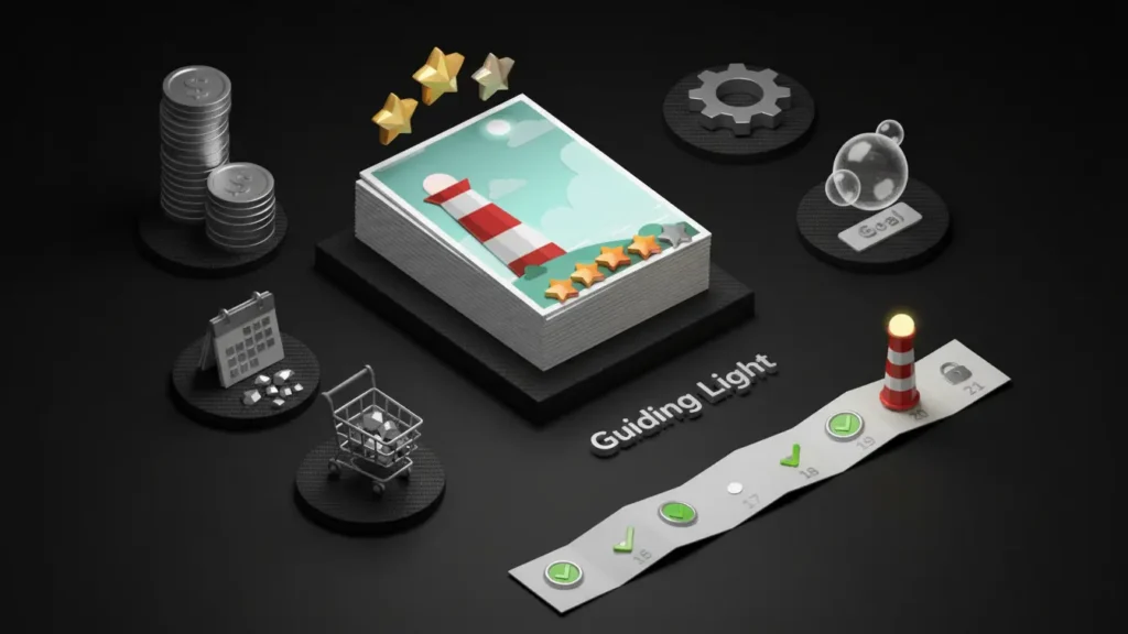
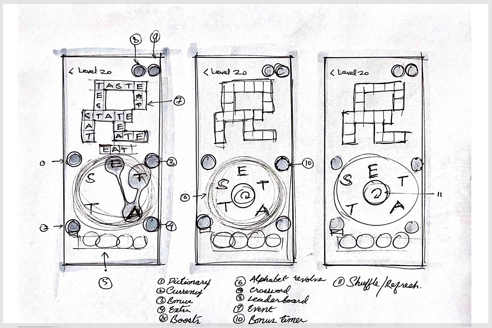
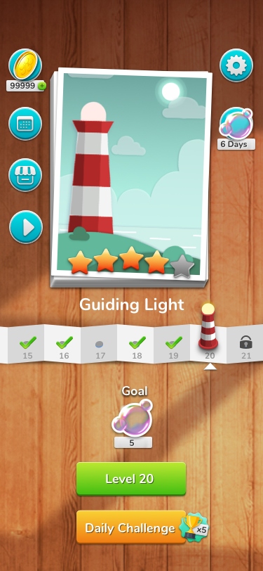
1. Progressive Disclosure: 8/10
Description: The game gradually introduces more complex words as the player progresses, increasing the level of difficulty step-by-step, ensuring that players are not overwhelmed initially. This encourages sustained engagement.
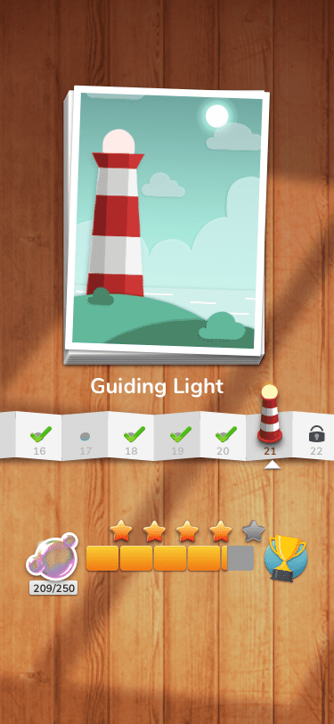
2. Endowment Effect: 9/10
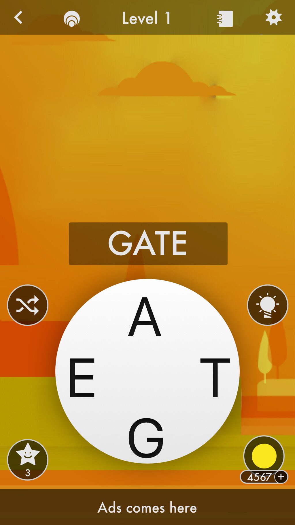
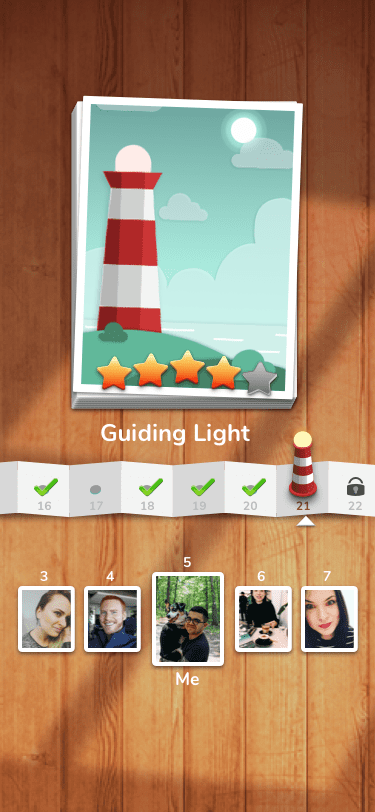
Description: The user is highly invested in their progress, such as unlocking new levels or accumulating coins (as seen in the bottom left corner). The presence of in-game currency strengthens the user’s attachment to their progress and motivates them to continue playing.
3. Goal Gradient Effect: 9/10
Description: The visible progress bar at the top of the screen (showing “Level 20”) reinforces the idea that users are close to achieving a new milestone, incentivizing them to finish the level to reach the next one.
4. Zeigarnik Effect : 6/10
Description: The game’s incomplete state (letters and some words still unsolved) plays on the Zeigarnik Effect, which suggests that people remember uncompleted tasks better, driving users to finish the puzzle. However, it’s not as strong in execution due to the relatively low challenge of the puzzle.
5. Immediate Rewards : 9/10
Description: The immediate feedback system (words turning green when correct) provides a satisfying instant reward, encouraging players to stay engaged and keep guessing new words.
3. Overall Effectiveness Score:
85/100%
The game employs effective behavior patterns, such as progressive disclosure and the goal gradient effect, to maintain user engagement. The use of in-game currency and level progression enhances the player’s commitment, while the instant feedback system drives continuous participation.
4. Effectiveness Evaluation
| Behavior Pattern | Effectiveness Explanation | Effectiveness Rating |
|---|---|---|
| Progressive Disclosure | The game gradually increases complexity, keeping players engaged without overwhelming them. | 8/10 |
| Endowment Effect | Players become more invested in the game as they accumulate coins and progress through levels. | 9/10 |
| Goal Gradient Effect | Showing the current level motivates players to reach the next level, enhancing engagement. | 9/10 |
| Zeigarnik Effect | The incomplete words encourage players to finish the task, but the challenge could be stronger. | 6/10 |
| Immediate Rewards | Instant feedback after each word guessed keeps the gameplay dynamic and satisfying. | 9/10 |
5. Alternative Suggestions
| Behavior Pattern | Description | Effectiveness Prediction |
|---|---|---|
| Variable Rewards | Introduce random, unexpected rewards (e.g., extra coins for completing a word in a certain time) to increase unpredictability and excitement. | +10% |
| Nudge Theory | Use subtle prompts or hints when users are stuck, such as slight animations of unsolved letters, to reduce frustration. | +8% |
| FOMO (Fear of Missing Out) | Display limited-time challenges or rewards that can only be obtained within a certain timeframe to drive more engagement. | +12% |
| Social Proof | Incorporate leaderboards or social sharing options to encourage competition among users, increasing their investment in the game. | +15% |
| Loss Aversion | Highlight what players stand to lose (e.g., limited coins or progress) if they exit the game early, increasing retention rates. | +7% |
6. Consistency and Flow Analysis
The behavior patterns applied are consistent throughout the interface. From the visible progress indicators (levels) to the coin collection system, each element reinforces a sense of progression and achievement. However, adding more challenging puzzles at higher levels or implementing new mechanics, like time-based challenges, could improve the flow and make it more dynamic.
7. Content and Design Analysis
The design of the app is simple and clean, with bright colors and clear feedback mechanisms. The large, easy-to-read letters and simple controls (dragging the letters) create a frictionless experience. However, the design could benefit from clearer indicators for how to use power-ups (bottom of the screen) and more feedback when the player is close to solving the puzzle.
8. Actionable Recommendations
| Behavior Pattern | Recommendation |
|---|---|
| Variable Rewards | Introduce unexpected bonuses for completing words faster or solving puzzles within a limited time to boost excitement. |
| Nudge Theory | Implement a slight hint system that highlights or shakes unsolved letters to prevent frustration during difficult levels. |
| Social Proof | Add leaderboards or sharing features to let players compare their progress with friends, increasing social engagement. |
iPhone Teaser
Tools: Sketch, After Effects
iPad Teaser
Tools: Sketch, After Effects
V1.2 Playthrough Video
Tools: Sketch, After Effects
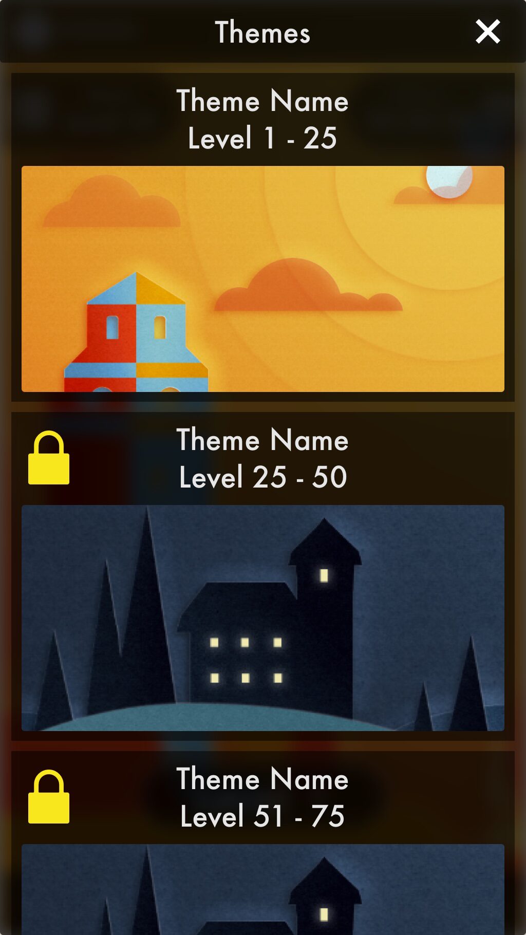
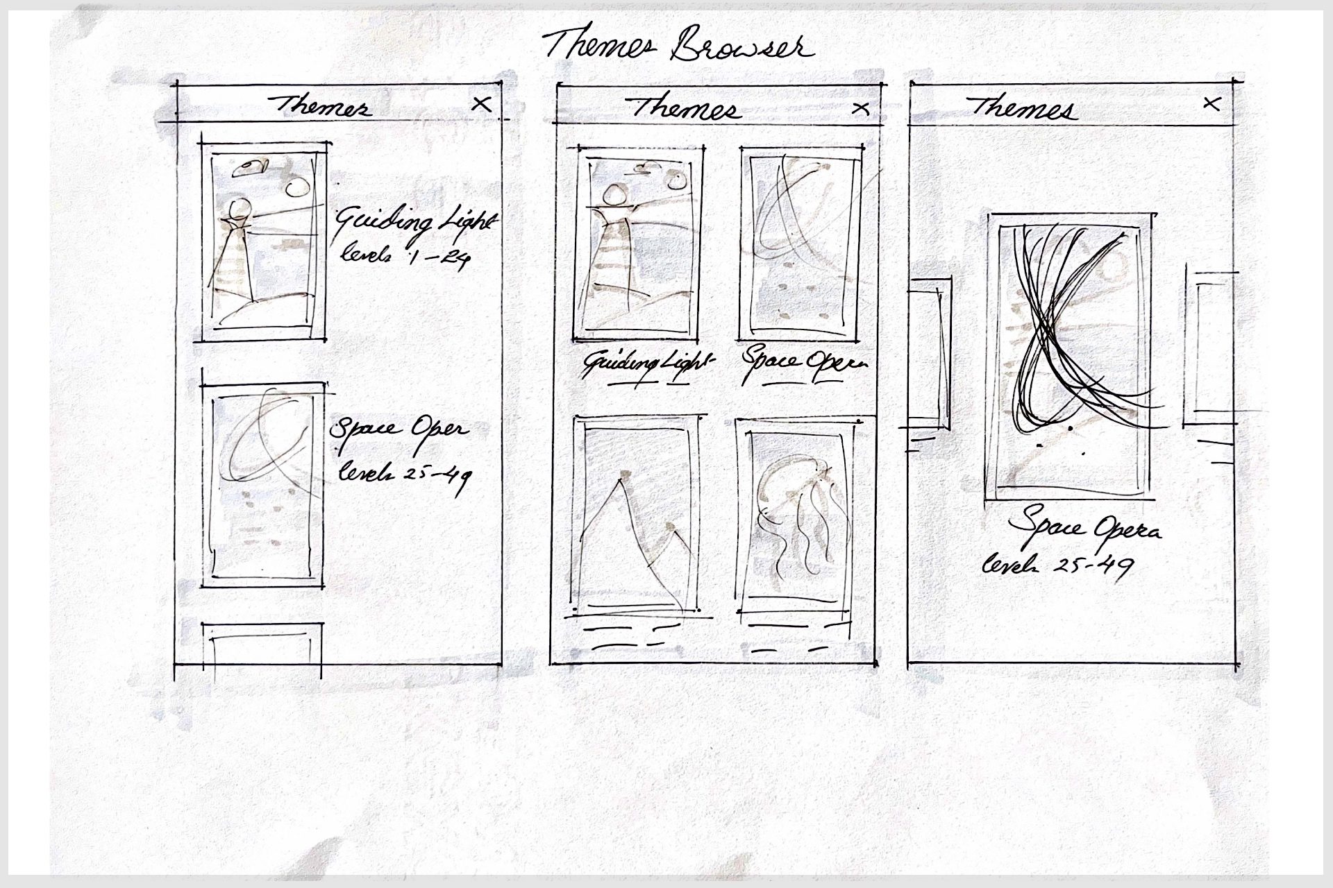
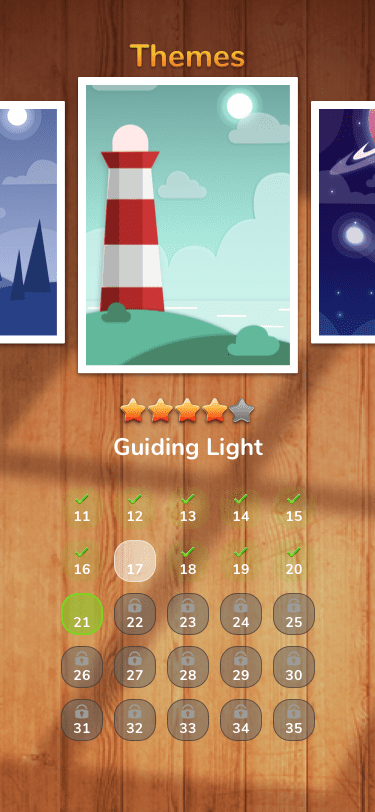
Themes
Tools: Sketch, Photoshop, Illustrator
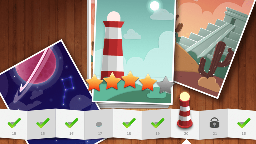
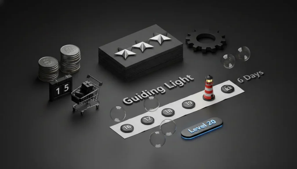
Guiding Light

Space Opera

Aztec

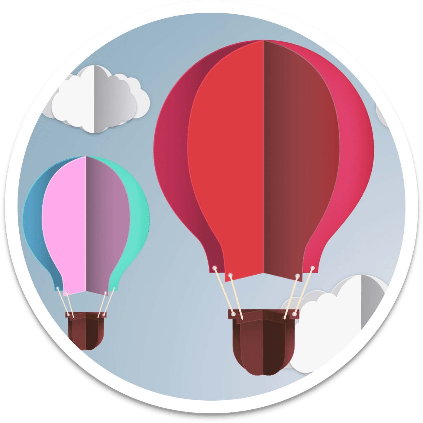
Dream Mill

Aero
Mariana
Watchtower

X Promo Banners
Tools: After Effects, Cinema 4D
Stats
- Dream Crosswords was soft-launched via stealth mode in North America and Canada in September 2019, followed by a European soft launch in November 2019. During the soft launch phase, 12 experiments were conducted with sample sizes ranging from 2% to 6%. Guerrilla testing was carried out using random samples in local transportation settings (tube testing).
- Key Metrics:
- Daily Active Users (DAU): Not specified.
- Townsend Publishing: 37,000 organic installs within the first 60 days.
- Average Session Length: Increased to 17 minutes.
- Maximum Level Reached: Level 620.
- The game was designed to operate without manual updates for two years, featuring an automated release cycle and algorithm-based level and event generation. Retention metrics showed strong Day 3 (D3) retention following modifications to the event sequences. However, Day 20 (D20) retention was weaker, though improvements were noted through controlled experiments with replayable levels and special events for highly engaged players.
- After six months of successful testing, the game was removed from the App Store. It is currently on hold, pending future re-skinning for popular IPs. An iPad version was developed but never released.
Conclusion
The “Dream Crosswords” project demonstrates the transformative potential of thoughtful UX design in enhancing user engagement and satisfaction. By addressing the core needs of crossword enthusiasts, such as intuitive navigation, seamless puzzle-solving, and personalized features, the redesign successfully revitalized the user experience. Through iterative user testing and feedback integration, we created an interface that not only meets user expectations but also exceeds them, providing a more enjoyable and immersive crossword experience.
The project reinforced the importance of aligning design decisions with user needs and behaviors. The outcome highlights how strategic design improvements can lead to a more cohesive and user-friendly product. The successful implementation of features like interactive hints and adaptive difficulty showcases the value of incorporating user feedback throughout the design process.
Learnings
- User-Centered Design is Crucial: Prioritizing user needs and preferences at every stage of the design process was key to the project’s success. Engaging with users through interviews and testing allowed us to make informed decisions and create a product that resonates with its audience.
- Iterative Testing Improves Usability: Regular user testing provided valuable insights and helped identify pain points early on. Iterative refinements based on this feedback ensured that the final design was both functional and enjoyable.
- Personalization Enhances Engagement: Implementing features that allow users to customize their experience significantly increased engagement and satisfaction. Personalization fosters a deeper connection with the product and encourages continued use.
- Balancing Innovation with Familiarity: While introducing new features and enhancements, it’s important to maintain a sense of familiarity. Users appreciate innovation, but it should be integrated in a way that aligns with their existing habits and expectations.
- Cross-Functional Collaboration is Essential: Effective communication and collaboration with developers, stakeholders, and other team members were crucial in bringing the design vision to life. A collaborative approach ensures that design goals are met while addressing technical and practical constraints.
Overall, the “Dream Crosswords” project underscored the importance of a user-centered approach and iterative design in creating impactful and engaging digital experiences. These learnings will continue to inform and guide future UX design endeavors.