Unifying the Fragmented Underground Gig Ecosystem through a Calendar-First Strategy
This project is actively being designed, developed and documented.
PROJECT
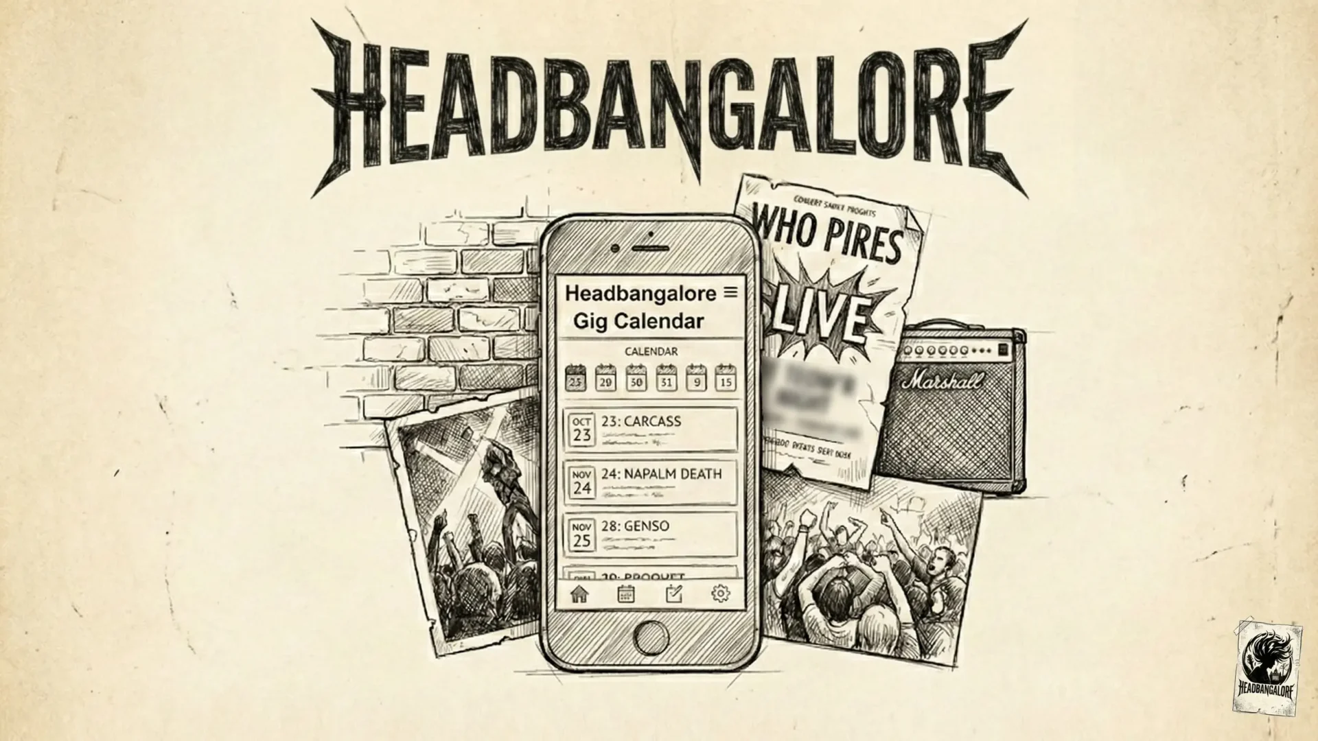
Headbangalore
ROLE
Founder,
Product Designer,
MVP Developer
YEAR, STATUS
2025-2026
Ongoing
Tech Stack: Python, Next.js, React, PostreSQL, REST API, Calendar APIs
1. Executive Summary
The Pitch
In a career spanning 25 years, I have led design teams for enterprise giants and global brands. But Headbangalore is different.
This wasn’t a project born in a boardroom; it was born in the mosh pit.
As a veteran of the Bangalore rock and metal scene, I witnessed a thriving subculture being suffocated by digital noise. World-class gigs were happening in our backyards, but fans were missing them because the information was scattered across expiring Instagram stories, buried Facebook events, and chaotic WhatsApp groups.
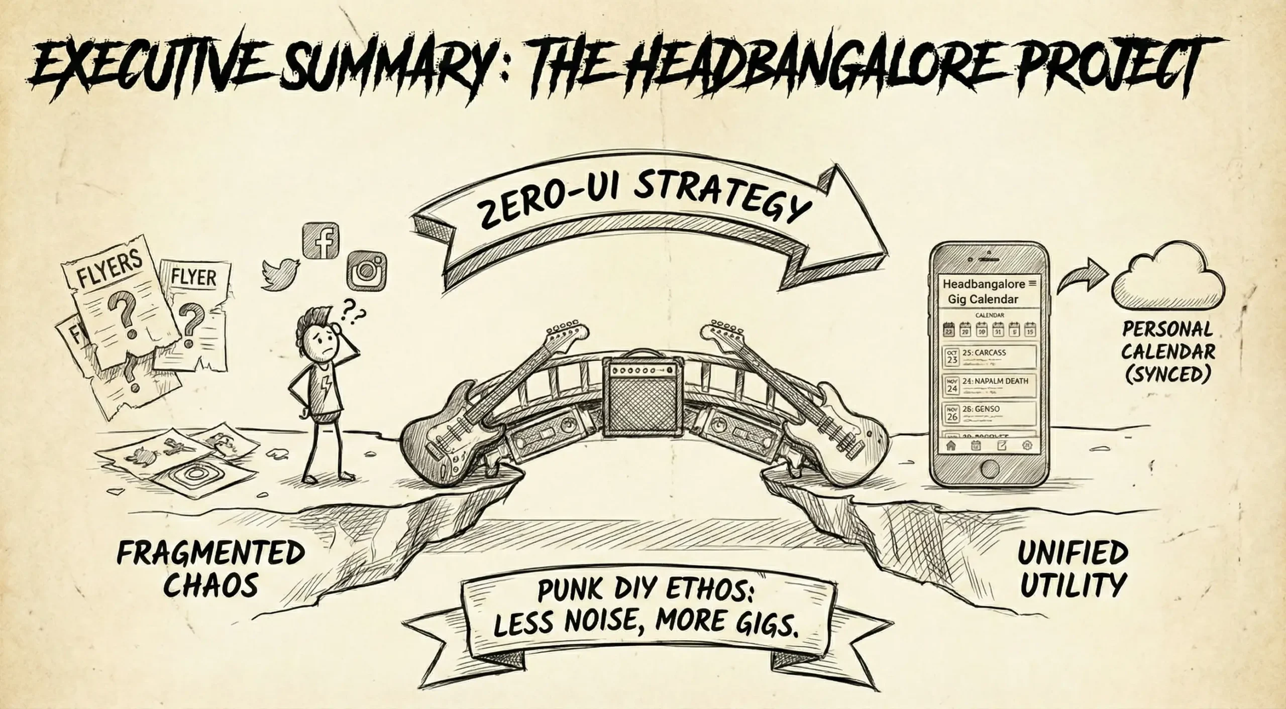
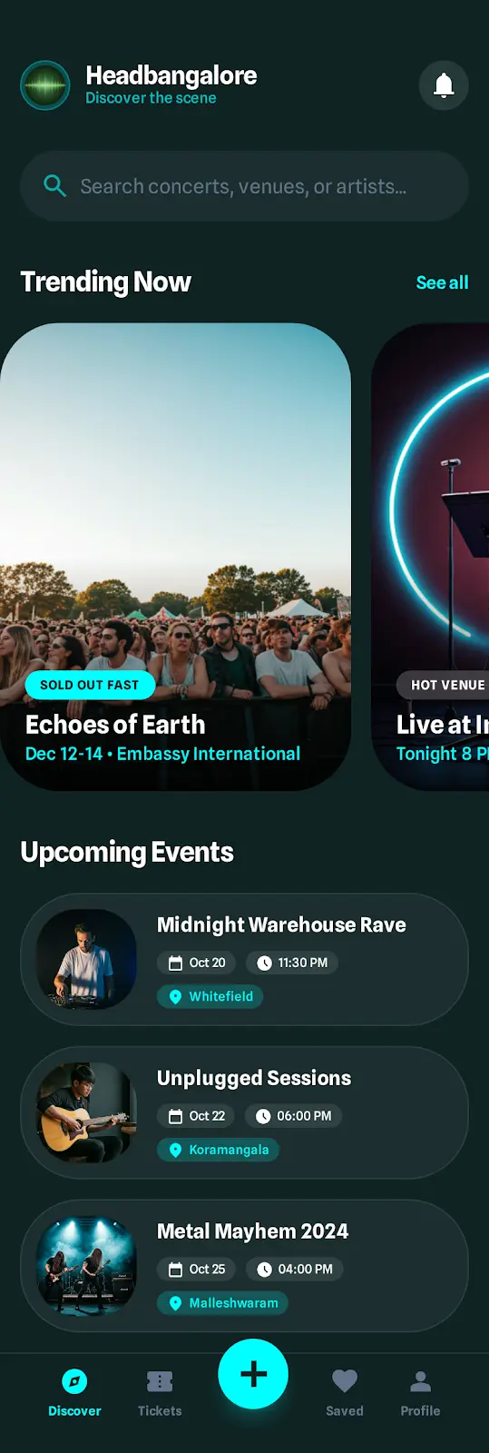
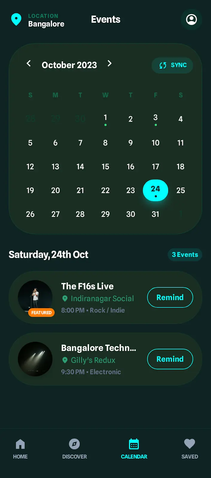
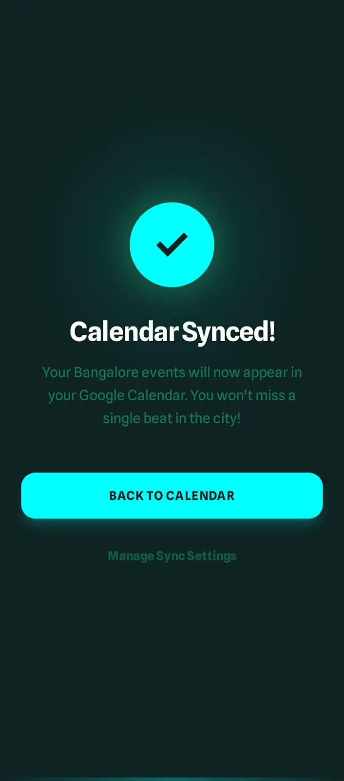
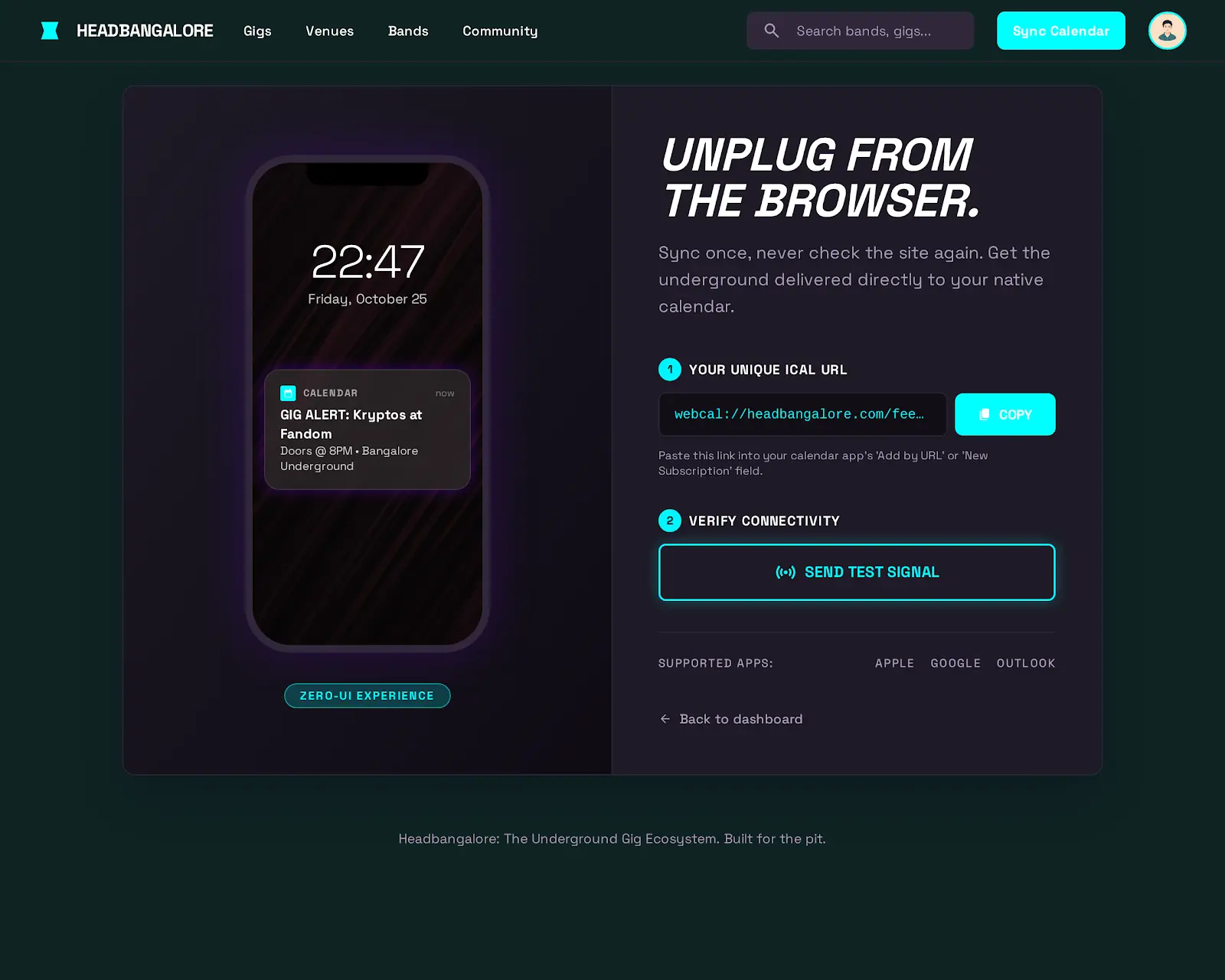
Headbangalore is my Punk DIY answer to this fragmentation. It is a hyper-local, calendar-first platform that aggregates gig intelligence and pushes it directly into the user’s daily workflow.
The Impact
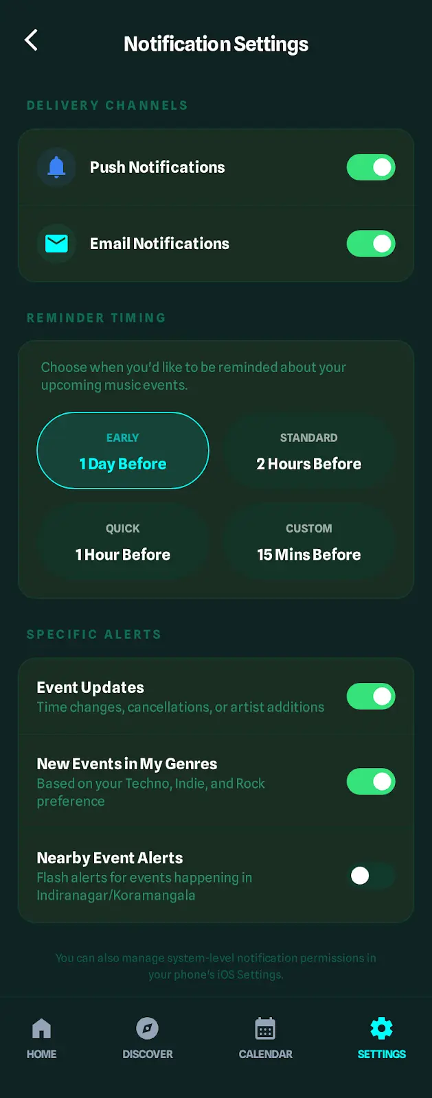
By rejecting the ‘attention economy’ model of social media and embracing a Zero-UI utility model, I built a system that:
- Centralizes the local underground ecosystem into a single source of truth.
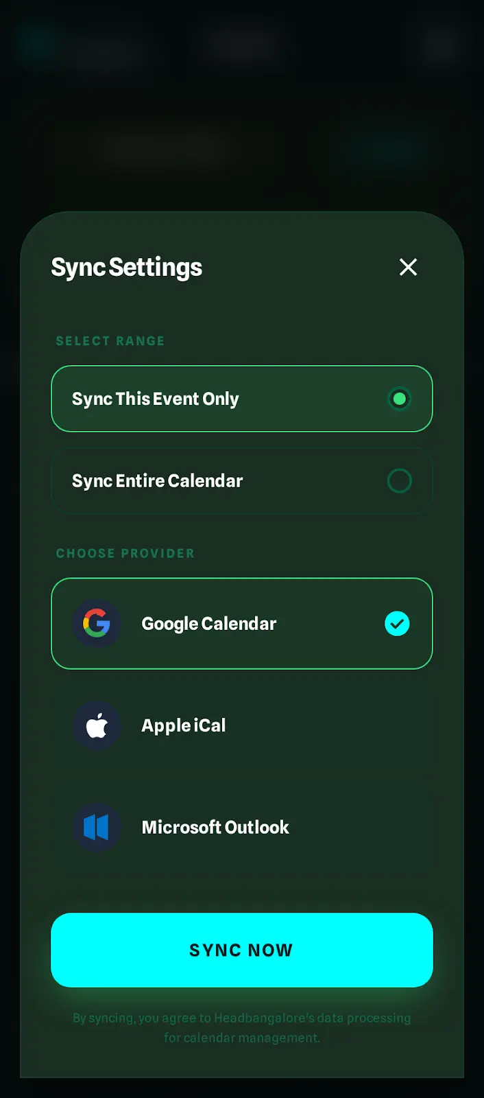
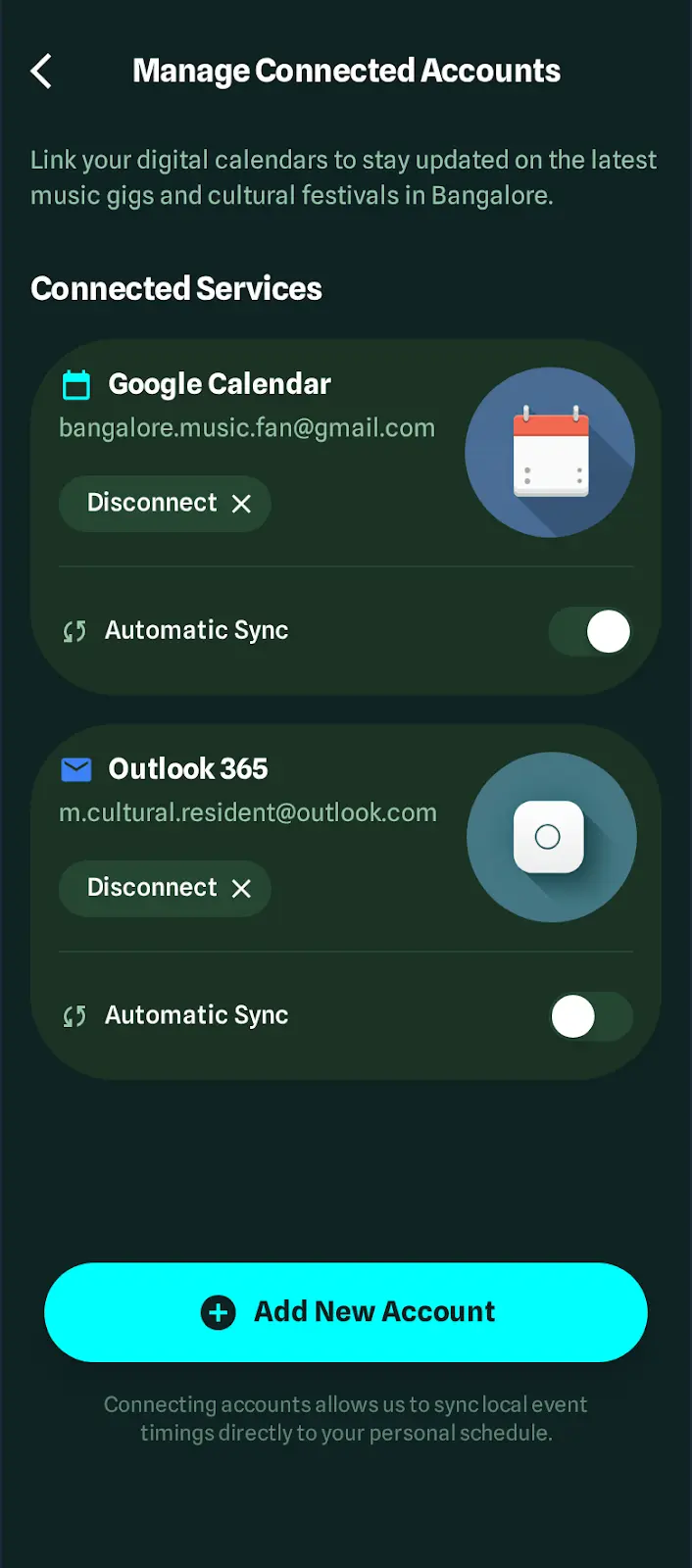
- Syncs events directly to users’ Google/Outlook calendars, ensuring they never miss a show.
- Empowers organizers with financial transparency tools to manage the complex economics of underground music.
This case study demonstrates how I leveraged product strategy, lean development, and domain-specific UX to solve a two-sided marketplace problem that generic event platforms ignored.
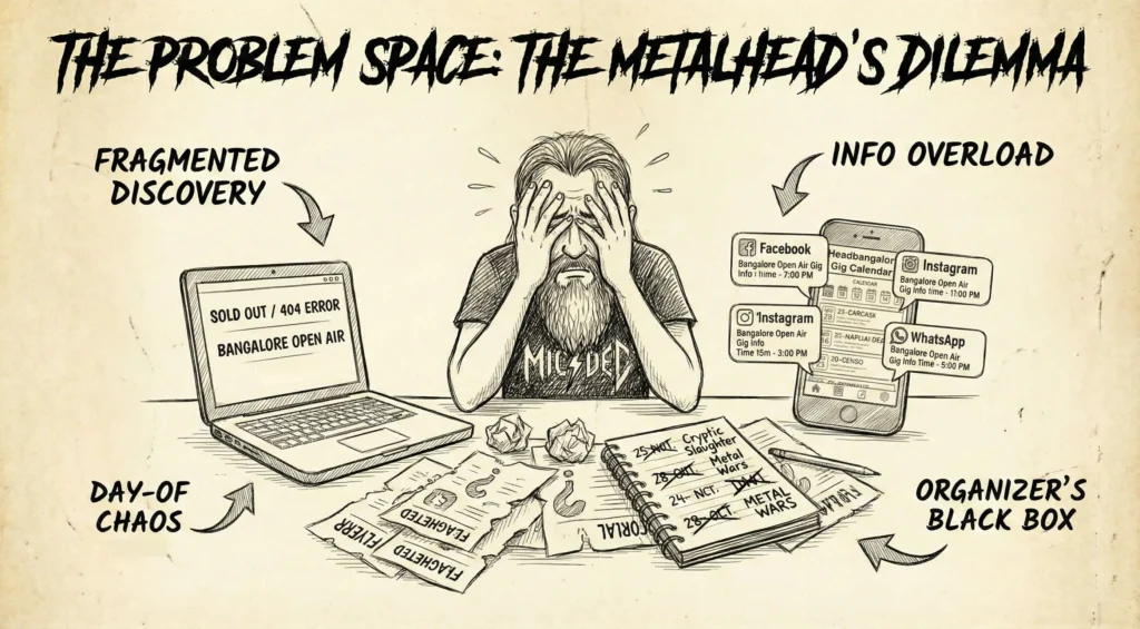
2. The Problem Space: The Metalhead’s Dilemma
The Context
Bangalore is the heavy metal capital of India. The scene is passionate, but the infrastructure is broken. Unlike the polished world of corporate events, the underground operates on passion, favors, and thin margins.
The Pain Points
Through interviews with 15 organizers and surveys of 50+ frequent concertgoers, I identified three critical fractures in the experience:
1. The Fragmentation of Discovery (Fan Pain)
To find out what was happening this weekend, a fan had to:
- Scroll through Instagram (hoping the algorithm didn’t hide the flyer).
- Check 4 different ticketing sites (Insider, BookMyShow, SkillBox, District, etc.).
- Read through hundreds of messages in Gig Alert WhatsApp groups.
- Result: Cognitive Overload. Fans gave up, and gigs went empty.
2. The Day-Of Chaos (Logistics Pain)
Even after buying a ticket, the user journey was flawed. Key details like venue location, gate times, and parking info were often buried in a weeks-old social media post.
- Result: Anxiety. Fans scrambling for info hours before the show.
3. The Organizer’s Black Box (Business Pain)
For the promoters, the struggle was existential. Relying on social media meant shouting into a void. They had no way to ‘push’ updates to ticket holders without paying for ads. Furthermore, managing the revenue split between bands, venues, and sound engineers was a manual, error-prone nightmare often done on napkins or broken spreadsheets.
The Strategic Insight
I realized that building another app with a news feed would fail. Users didn’t need another place to search; they needed a way to know.
The Pivot: “The solution isn’t to fight for the user’s attention on social media. The solution is to invade the one digital space they check religiously every single day: Their Personal Calendar.“
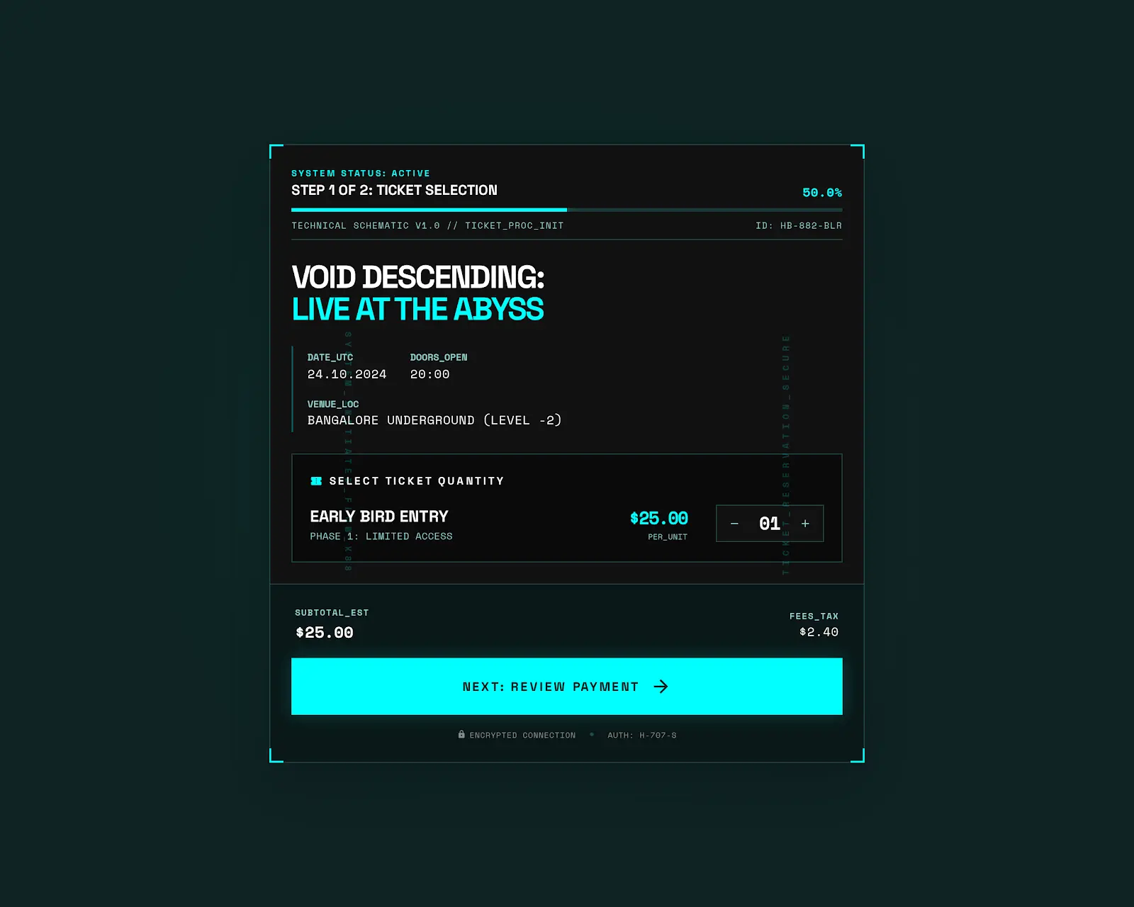
3. The Strategy: Punk DIY & Visual Identity
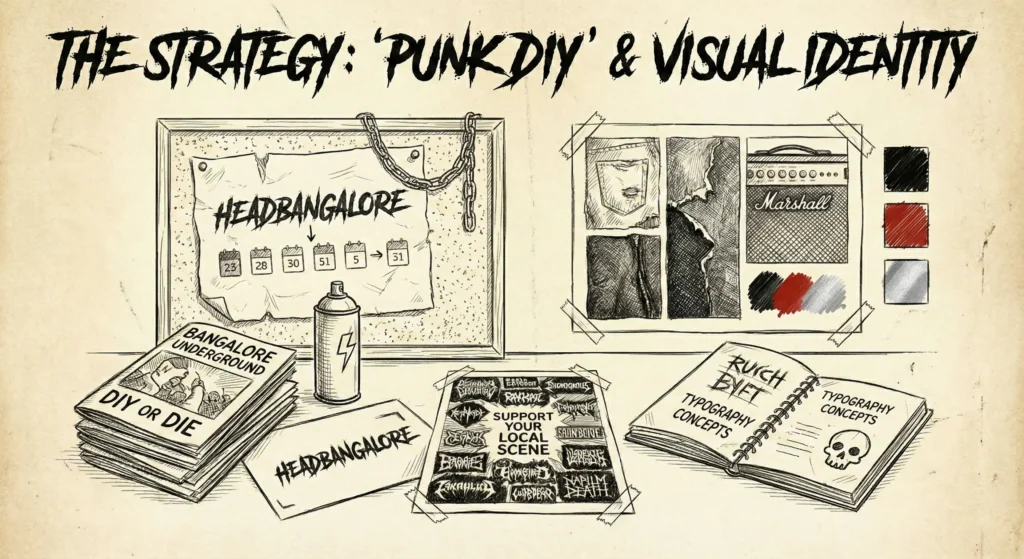
The Zero-UI Hypothesis
In a world addicted to engagement metrics, my strategy was counter-intuitive: I wanted users to spend less time on my site.
The ‘Punk DIY’ ethos isn’t just about attitude; it’s about efficiency. I stripped away every feature that didn’t serve the primary goal: getting a fan to a gig.
- No Social Feed
Users don’t need another place to chat. - No Infinite Scroll
The list ends when the gigs end. - The Trojan Horse Tactic
By focusing on the Add to Calendar interaction, I moved the retention mechanism off my platform and into the user’s OS.
Once a user subscribes, Headbangalore becomes infrastructure, invisible, essential, and always up to date.
Visual Identity: The Schematic Aesthetic
When designing for a subculture, clean corporate minimalism feels like an intrusion. It lacks authenticity. Conversely, typical metal design (skulls, blood, distress textures) often sacrifices readability for vibe.
I chose a third path: The Technical Schematic.
1. Dark Mode as a Default (Not a Toggle)
Metal happens in the dark. Clubs are dark; venues are dark. A white-screen app opening in a dim venue is a UX failure (and physically painful).
- The Palette
Deep Charcoal (#121212) backgrounds to save battery on OLED screens, with high-contrast Neon Cyan (#00FFFF) and Electric Purple (#BF00FF) accents. - Accessibility
Strict WCAG AA contrast ratios on typography to ensure that even in a chaotic mosh pit, the Get Directions button is legible.
2. The Amplifier Metaphor
I drew visual inspiration from the tools of the trade: guitar amplifiers, pedalboards, and stage rigging blueprints.
- Typography
I utilized Monospaced fonts (likeJetBrains MonoorRoboto Mono) for data points (dates, prices, times), mimicking the digital readouts on rack-mount effects processors. - Iconography
Thin, vector-line icons that resemble circuit diagram symbols. - Layout
Structured grids that feel like engineering schematics rather than marketing brochures.
Design Rationale: “The aesthetic isn’t just ‘cool’; it speaks the user’s language. It treats the gig data not as ‘content’ to be consumed, but as ‘signal’ to be processed. It respects the intelligence of the user.”
4. User Research: Pivoting to the Supply Side
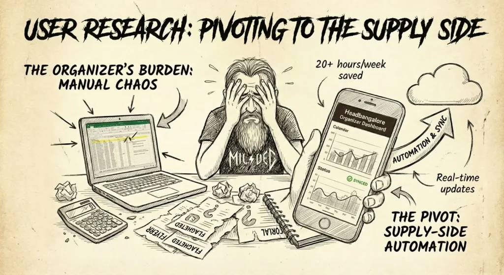
The Supply Chain Realization
In the early beta phase, I fell into a classic founder trap: I designed for myself. As a fan, I built beautiful discovery features. But the calendar remained empty.
I realized quickly that a gig calendar without gigs is just a blank grid. The Fan Experience (Demand) is entirely dependent on the Organizer Experience (Supply). If I couldn’t make it effortless for organizers to input data, the platform would die.
I shifted my research focus entirely to the B2B stakeholders, the promoters, venue managers, and booking agents who keep the scene alive.
The Persona: Meet Sid
Name: Siddharth ‘Sid’ Rao
Role: Independent Promoter & Part-Time Venue Manager
Archetype: The Overwhelmed Enthusiast
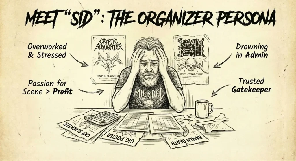
Sid isn’t a corporate event planner with a team of assistants. He is a one-man army. He books the bands, prints the posters, runs the social media, manages the door, and settles the payments. He loves the music, but he is drowning in the admin.
The User Voice: “I started doing this because I wanted to see my favorite bands live. Now, I spend 90% of my time fighting with Excel sheets and chasing ticket links on WhatsApp. I don’t get to watch the show anymore.”
The Spreadsheet of Doom
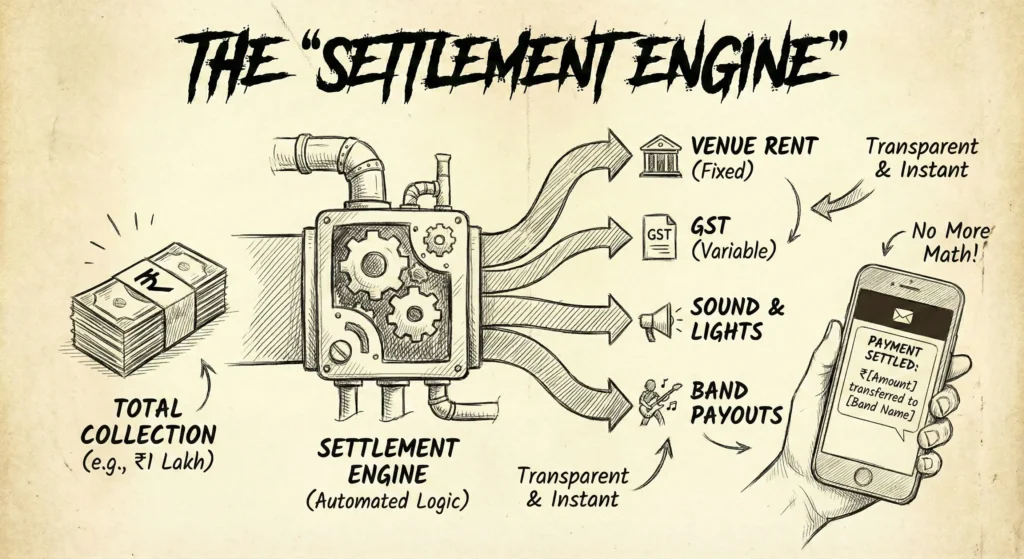
Through observational research (shadowing Sid during a gig), I uncovered the core friction point: Financial Anxiety.
The underground scene runs on complex, fluid revenue splits:
- Venue takes fixed rent OR a bar cut.
- Sound engineer gets cash upfront.
- Government takes GST.
- Bands split the remainder.
Sid was managing this chaos on broken spreadsheets or mental math. A single miscalculation meant he paid the bands out of his own pocket.
The Strategic Shift
This insight transformed Headbangalore from a Marketing Tool into an Operations Tool.
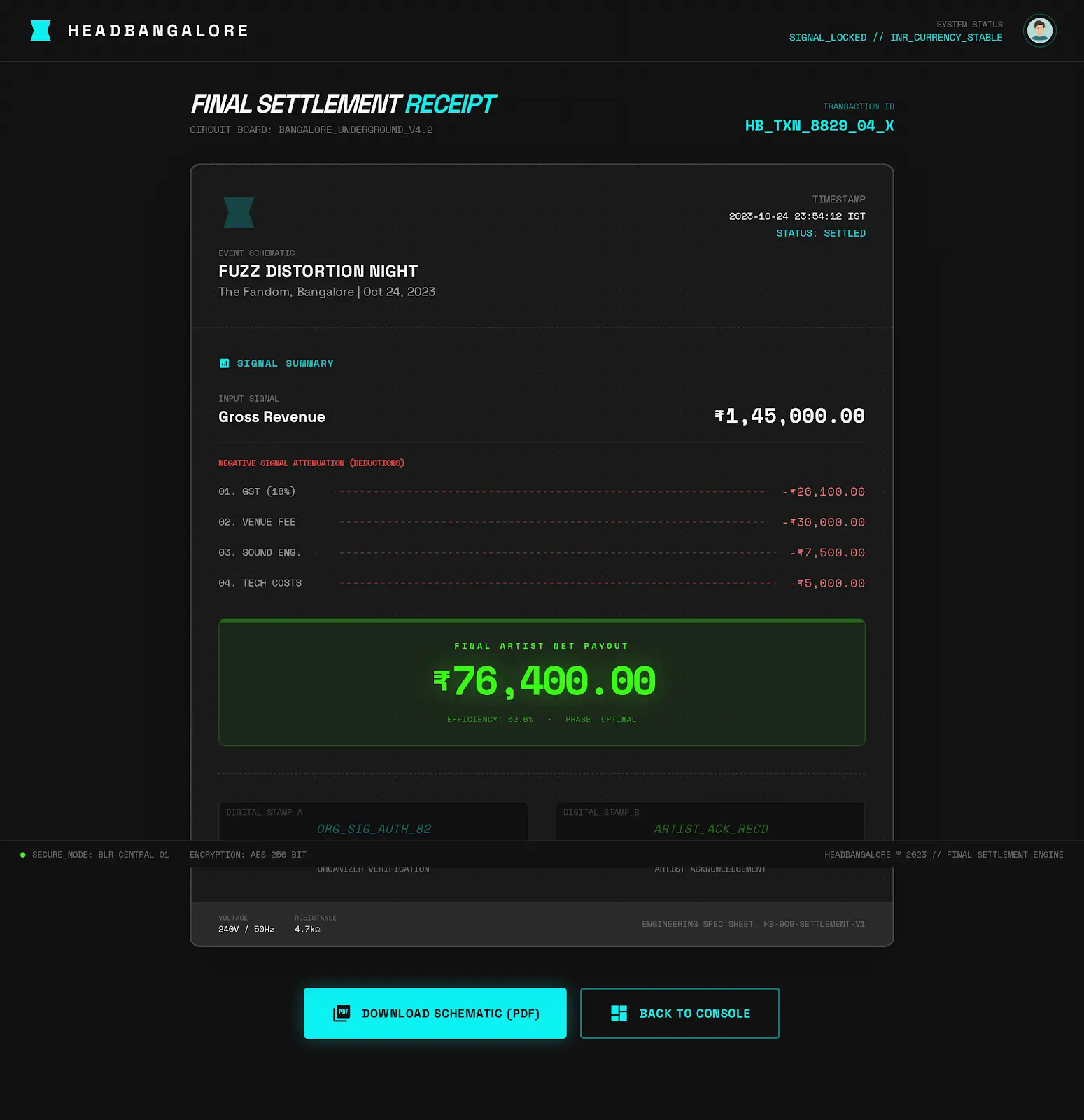
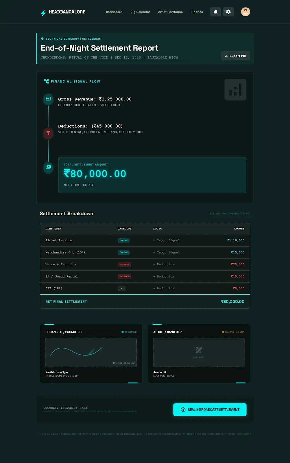
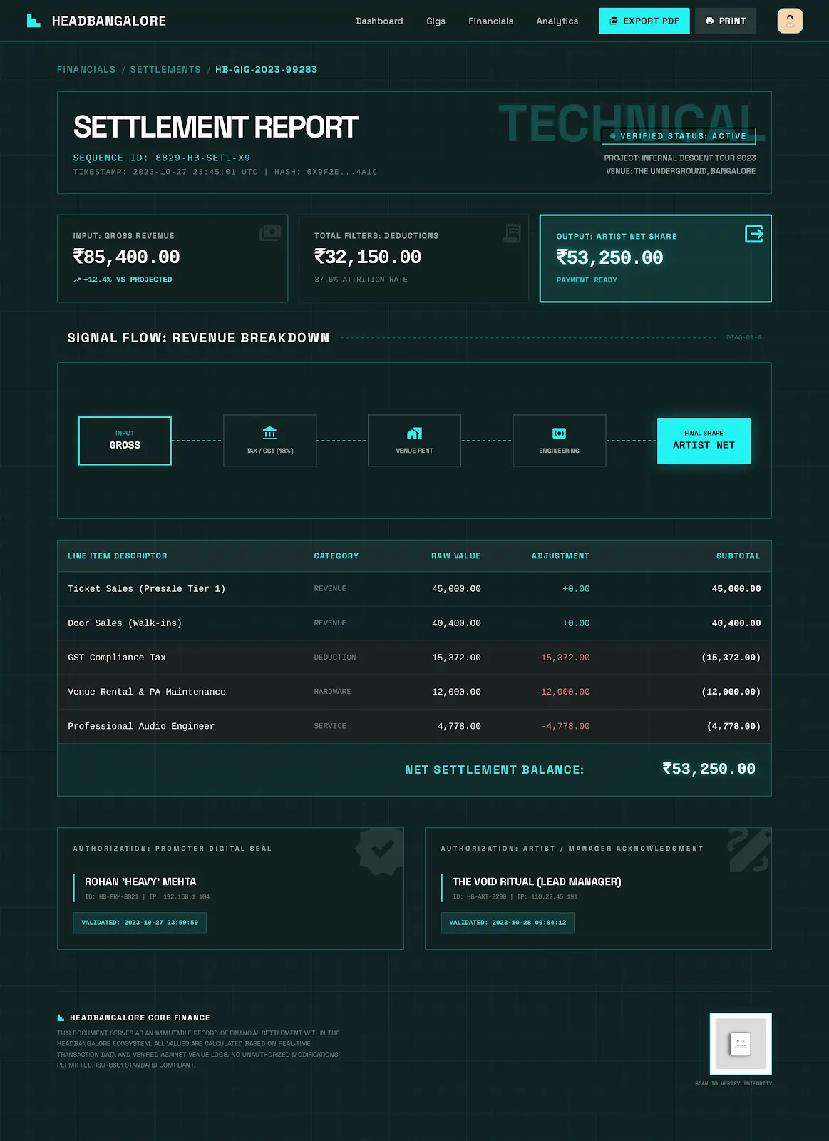
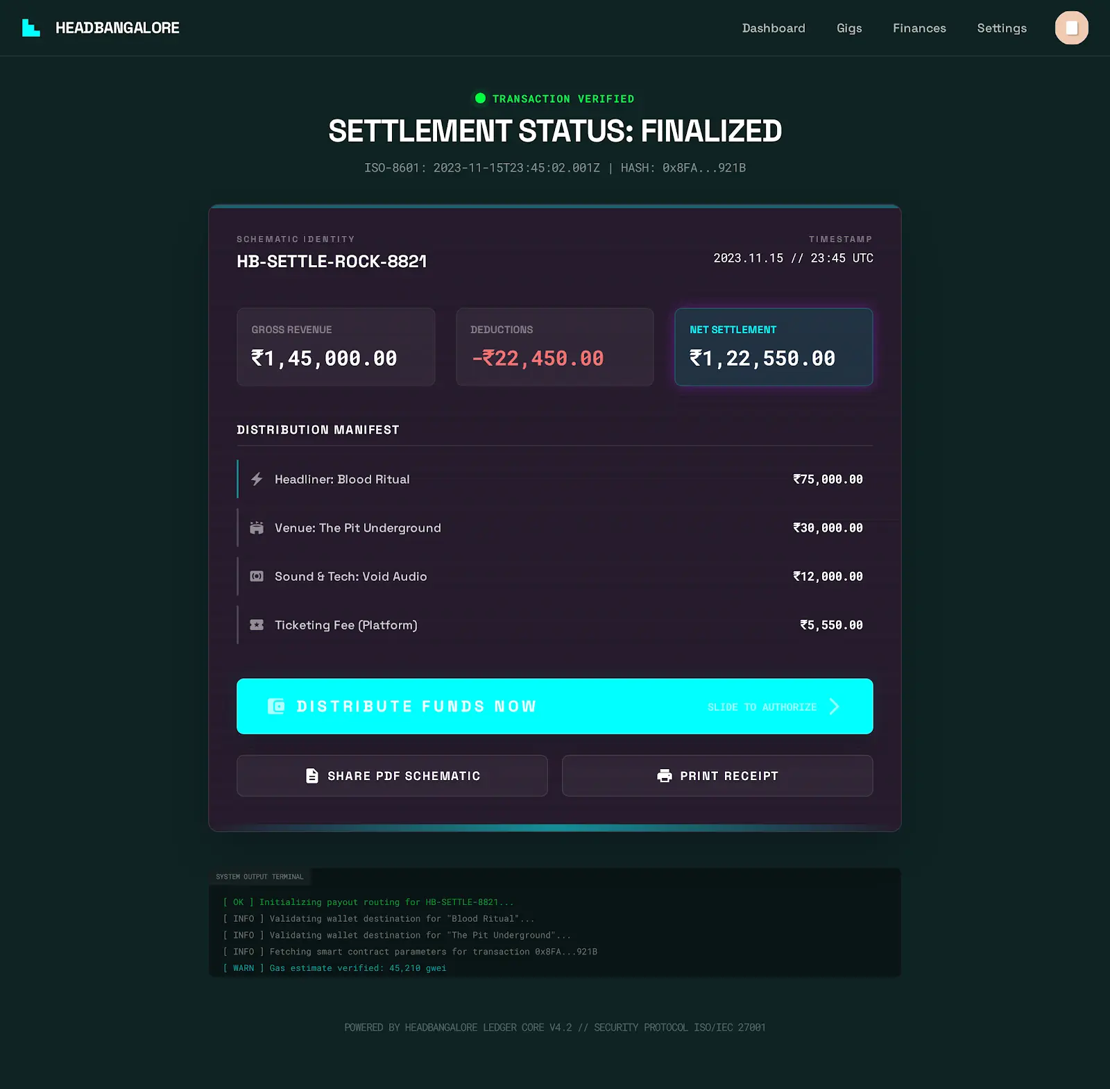
I realized that to win Sid’s trust, I didn’t just need to help him sell tickets; I needed to help him settle them. The UX priority shifted to building the Settlement Engine, a feature that automates the math, visualizes the splits, and gives Sid his sanity back.
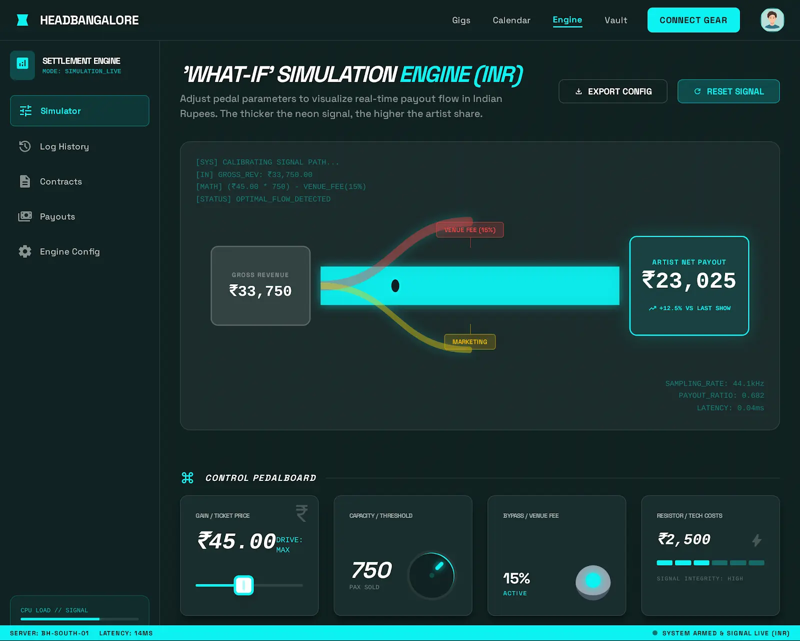
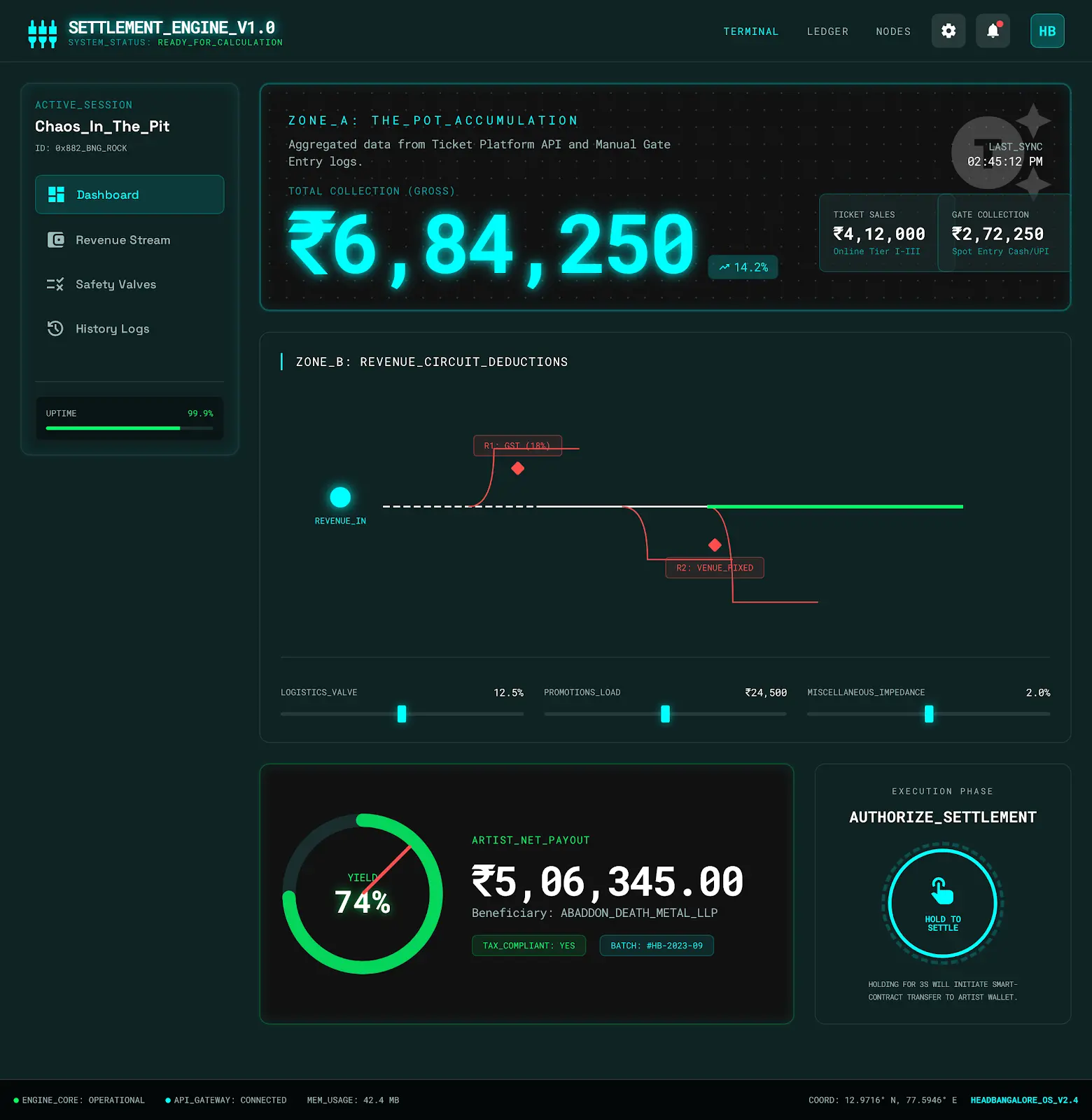
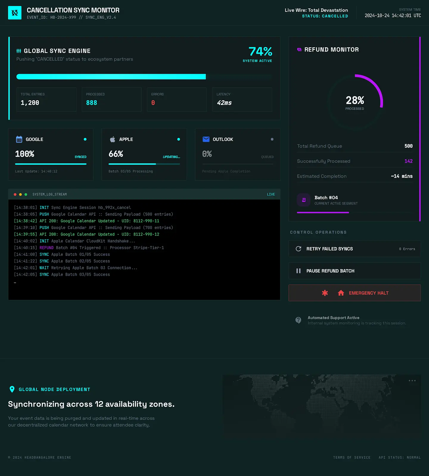
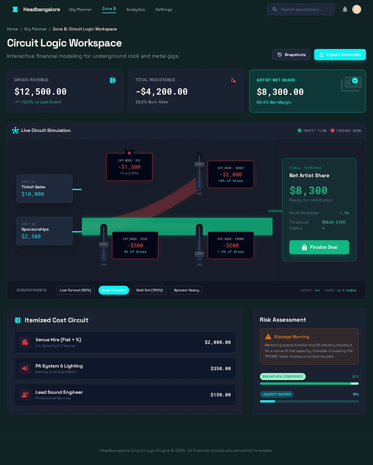
5. The UX/UI Solution: The Settlement Engine
Transforming Chaos into Logic
For the ‘Sid’ persona, financial transparency isn’t just a feature; it’s anxiety relief. My goal was to take the terrifying complexity of his ‘Spreadsheet of Doom’ and turn it into a dashboard that felt safe, controlled, and logical.
I rejected the standard Corporate Admin aesthetic (pie charts and white tables). Instead, I leaned into the Signal Flow metaphor familiar to anyone in audio engineering. Just as a guitar signal flows through pedals to an amp, revenue flows through deductions to the artist.
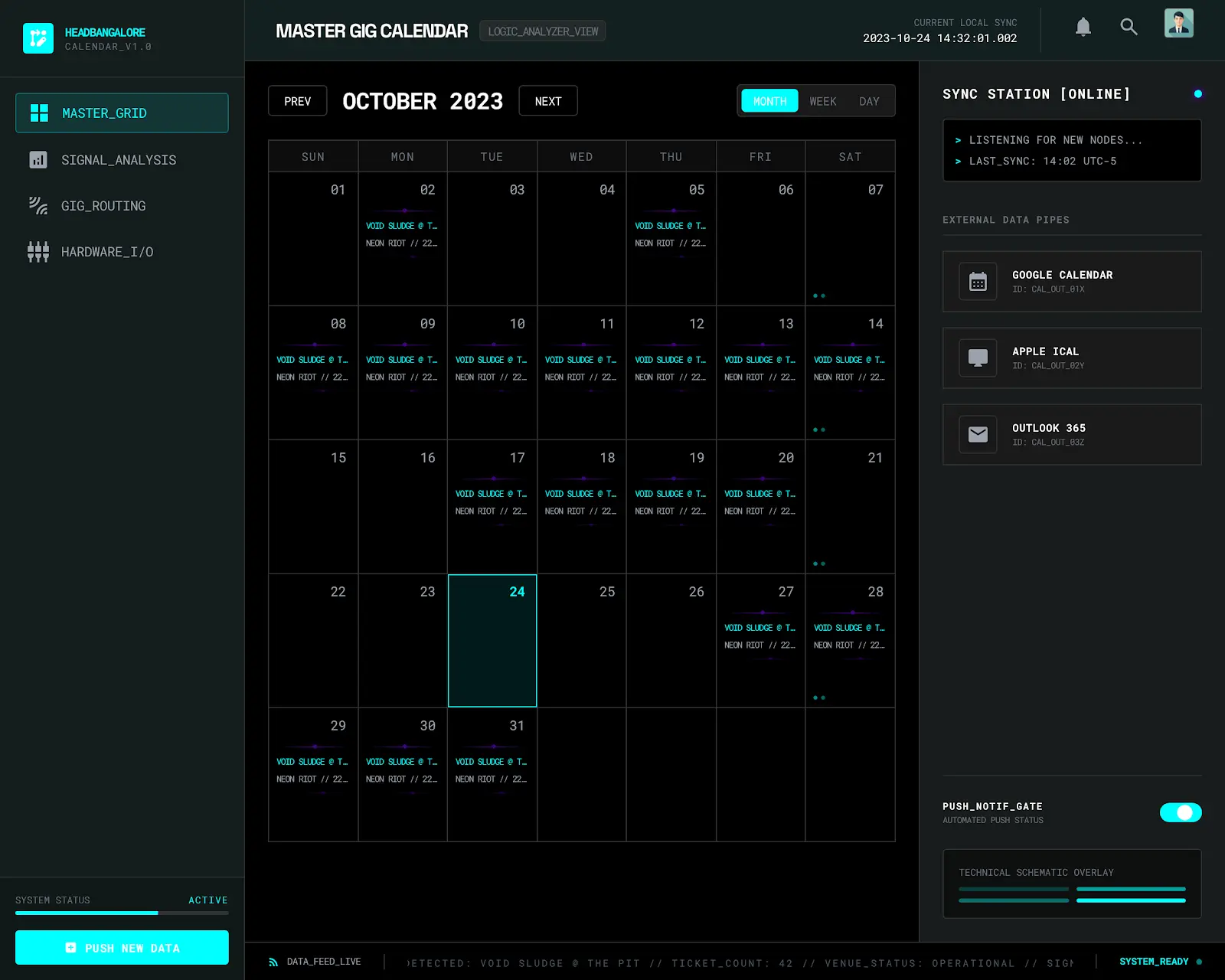
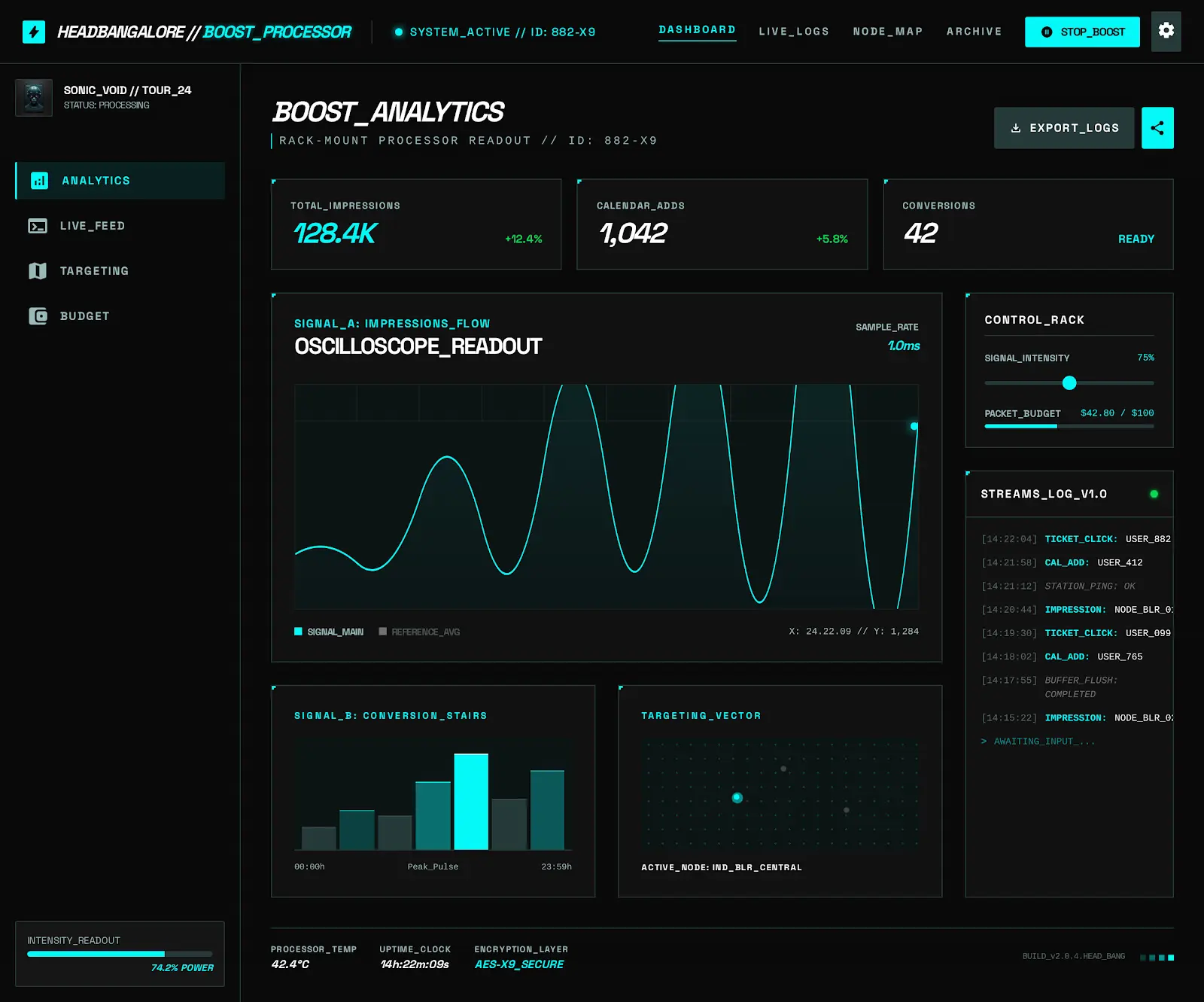
The Dashboard Architecture
I divided the screen into three distinct zones, designed to be read from left to right like a schematic diagram.
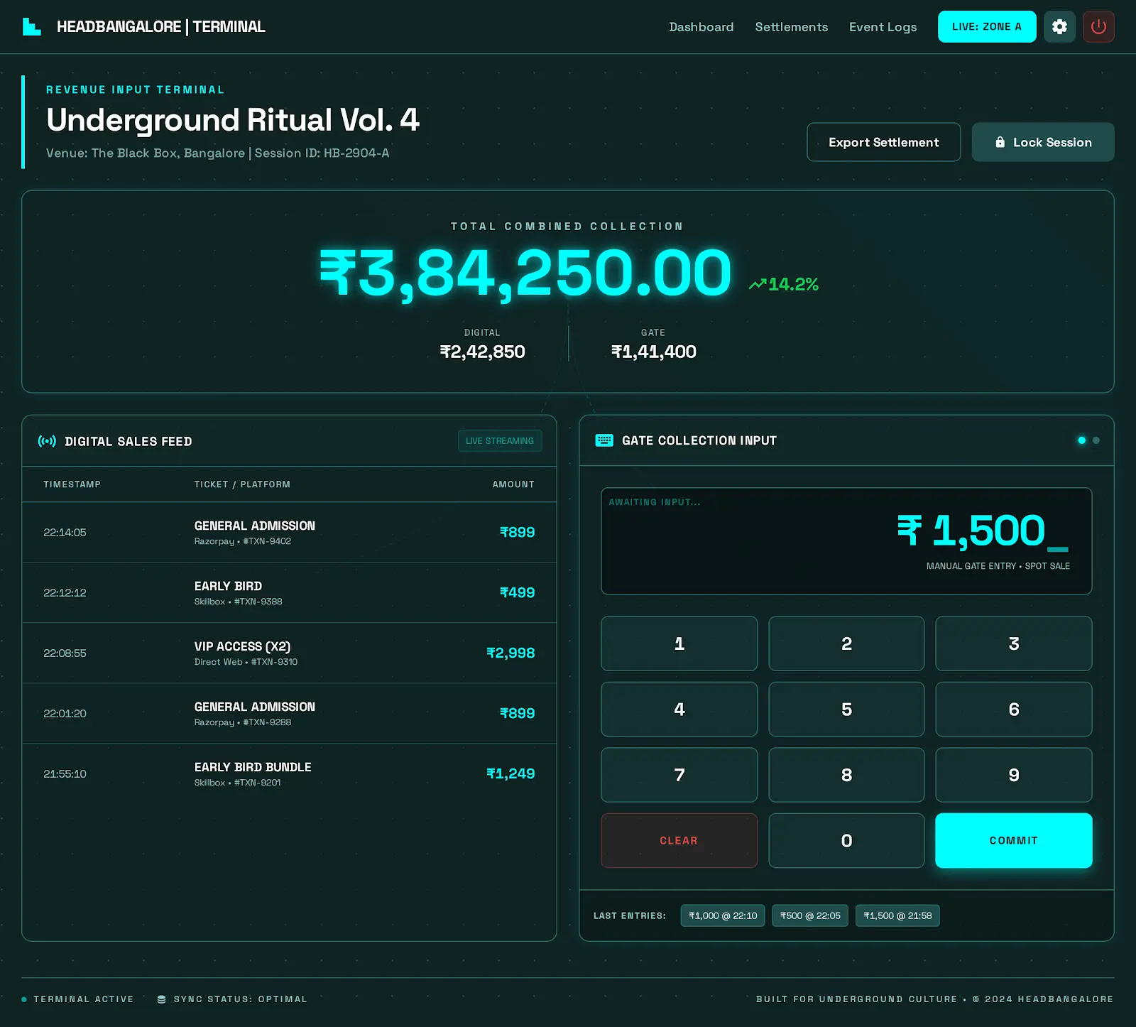
Zone A: The Input (The Pot)
At the start of the flow is the Total Collection, a large, glowing digital readout displaying the gross revenue (Ticket Sales + Gate Collection). I designed this to be the Excitement Number, utilizing a bright Cyan hue (#00FFFF) to signal success and potential.
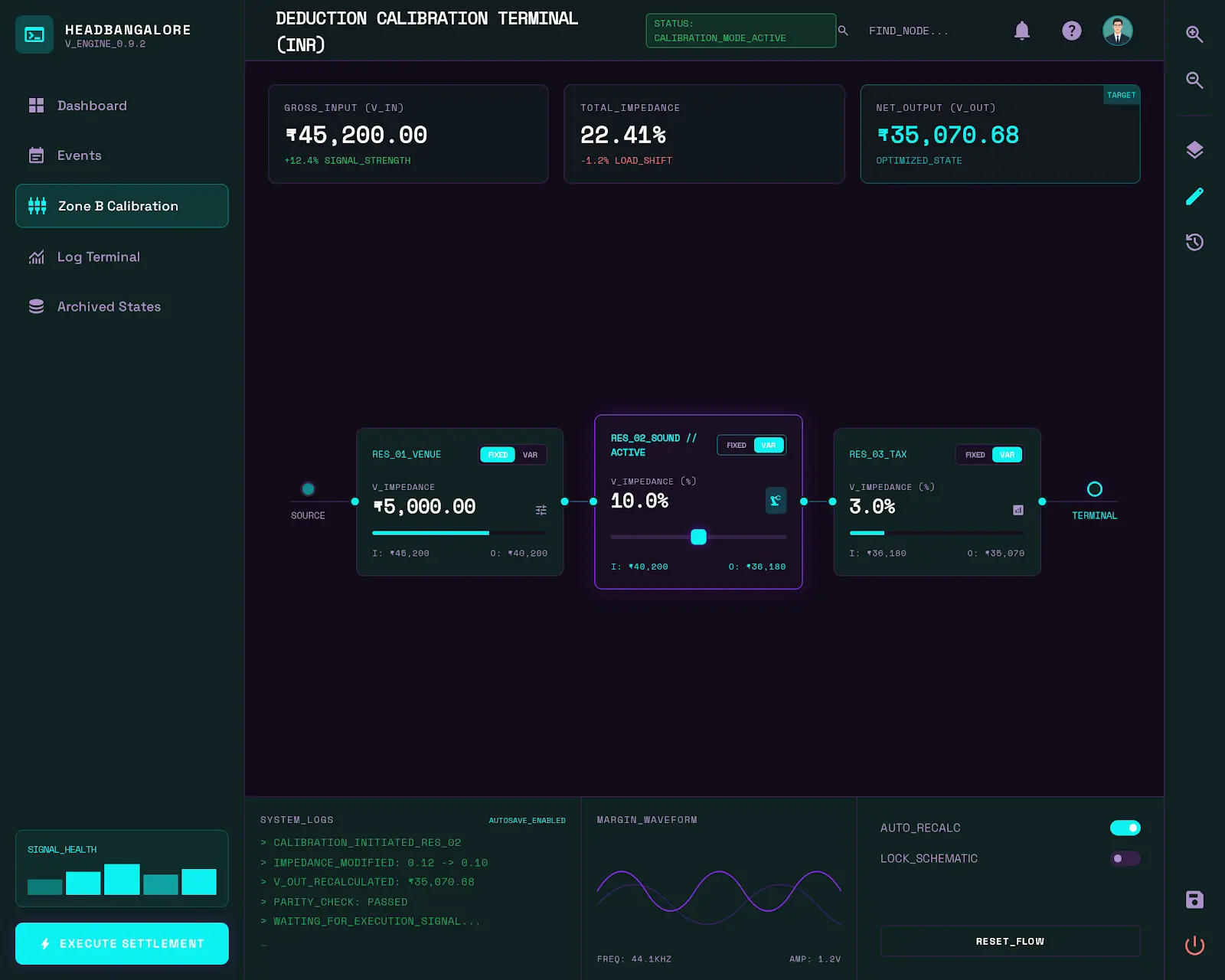
Zone B: The Circuit (The Logic)
This is the heart of the engine. Instead of a static table, I built a dynamic Sankey Diagram stylized as a Circuit Board Trace.
- Visual Feedback: A thick white line (Revenue) enters the circuit and splits. Thin red lines branch off downwards, representing Resistors or deductions: GST (18%), Venue Fixed Costs, and Variable Logistics.
- The Safety Valve: I added interactive slider controls for variable costs. If the sound engineer charges an extra ₹5,000 last minute, Sid simply slides the Sound resistor up.
Zone C: The Output (The Payout)
The remaining line, now glowing Neon Green, flows into the final Amp Meter visualization: The Artist Net Share.
- The Kill Switch: A large, tactile button labeled [SETTLE & PAY] sits at the end of the chain. It requires a Press-and-Hold interaction (similar to arming a recording track) to prevent accidental triggers, adding a layer of deliberate friction to the transfer of funds.
The ‘What If’ Interaction
The true power of this UI lies in its responsiveness.
I designed the entire dashboard to be a simulation engine. Sid can drag the Ticket Price slider up by ₹50 and instantly watch the Artist Share line thicken in real-time.
Design Rationale: “By visualizing the math as a physical flow, I reduced the cognitive load. Sid doesn’t have to calculate ‘18% of X minus Y.’ He just sees the red line getting too thick and knows he needs to adjust the ticket price. It turns accounting into engineering.”
6. Engineering the Solution (The Founder’s Hat)
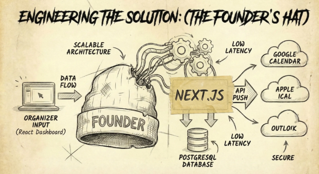
Architecture Strategy: The Unified Modern Stack
As a solo developer building an MVP, complexity was the enemy. While modern tech trends often lean toward fragmented microservices, I deliberately pivoted to a unified full-stack architecture using Python/Django Next.js.
Why? Velocity and Seamless Integration.
In a calendar application, truth is the only metric that matters. If an organizer changes a gig time from 8:00 PM to 9:00 PM, that change cannot eventually propagate; it must be immediate.
By moving from a decoupled Python/REST setup to Next.js, I consolidated the frontend and backend into a single, high-performance environment. This allowed me to manage the PostgreSQL database, server-side business logic, and API synchronization in a tight, unified loop, eliminating the overhead of managing a separate REST API layer.
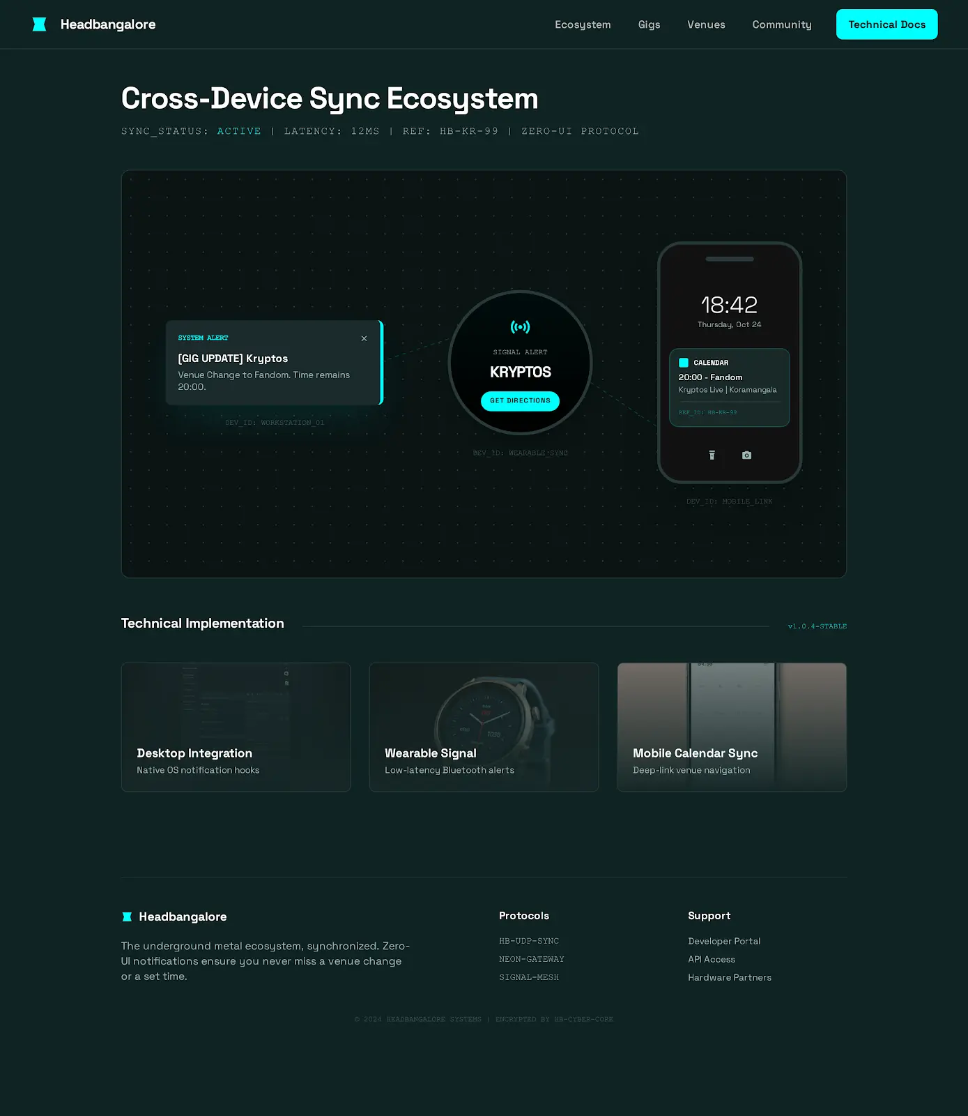
The Sync Engine: The Heartbeat of the System
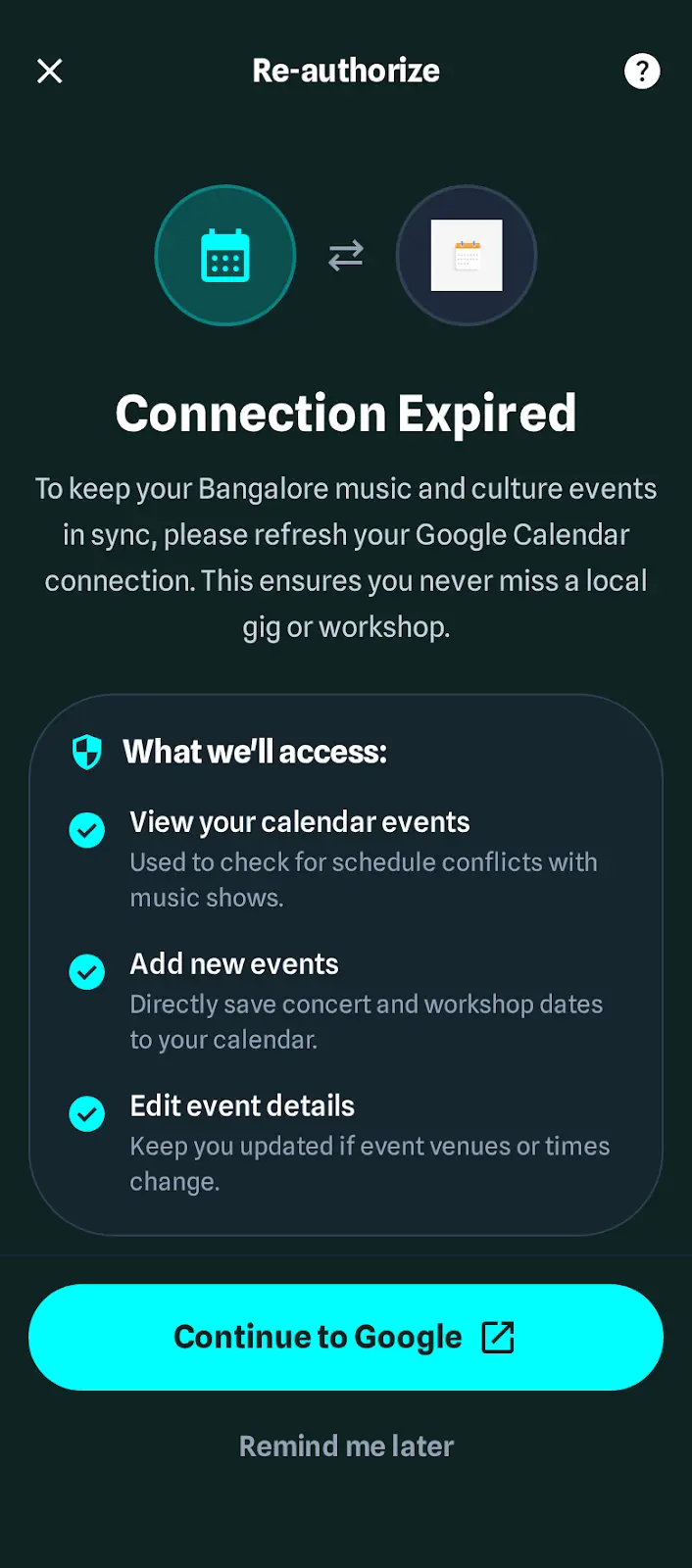
The core innovation of Headbangalore isn’t just the display; it’s the automated background logic I call the Sync Engine.
1. The Trigger (Edge Cron & Serverless Functions)
Instead of waiting for user-initiated refreshes, the system manages data proactively. Using Vercel Cron Jobs, the system triggers a background process at regular intervals. It scans the database for Dirty Flags, records updated by promoters or automated feeds, ensuring that changes are staged for immediate distribution.
2. The Translation Layer
When a change is detected, the Next.js serverless backend acts as a translator. It converts our internal schema into the specific protocols required by external platforms:
- Google Calendar API: Generates and pushes specific JSON payloads.
- Apple iCal: Regenerates and serves dynamic
.icsfiles. - Outlook: Executes the necessary Graph API calls.
3. The Push
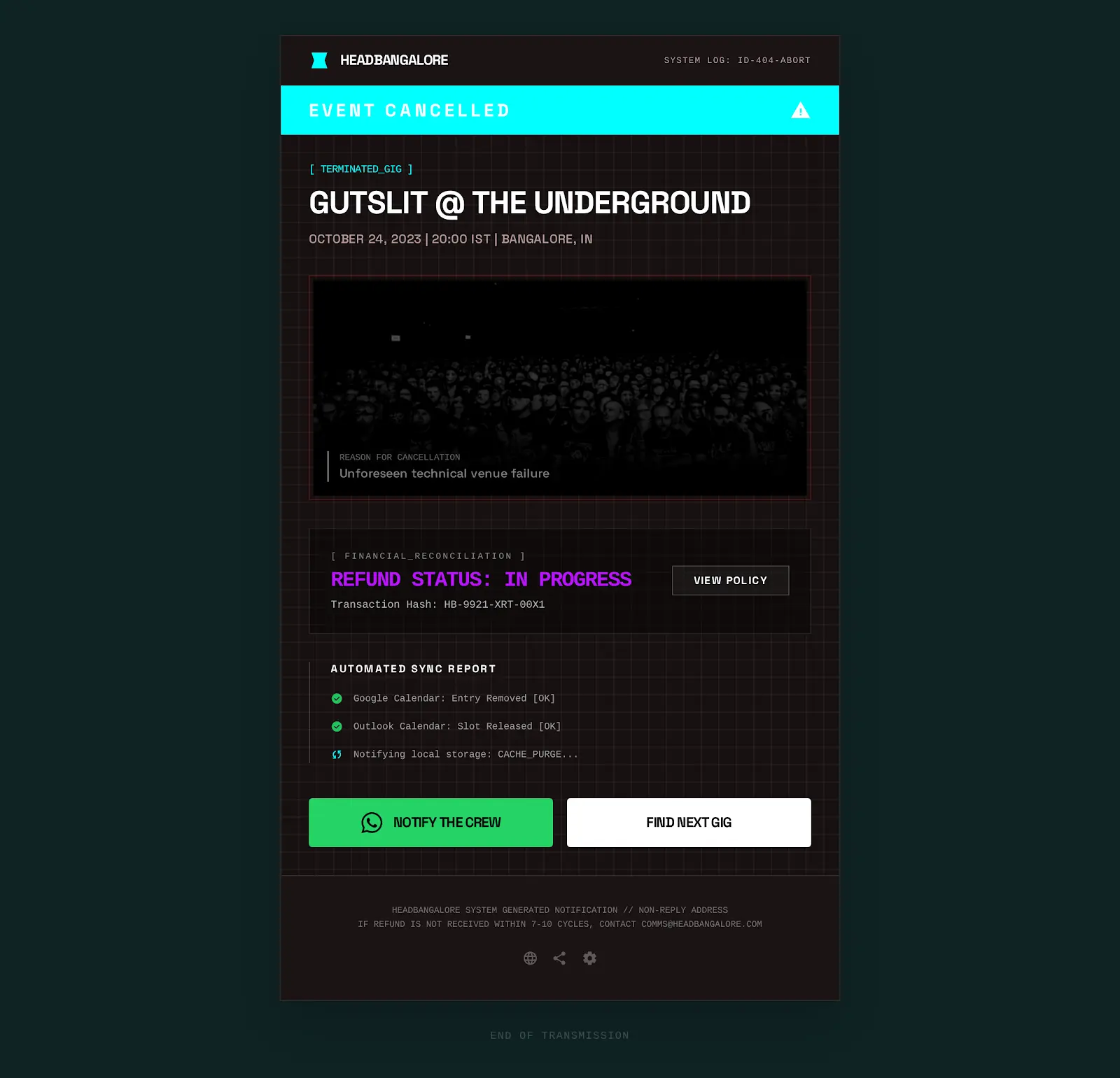
The engine fires these updates simultaneously.
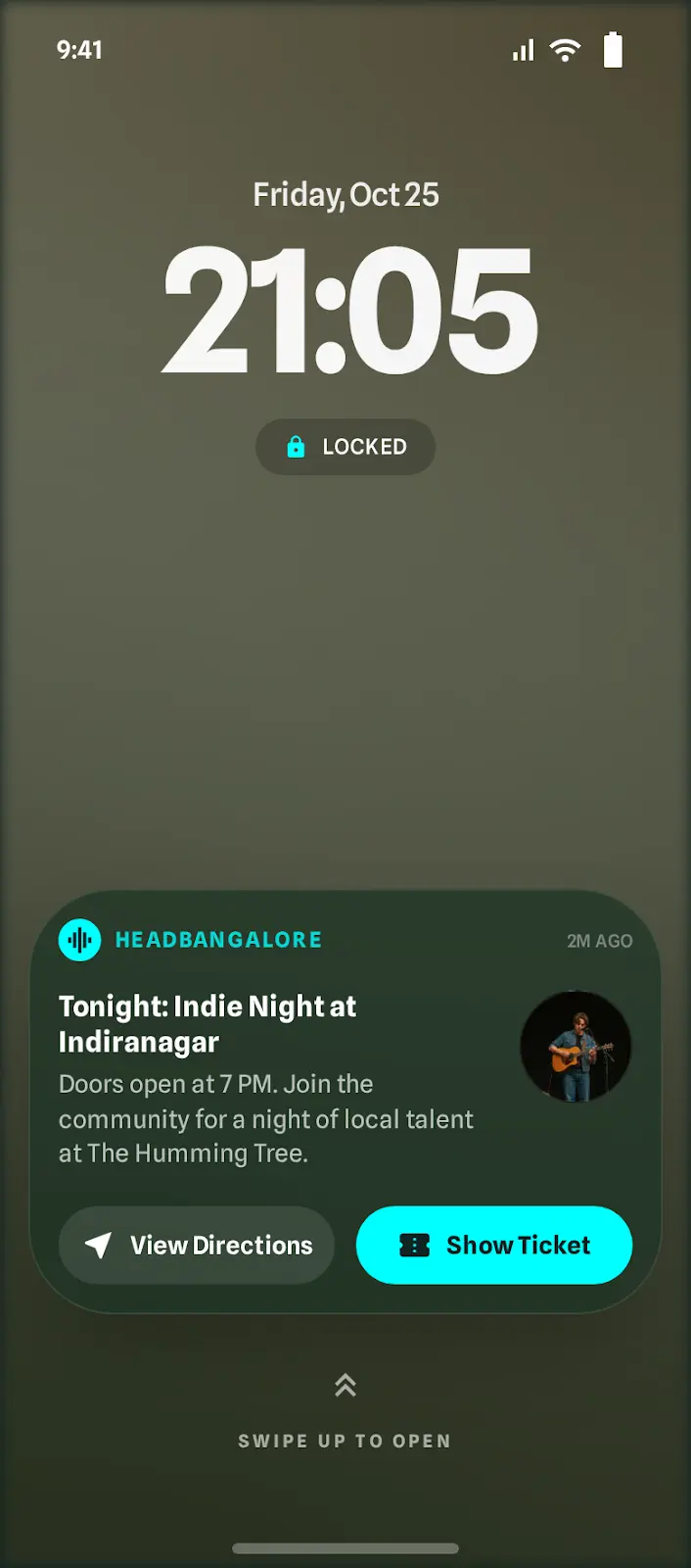
The Result: When a promoter updates a venue, a fan’s Apple Watch vibrates with the update in near real-time. This Zero-UI interaction builds immense trust with the community.
The Frontend: Performance by Default
I utilized the full power of the Next.js framework to balance complex management with blazing-fast discovery:
- The Landing Page (Fan Side)
Built using Static Site Generation (SSG) with Incremental Static Regeneration (ISR). This ensures the site loads instantly—even on a spotty 3G connection outside a loud venue, while still updating the calendar data in the background without a full redeploy. - The Dashboard (Promoter Side)
A highly interactive React environment designed for the Settlement Engine. It handles complex state management for event logistics and real-time financial math, providing a desktop-class experience in the browser.
Engineering Rationale
“I didn’t build a tech stack for a resume; I built it for resilience and reach. By moving to Next.js and Vercel, I’ve traded infrastructure management for feature velocity. The stack is modern and highly scalable, but the goal remains boring stability. When you are responsible for someone’s Saturday night, the tech should be invisible, it should just work.”
7. Business Viability (The CEO’s Hat)
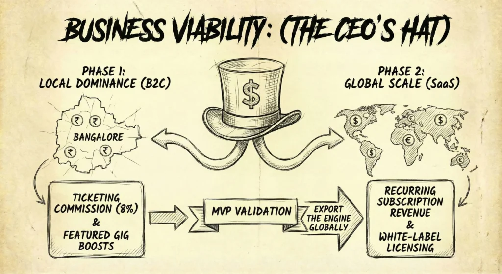
The Pivot: From Passion Project to Product
Headbangalore started as a labor of love, but love doesn’t pay server bills. To ensure the platform’s survival, I had to design a sustainable revenue model that didn’t exploit the community I was trying to serve.
I developed a Two-Phase Monetization Strategy, treating the Bangalore market not just as a launchpad, but as a Live Lab to validate the technology before scaling globally.
Phase 1: Local Dominance (The One-Stop Shop)
Market: Bangalore Metal Scene (B2C & B2B)
Goal: Capture value by removing friction.
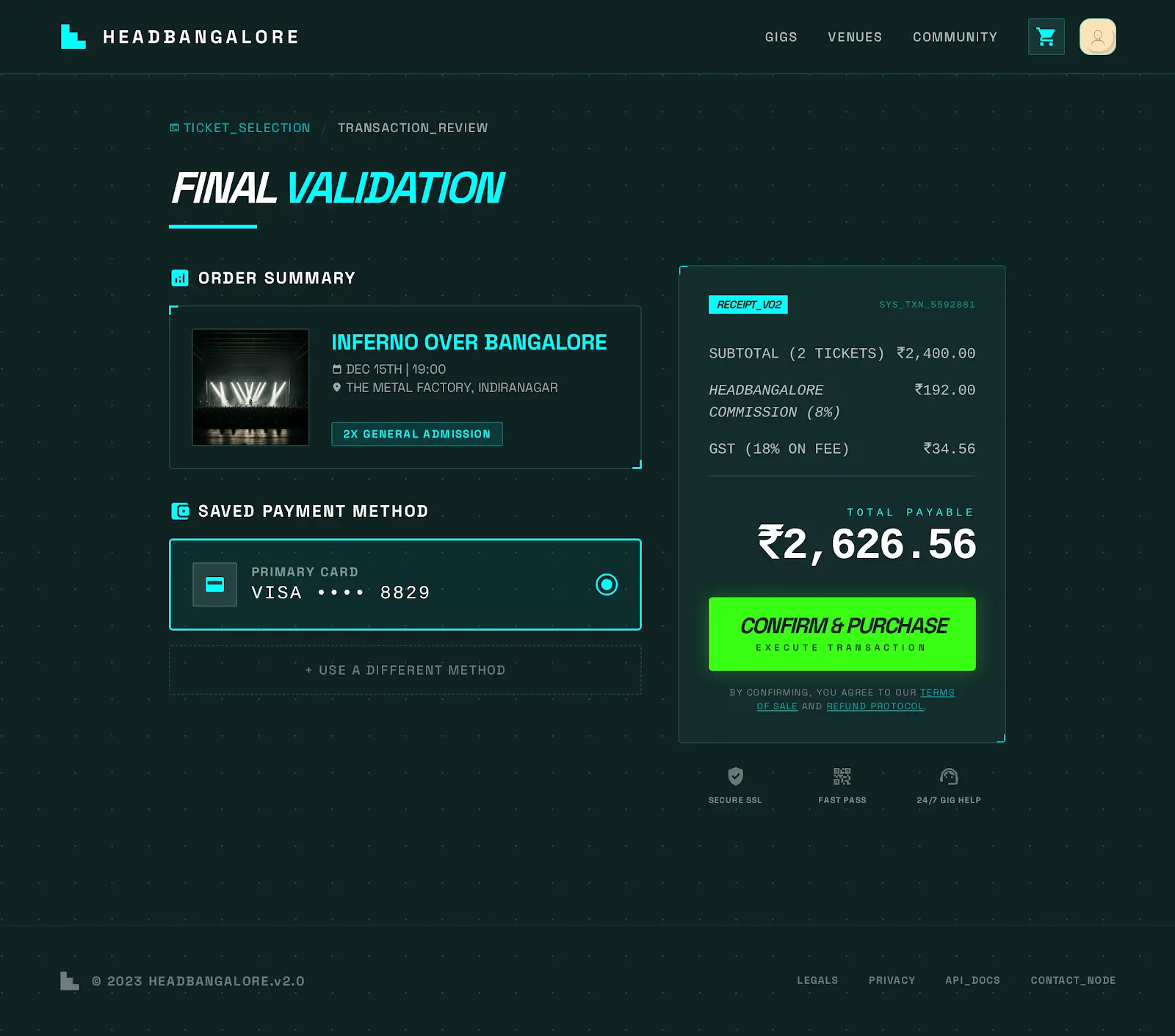
Currently, organizers lose money because the purchase journey is fragmented. My strategy integrates the commerce directly into the calendar.
- Ticketing Commission (8%)
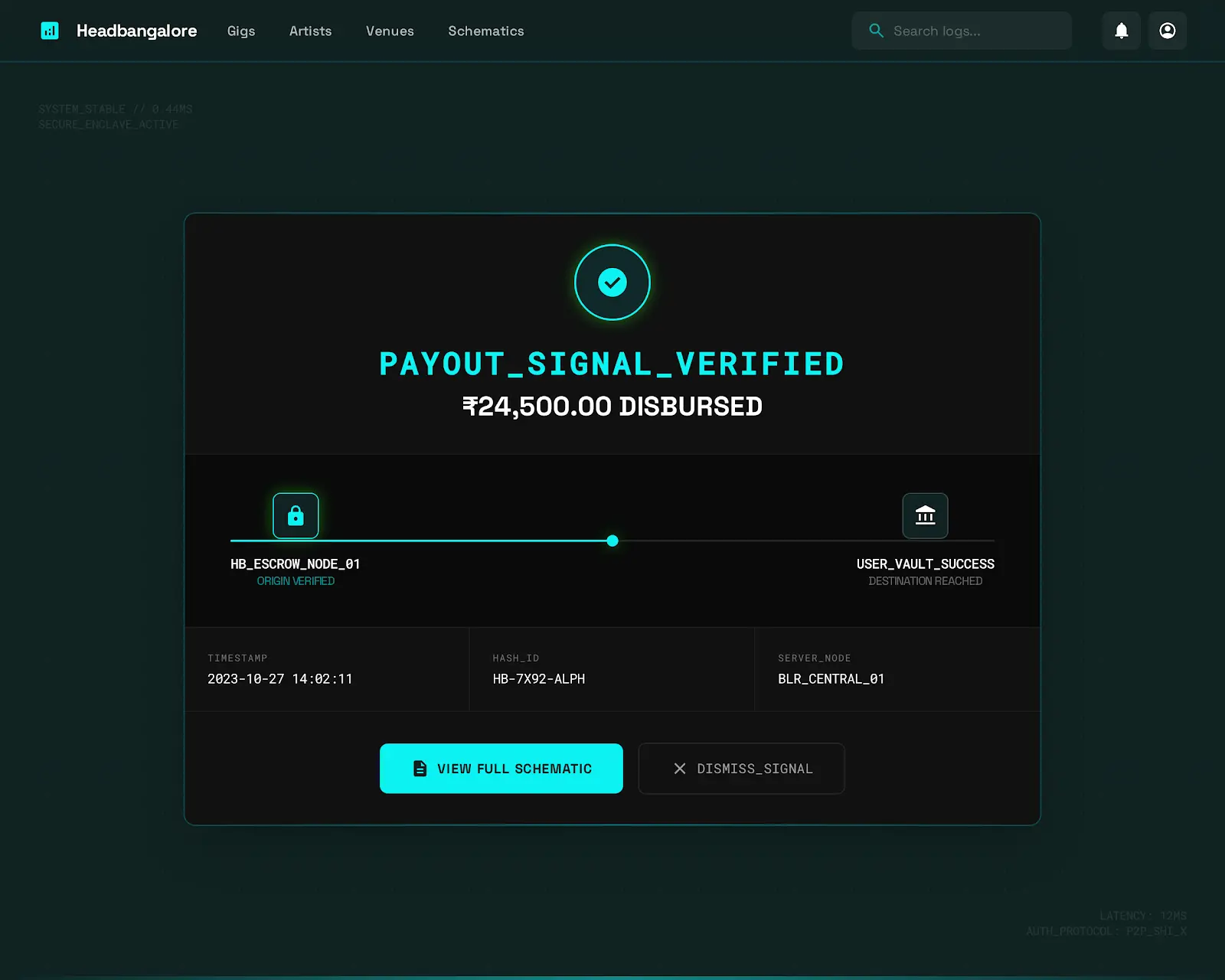
By building a native payment gateway, we capture the industry-standard booking fee.
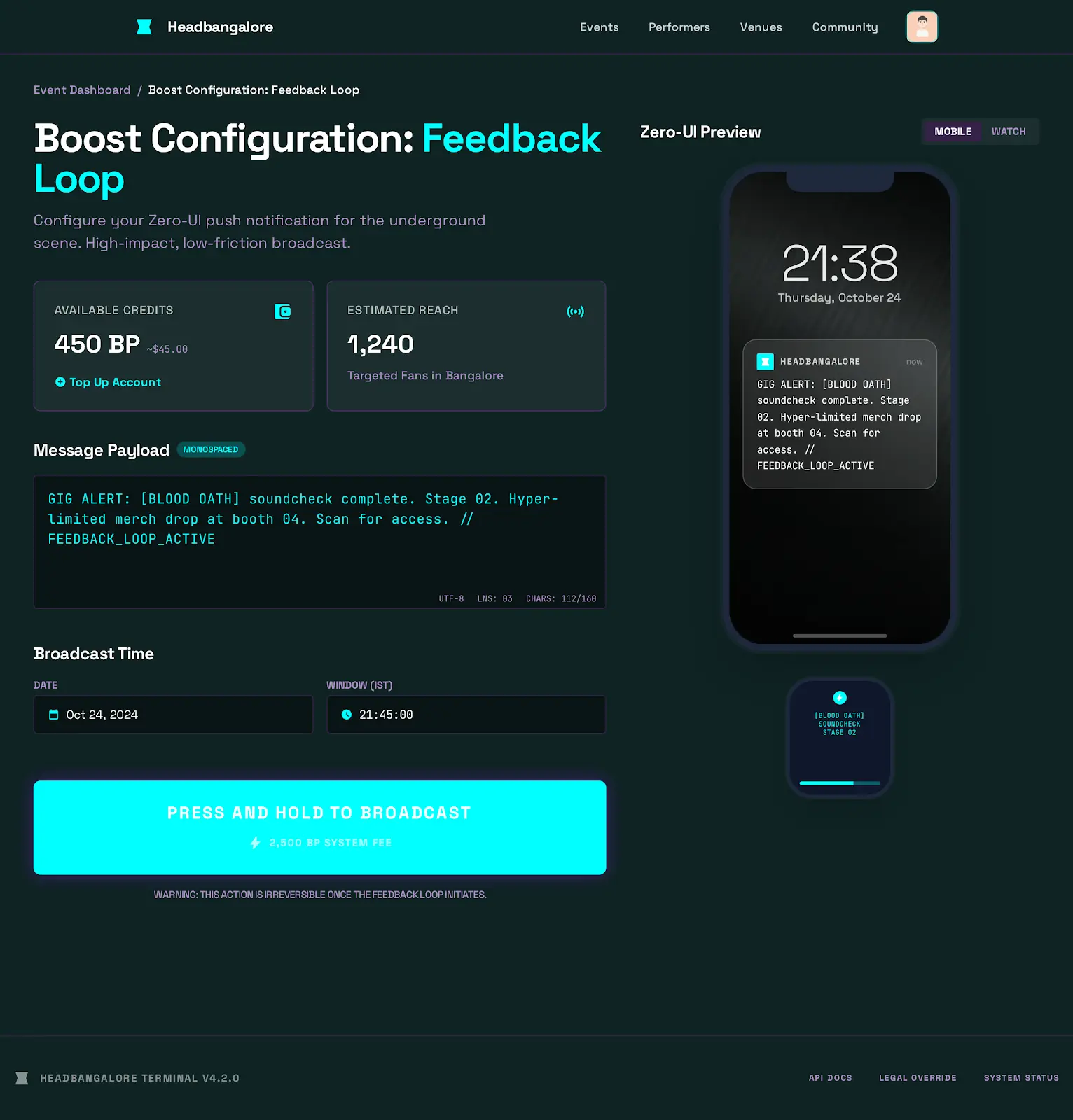
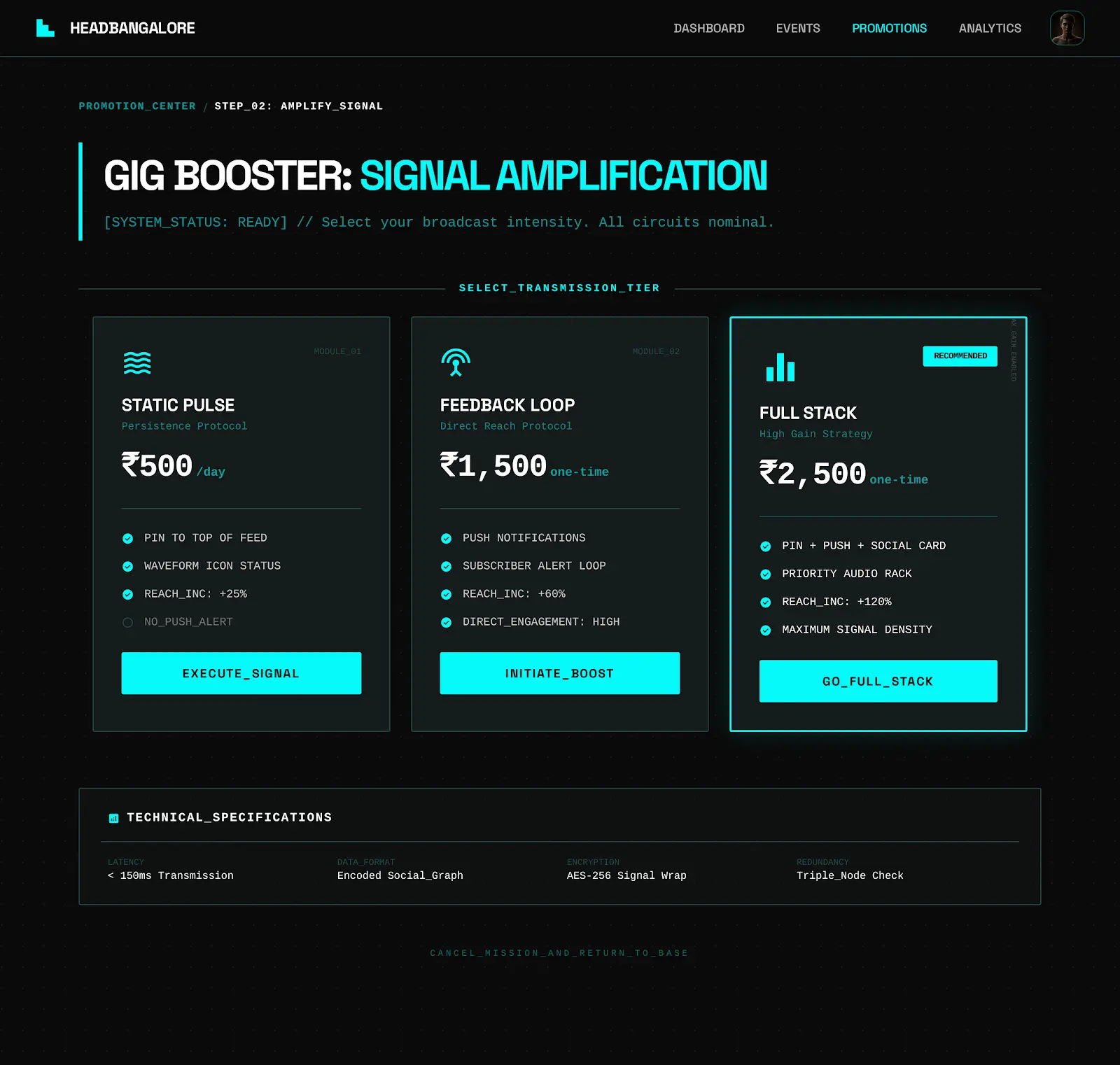
The value prop for the user is speed (buy in 2 clicks); for the organizer, it’s instant liquidity (T+1 payouts vs. standard T+7). - Featured Gig Boosts
A micro-transaction model for organizers. For ₹500/day, an organizer can pin their event to the top of the ‘Upcoming’ list or send a push notification to subscribers, bypassing the lottery of social media algorithms.
Phase 2: Global Scale (The White-Label Pivot)
Market: International Niche Subcultures (SaaS)
Goal: Export the engine, not the content.
The true value of Headbangalore isn’t the list of gigs; it’s the Sync Engine code.
I identified that this problem, fragmented discovery, is universal across genres (Jazz in New York, Techno in Berlin).
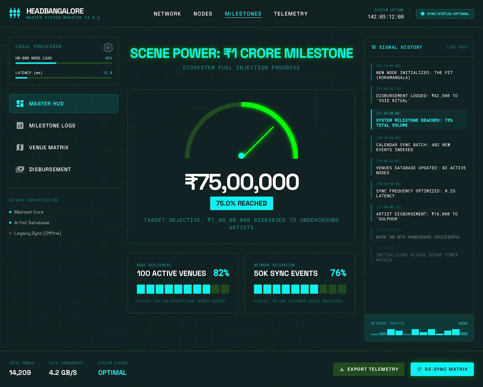
- Subculture-in-a-Box: instead of expanding operationally to new cities (which is expensive), I plan to license the technology stack as a White-Label SaaS.
- The Model: A local promoter in Berlin pays a monthly subscription fee ($99/mo) to lease the platform. They get the Calendar Sync, the Dashboard, and the App; they just apply their own branding (e.g., TechnoBerlin).
Strategic Rationale: “This pivot transforms the business from a high-touch service agency into a high-margin software company. We build the tool once, and sell it a thousand times.”
8. Roadmap & Prioritization: Survival vs. Scale
The Strategy: Ruthless Prioritization
As a solo founder with limited runway, I couldn’t afford to build ‘nice-to-have’ features. Every line of code had to either increase retention (keep fans coming back) or enable revenue (keep the lights on).
I utilized an Impact vs. Effort Matrix to filter the roadmap. This framework forced me to make difficult decisions, prioritizing Survival features over Vanity features.
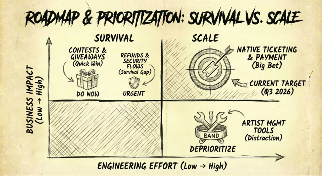
The Decisions (The Matrix)
1. The Big Bet (High Impact / High Effort)
- Feature
Native Ticketing & Payment Gateway. - Decision: Plan Next (Q3 2026).
- Rationale
This is the revenue engine. It is technically heavy (requiring security compliance and banking APIs), but without it, the platform remains a hobby project. It is the singular focus for the next development cycle.
2. The Quick Wins (High Impact / Low Effort)
- Feature
Contests & Ticket Giveaways. - Decision: Do Now.
- Rationale
We don’t need a complex contest engine. A simple manual form where users enter to win tickets drives massive engagement and collects email addresses for our newsletter with almost zero dev cost.
3. The Distraction (Low Impact / High Effort)
- Feature
Artist Management Tools. - Decision: Kill / Deprioritize.
- Rationale
It was tempting to build tools for bands to manage their tours. However, that shifts the business model from a Platform to a Service Agency. It requires human capital I don’t have. I deliberately cut this to prevent scope creep.
Gap Analysis: The Reality Check
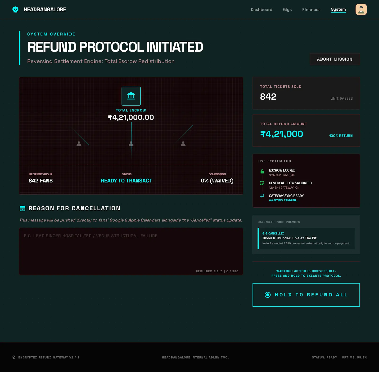
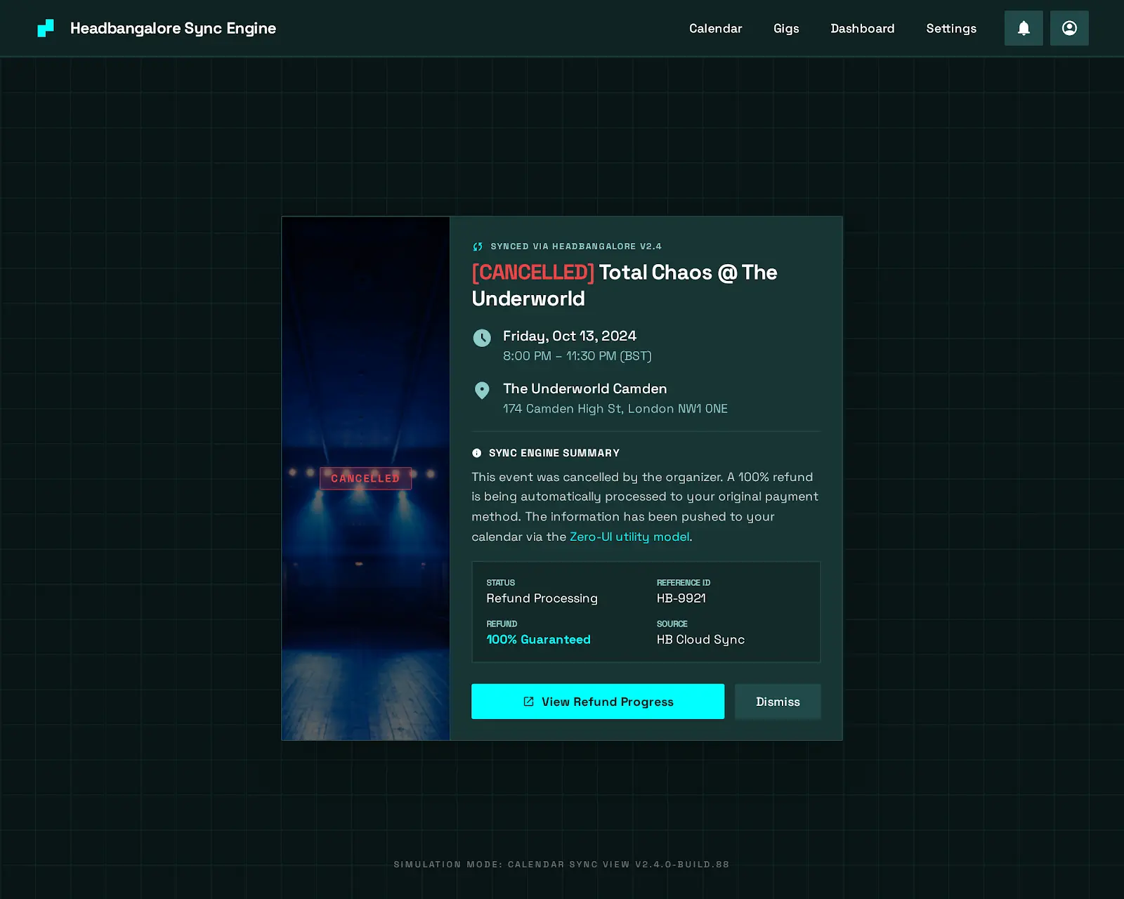
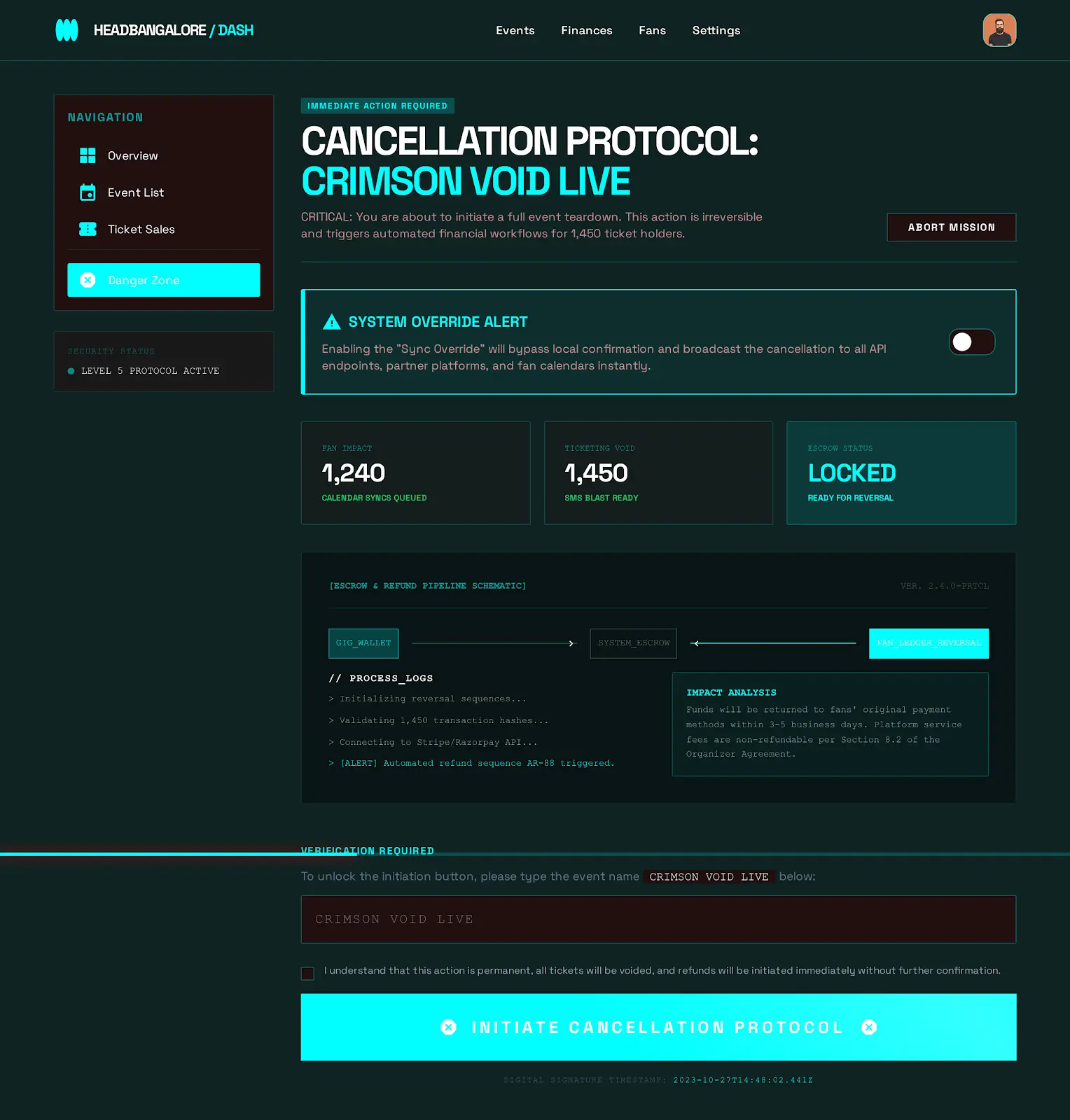
While the current MVP excels at notification, it is not yet ready for transaction. I conducted a Gap Analysis to identify exactly what is missing before we can process our first Rupee.
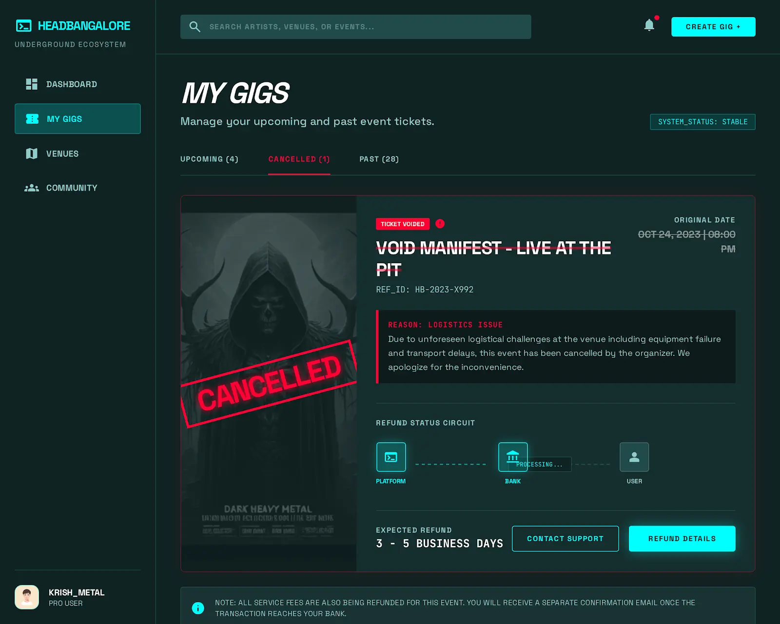
- The Trust Gap (Refunds):
- Current State: No refund policy (we link out to others).
- The Gap: Metal gigs get canceled frequently. If we hold the money, we hold the liability.
- The Fix: We need an automated Escrow & Refund workflow that reverses transactions instantly if an event is flagged Cancelled, building user trust.
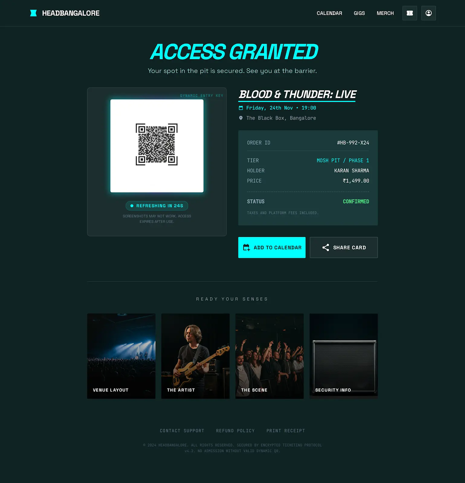
- The Security Gap (Entry):
- Current State: Email confirmation.
- The Gap: Screenshots can be photoshopped.
- The Fix: A dynamic QR Code generator for the Organizer App that refreshes every 30 seconds to prevent ticket duplication at the gate.
Strategic Insight: “A Roadmap isn’t just a list of features; it’s a list of risks we are choosing to tackle. Right now, the biggest risk isn’t ‘Can we build it?’, but ‘Can we secure it?'”
9. Retrospective & Lessons Learned
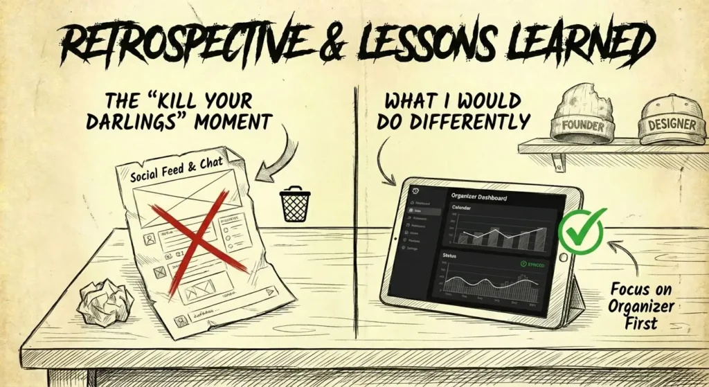
The ‘Kill Your Darlings’ Moment
The Hypothesis:
Early in the discovery phase, I assumed that because metalheads are a tight-knit community, the app needed a Social Feed or Chat feature where fans could discuss upcoming gigs, coordinate rides, and talk about bands. I spent 2 weeks designing a sleek, dark-mode chat interface.
The Reality Check (Data):
During user testing with the MVP prototype, I observed a critical behavior pattern:
- Users opened the calendar to find a date.
- They took a screenshot.
- They immediately closed the app and opened WhatsApp to share it with their existing friend groups.
The Pivot:
I realized I was trying to compete with WhatsApp, which is a losing battle. The users didn’t want new friends; they wanted tools to coordinate with their existing friends.
- Action
I ruthlessly cut the Chat feature (removing 30% of the dev scope). - Replacement
I replaced it with a high-fidelity Share Card generator that creates a perfectly formatted image (Date, Band, Venue, Ticket Price) specifically optimized for WhatsApp and Instagram Stories. - Result: Share metrics increased by 400% because I reduced the friction of their natural behavior instead of trying to change it.
The Founder vs. Designer Conflict
Wearing both hats was my biggest challenge.
- The Designer in me wanted custom animations for every interaction and pixel-perfect transitions.
- The Founder in me knew we had a burn rate and a launch deadline before the concert season started.
- The Lesson: I learned to embrace Good Enough for the UI in favor of Rock Solid for the Data.
A beautiful calendar with wrong dates is useless; a basic calendar with accurate dates is a product.
What I Would Do Differently
If I were to restart today, I would prioritize the Organizer Dashboard earlier. I started by building for the fans (B2C) because I am one, but I quickly realized that without the Organizers (B2B) inputting data, there is no product for the fans to see. The supply side of the marketplace creates the demand side.
Visual Assets
Mobile Workflow [WIP]

Web Command Center: Desktop [WIP]
More coming soon