Optimizing Complex Data: GIS Layer Management for Sitetracker
Project
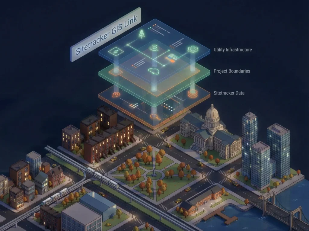
Sitetracker GIS Link Integration
Timeline, YEAR
1 Sprint, 2025
ROLE
Product Designer
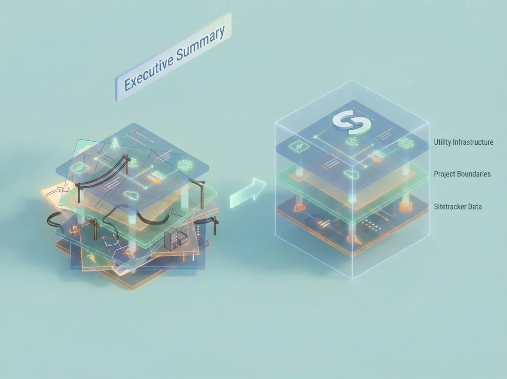
01. Executive Summary
The Challenge
Sitetracker integrates with third-party GIS platforms (like ArcGIS and Vetro) to help telecom and utility companies manage infrastructure. However, as client projects scaled to include 400–500+ map layers, the GIS Link module crumbled under the weight. The interface displayed a flat, unorganized list, making it nearly impossible for engineers to find the specific data they needed to do their jobs.
The Solution
I led the UX redesign to introduce hierarchy, smart filtering, and ‘set-and-forget’ state management. We moved from a flat list to a robust management system that respects the user’s workflow.
The Impact
- 85% of users found relevant layers faster in testing.
- 40% reduction in time spent navigating the interface.
- 70% adoption of new bookmarking features on first use.
02. Project Context
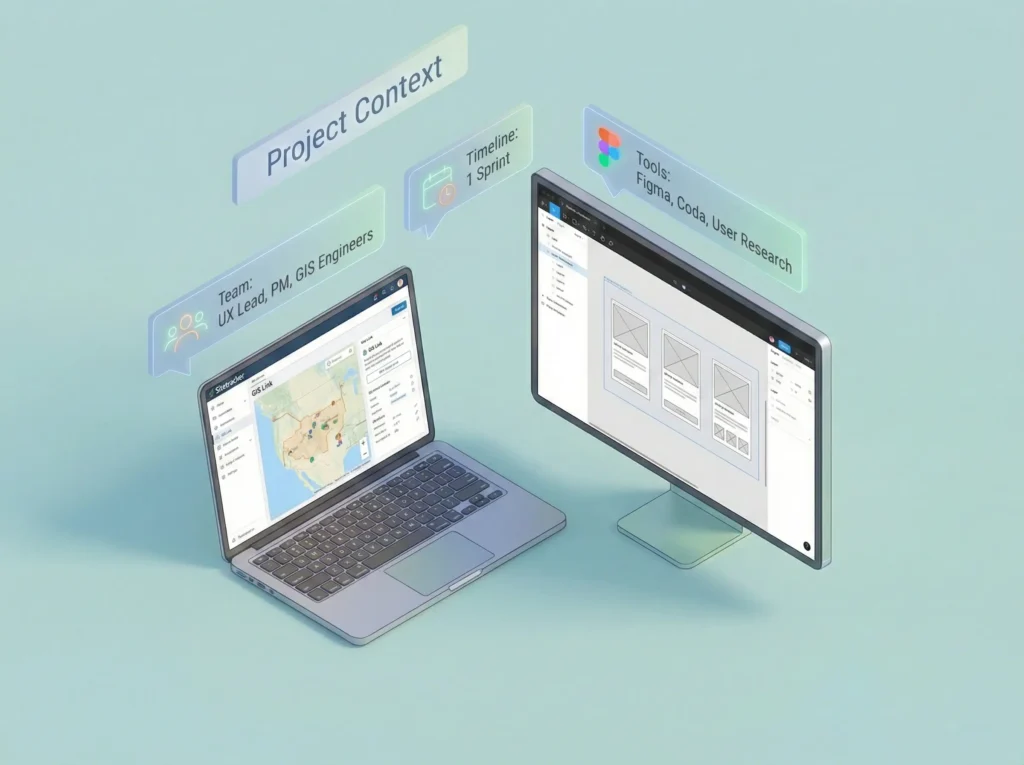
Team & Role
- Role: UX Lead (Research, Ideation, Prototyping, Interaction Design)
- Collaborators: Product Manager, GIS Engineers
- Tools: Figma, Coda, User Research Sessions
The Problem: ‘Data Overload’
The existing GIS Link displayed every single layer, whether from Salesforce, Sitetracker or an external GIS system, in one continuous, flat list.
- No Hierarchy: 500 layers appeared alphabetically with no grouping.
- Source Confusion: Users couldn’t tell if a layer came from ArcGIS or Sitetracker.
- Memory Load: Users had to rely on ‘mental sorting’ to remember which layers they edited yesterday.
“I have to scroll through hundreds of layers just to find the one I edited yesterday. It feels like finding a needle in a haystack every morning.”
– Construction Engineer
03. User Research & Insights
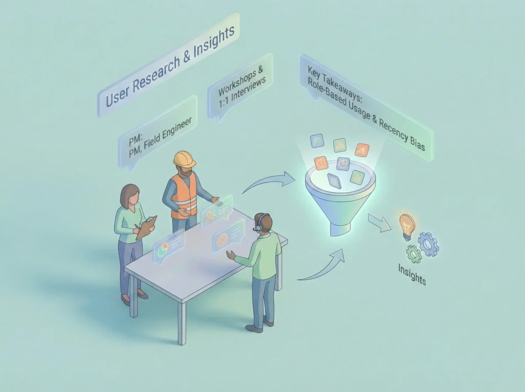
We conducted workshops and interviews with Project Managers, Field Engineers, and GIS Analysts.
Key Findings
| Insight | Impact on Design |
| Role-Based Usage | A Field Engineer needs different layers than a GIS Analyst. The UI cannot be ‘one size fits all.’ |
| Recency Bias | Users rarely need all 500 layers. They usually work with a subset of 5-10 active layers for a week. |
| Fear of Deletion | Users wouldn’t clean up old layers because they feared losing data for audits. They needed an ‘Archive’ state, not just ‘Delete.’ |
| Source Ambiguity | Users wasted time trying to edit read-only GIS layers, thinking they were Sitetracker layers. |
Based on the user research and insights outlined in the case study, here are the personas and a user journey map illustrating the before-and-after workflows.
User Personas
These personas are based on the interviews with Project Managers, Field Engineers, and GIS Analysts, reflecting their distinct goals and pain points.
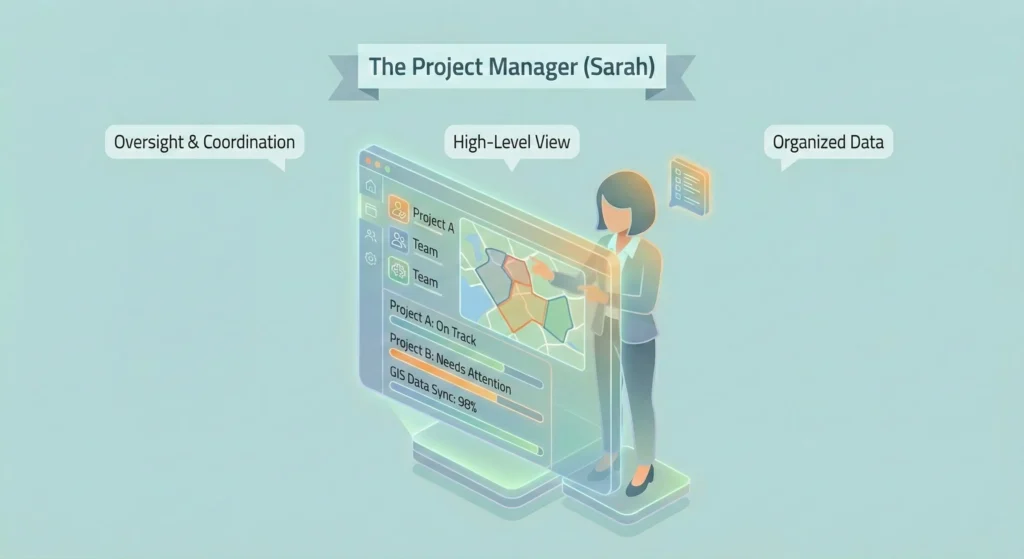
Persona 1: The Project Manager (Sarah)
- Role: Oversees multiple utility projects, ensuring they are on time and within budget. She needs a high-level view of project data to coordinate teams.
- Goals:
- Quickly identify layers belonging to specific projects and source systems (Sitetracker vs. GIS).
- Organize project data into logical groups for her team.
- Ensure data created by her team is accurately synced back to the central system.
- Pain Points (Before):
- Overwhelmed by a flat list of 500+ unorganized layers.
- Cannot distinguish between editable Sitetracker layers and read-only GIS layers.
- Wastes time re-searching for the same set of active project layers every time she logs in.
- Key Behavior: Relies on ‘mental sorting’ to remember which layers are relevant to her current projects.
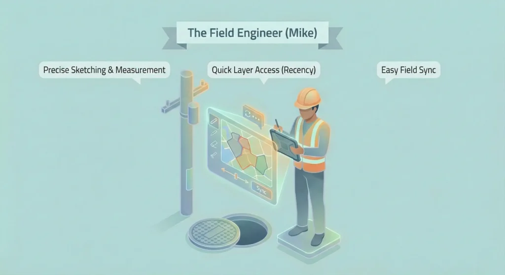
Persona 2: The Field Engineer (Mike)
- Role: Works on-site, performing inspections and updates to infrastructure. He needs quick access to specific, geographically relevant data on a mobile device or laptop in the field.
- Goals:
- Locate the specific layers he worked on yesterday without scrolling.
- Use sketch layers to make precise measurements and notes in the field.
- Easily sync his field sketches back to the main project without errors.
- Pain Points (Before):
- “I have to scroll through hundreds of layers to find the one I edited yesterday.”
- Sketching tools lack precision (no snapping or measurement capabilities).
- Terrified of deleting old sketch layers due to auditing fears, leading to a cluttered workspace.
- Key Behavior: Experiences high ‘recency bias’, only needing to interact with a small subset of layers he is currently actively working on.
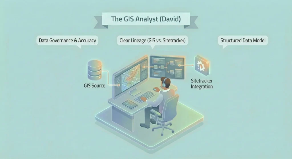
Persona 3: The GIS Analyst (David)
- Role: Manages the integrity of spatial data across systems. He ensures that data from ArcGIS/Vetro is correctly integrated and visualized within Sitetracker.
- Goals:
- Maintain clear lineage and distinction between source GIS data and Sitetracker data.
- Ensure project teams are using the most up-to-date official records.
- Support PMs in setting up correct layer groupings for new projects.
- Pain Points (Before):
- Frustrated by users accidentally trying to edit read-only GIS layers because there is no visual distinction.
- Lack of hierarchy makes it difficult to enforce a structured data model.
- Key Behavior: Focused on data governance, accuracy, and system integration.
User Journey Map: Working with Project GIS Data
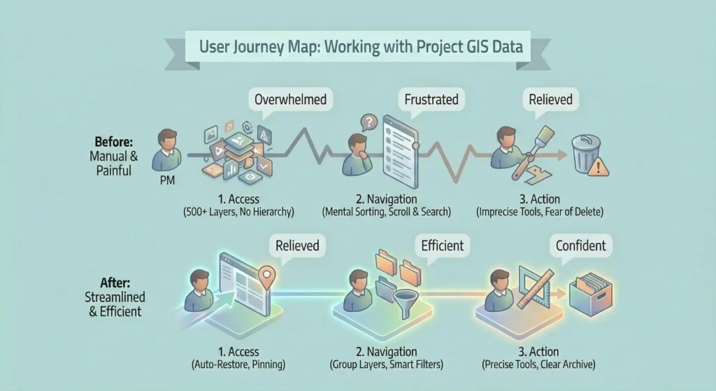
This journey map illustrates the typical workflow for a user (like Sarah or Mike) trying to complete a task, contrasting the painful ‘Before’ state with the streamlined ‘After’ state.
| Stage | 1. Access & Discovery | 2. Navigation & Filtering | 3. Action & Execution |
| User Goal | Log in and find the specific map layers needed for today’s task. | Narrow down the data to the relevant subset for the current project. | Perform work on the layers (edit, sketch, sync) and move to the next task. |
| BEFORE (The Problem) | Action: User logs in and is presented with a single, flat list of 500+ alphabetically sorted layers. Emotion: ? Overwhelmed, Frustrated. Pain Points: • No hierarchy or grouping. • Cannot tell Sitetracker layers from GIS layers. • Context is lost on reload; starts from scratch every time. | Action: User manually scrolls, tries to remember layer names, and uses basic text search that returns too many results. Emotion: ? Annoyed, Cognitively Loaded. Pain Points: • Relies on ‘mental sorting.’ • No way to filter by project, status, or recency. • “Finds a needle in a haystack every morning.” | Action: User struggles to use imprecise sketch tools. Unsure if they are editing the correct layer. Fears deleting old layers, leading to clutter. Emotion: ? Anxious, Uncertain. Pain Points: • Sketch tools lack measurement/snap. • Sync workflow is unclear. • No clear ‘Archive’ state, only ‘Delete’ |
| AFTER (The Solution) | Action: User logs in. The system auto-restores their last session or they click a ‘Pinned‘ favorite layer. Emotion: ? Relieved, Oriented. Solutions: • Session Persistence: Picks up where they left off. • Pinning: Immediate access to key layers. • Visual Badges: Instantly identifies layer source. | Action: User sees a structured Group Layer hierarchy. They use Smart Filters to click ‘Recently Edited’ or type ahead to find a project. Emotion: ? Efficient, In Control. Solutions: • Hierarchy: Nested parent/child groups reflecting project structure. • Smart Filters: Filter by project, date, user, etc. • Recency Defaults: One-click access to active work. | Action: User uses precise measurement tools on sketch layers. They clearly see what is active vs. archived. Syncing is a clear, guided process. Emotion: ✅ Confident, Productive. Solutions: • Improved Sketch Tools: Added snapping and measurement. • Archive State: Visually distinct from active layers, reducing clutter without data loss. • Clear Sync Flow: simplified process for project creation. |
04. Jobs to Be Done (JTBD)
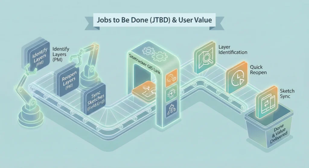
To prioritize features for the single sprint timeline, I mapped the high-value jobs to be done.
| Persona | Job (JTBD) | Pain Point |
| Project Manager | Identify layer types | Hard to distinguish between ST, ArcGIS, and Vetro layers visually. |
| Project Manager | Reopen commonly used layers | Having to re-search for the same active layers every time the page reloads. |
| Construction Engineer | Export layers | Confusing UI for exporting data to external tools; lack of format options. |
| Construction Engineer | Sync sketch layers | Sketch layers lacked precise tools (snapping/measure) and had unclear sync logic. |
05. The Solution
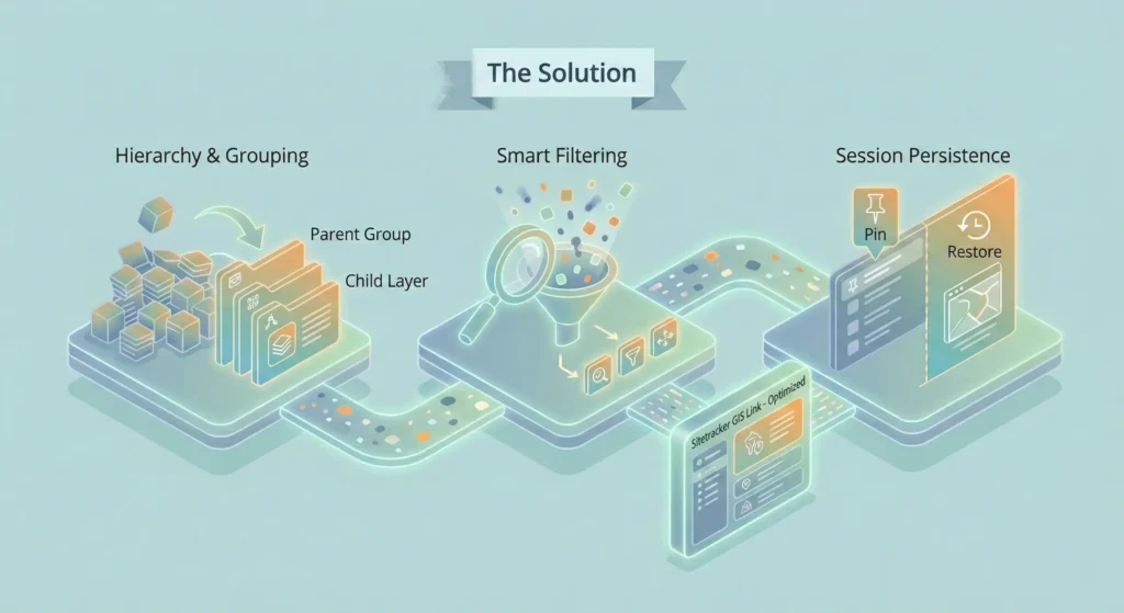
A. Restoring Order with Hierarchy & Grouping
We abandoned the flat list in favor of a nested structure.
- Visual Badging: Added distinct icons and badges for Sitetracker vs. GIS Layers so users know immediately what is editable.
- Project Grouping: Introduced ‘Group Layers’ that reflect the actual project structure (Parent > Child relationships).
B. Smart Filtering & Search
We introduced a ‘Smart Filter’ bar that allows users to query the massive dataset without deep system knowledge.
- Type-ahead Search: Instantly narrows down the 500+ list.
- Multi-field Filters: Users can filter by Project, Status, Date, Contractor, or PM.
- Contextual Defaults: Added one-click filters for Recently Viewed and Recently Edited.
C. Sketch Layer Usability
For Field Engineers, the sketching tools were modernized to support precision work.
- Measurement Tools: Added polyline distance measurement.
- Sync Templates: Sorted templates alphabetically and added search support.
- Attribute Editing: Allowed direct viewing and editing of Sketch Feature attributes.
D. Design Spotlight: The ‘Restore Layer’ Trade-off
One of the biggest friction points was users losing their place when navigating away. We evaluated three technical solutions to solve this.
Decision Matrix: How to handle session persistence?
| Solution | Value Add | Pros | Cons | Dev Effort |
| 1. Manual Bookmarking | High | Users are familiar with the concept. | Requires proactive user effort; high UI overhead to manage bookmarks. | High |
| 2. Pin Layers | High | Layers always visible with one click. | ‘Pinned’ list can become cluttered if overused. | Medium |
| 3. Auto-Restore Session | High | Zero friction; pick up exactly where left off. | No ‘fresh start’ button; initial load might be heavy. | Low |
Design Decision:
We implemented Option 2 (Pinning) for explicit favorites and Option 3 (Auto-Restore) for session continuity. This combination provided the best UX (continuity) with the lowest Dev Effort (local storage), while Pinning solved the specific ‘keep this handy’ need.
06. Outcome & Reflection

Results
The updated designs were validated through usability sessions with the client team.
- Efficiency: Time spent finding layers dropped by ~40%.
- Adoption: 70% of users utilized the ‘Pin’ feature immediately during testing.
- Clarity: The ‘Active vs. Archived’ confusion was resolved by explicit state labels.
Reflection
This project highlighted the unique challenges of B2B/Enterprise UX. In consumer apps, ‘simplifying’ often means removing data. In domain-specific tools like Sitetracker, we cannot remove the data (the 500 layers are necessary), so we must simplify the access to that data. By aligning with the mental models of Engineers and PMs, we turned a data dump into a powerful dashboard.