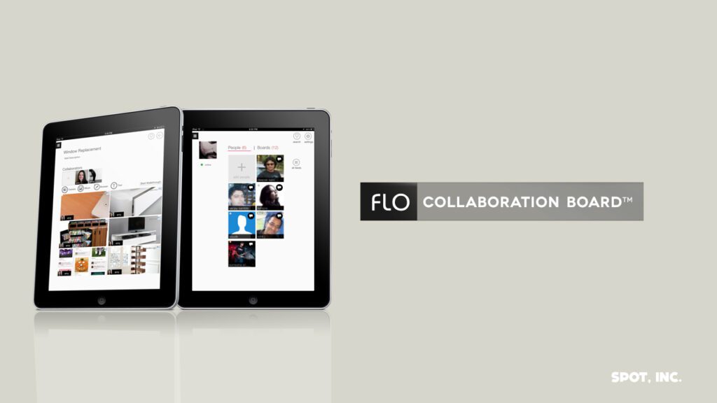
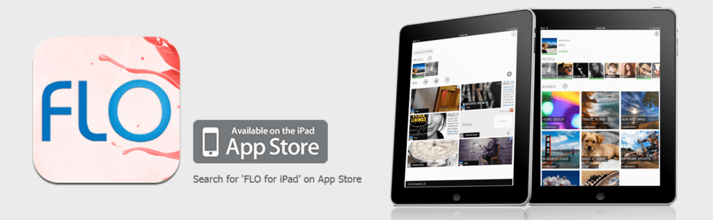
OneFLO (FLO Collaboration Board™)
Project
OneFLO (Spot Inc.)
Timeline
2010–2013
ROLE
UX Design, Art Direction, Copy
Platform: iPad (iOS)
Executive Summary
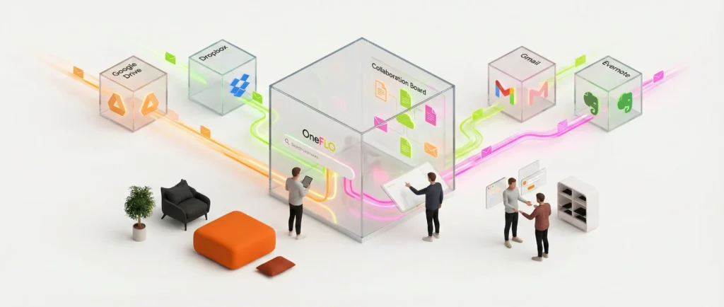
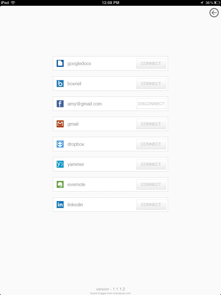
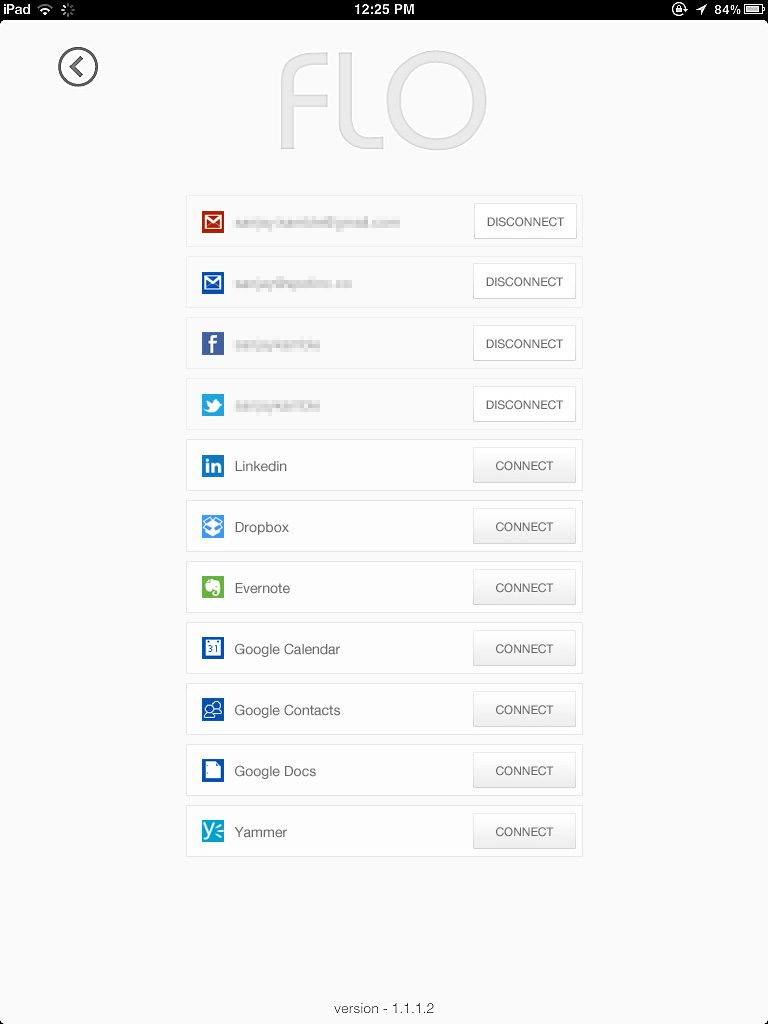
OneFLO (later branded as FLO Collaboration Board™) was a pioneering productivity platform developed by Spot Inc. to solve the growing problem of cloud data fragmentation. As the Visual Experience Designer (UX), I designed a unified interface that allowed users to search, organize, and collaborate on data across disparate services (Gmail, Google Drive, Dropbox, Evernote, etc.) within a single, touch-optimized iPad application.
The Challenge
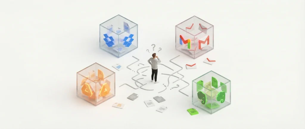
In the early 2010s, the adoption of cloud services was exploding, but this created a ‘silo’ effect. Users’ digital lives were scattered, documents in Dropbox, conversations in Gmail, and notes in Evernote.
The core user problems were:
- Fragmentation: Users wasted time switching between apps to find related files.
- Lack of Context: A file in Dropbox had no semantic link to a related email in Gmail.
- Collaboration Friction: Collaborating on a project required managing permissions and communication across multiple different platforms.
The Solution
We developed OneFLO, a ‘virtual filesystem for semantic metadata’. Instead of moving files, the app indexed them to create a unified view. The UX strategy focused on three pillars: Aggregation, Semantic Context, and Real-Time Collaboration.
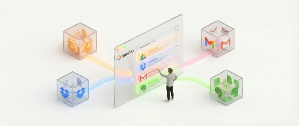
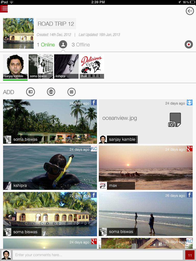
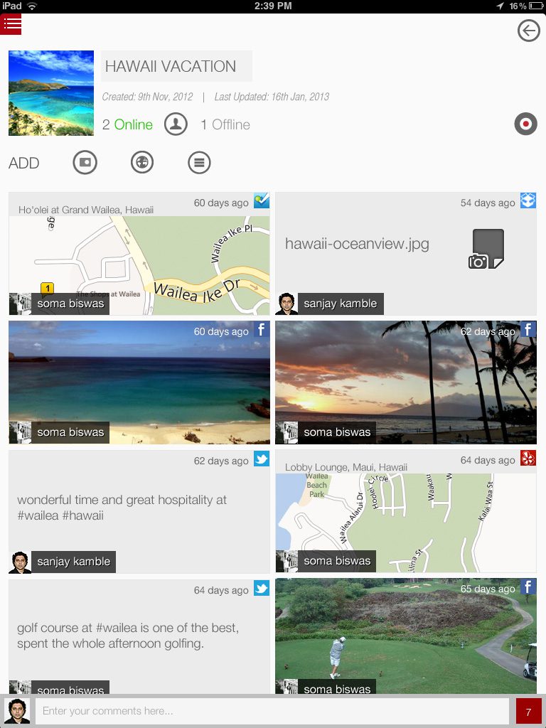
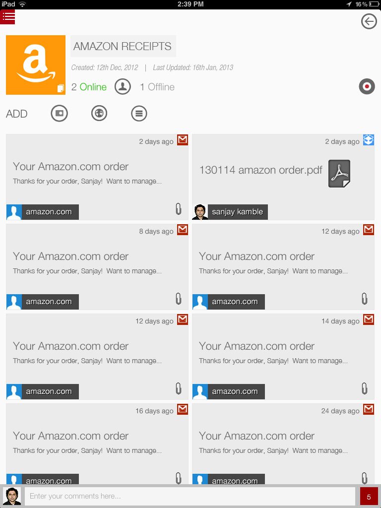
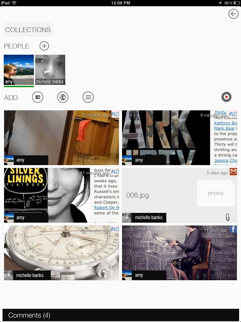
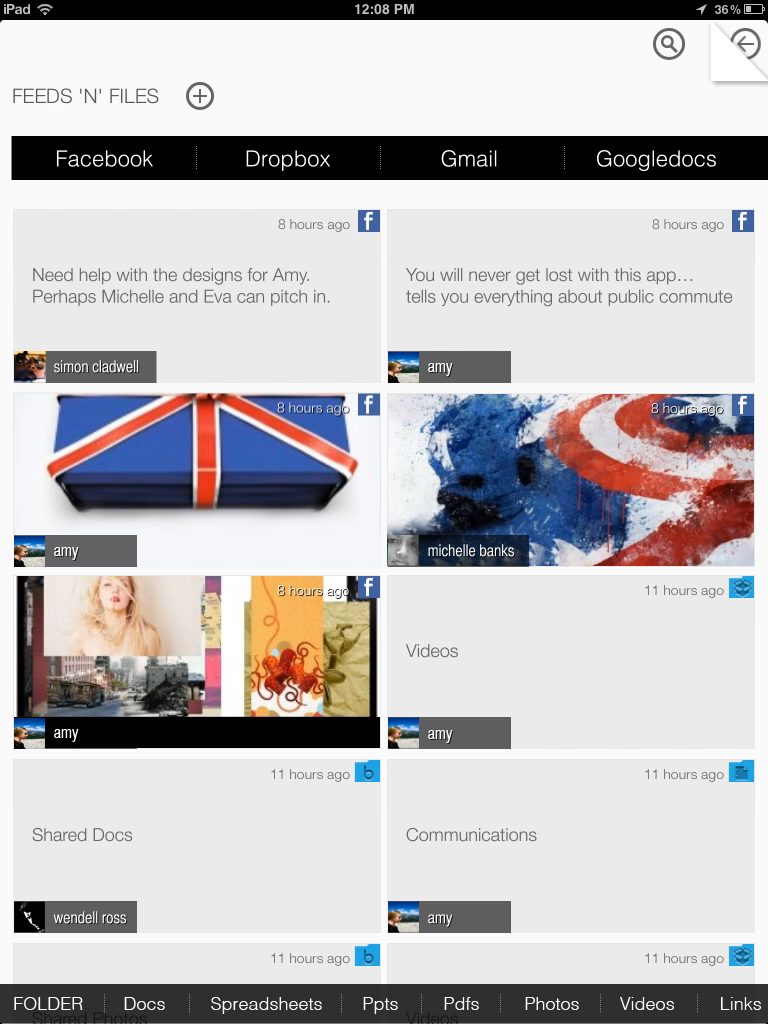
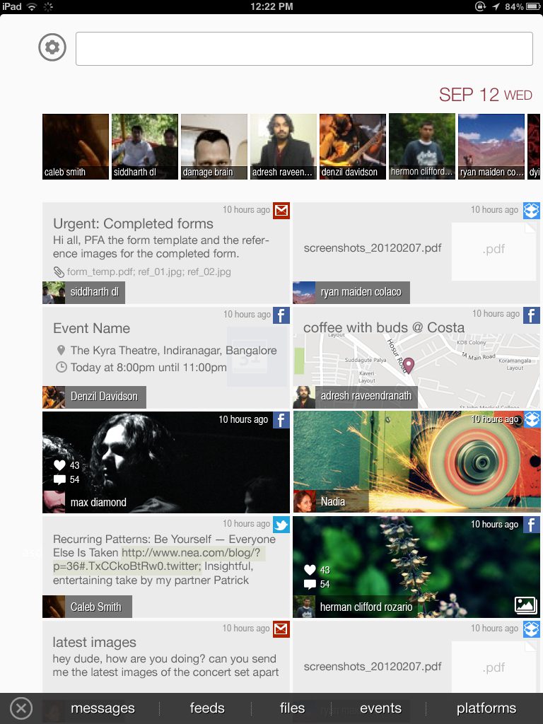
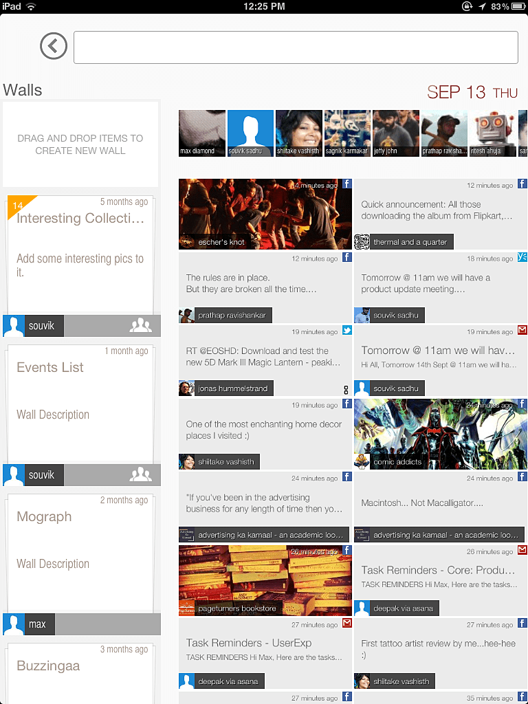
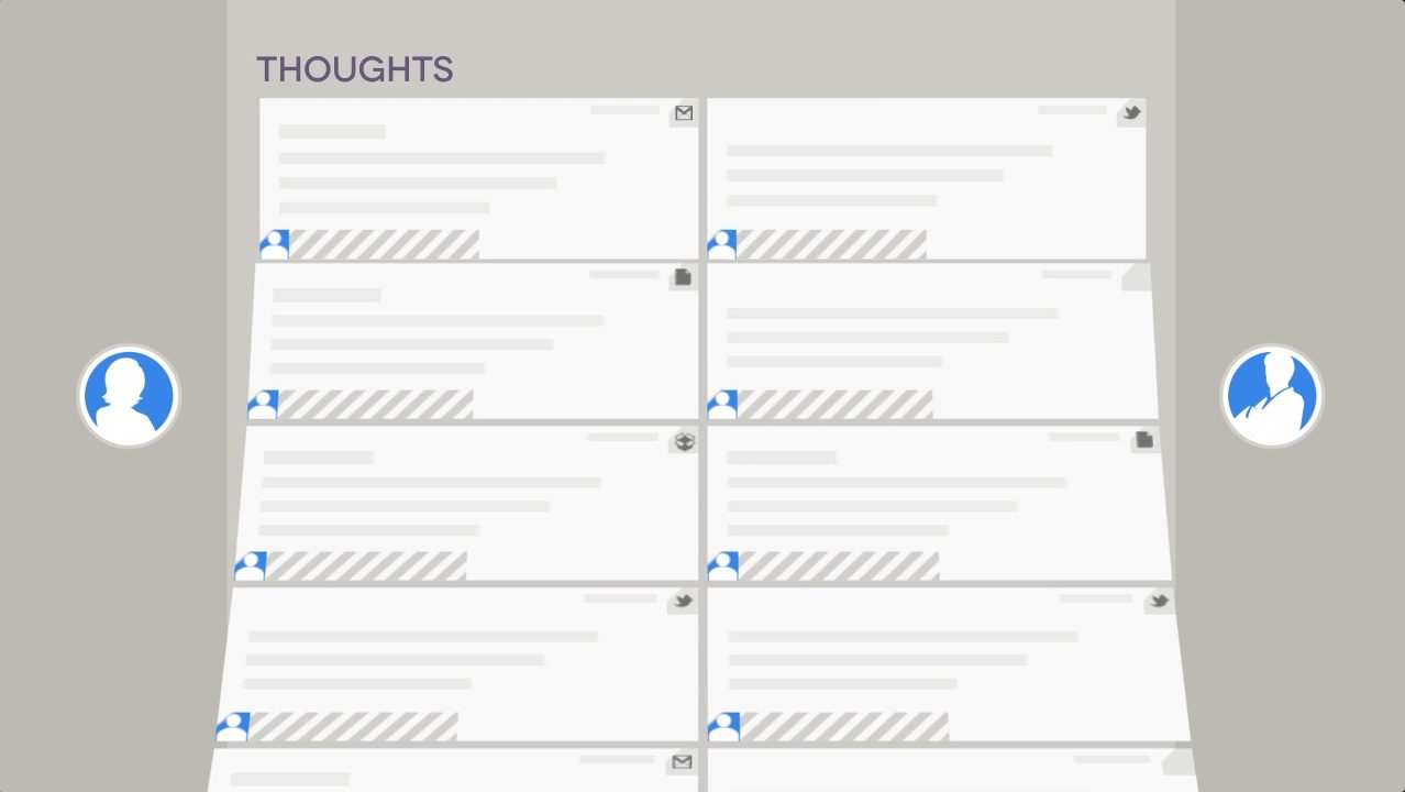
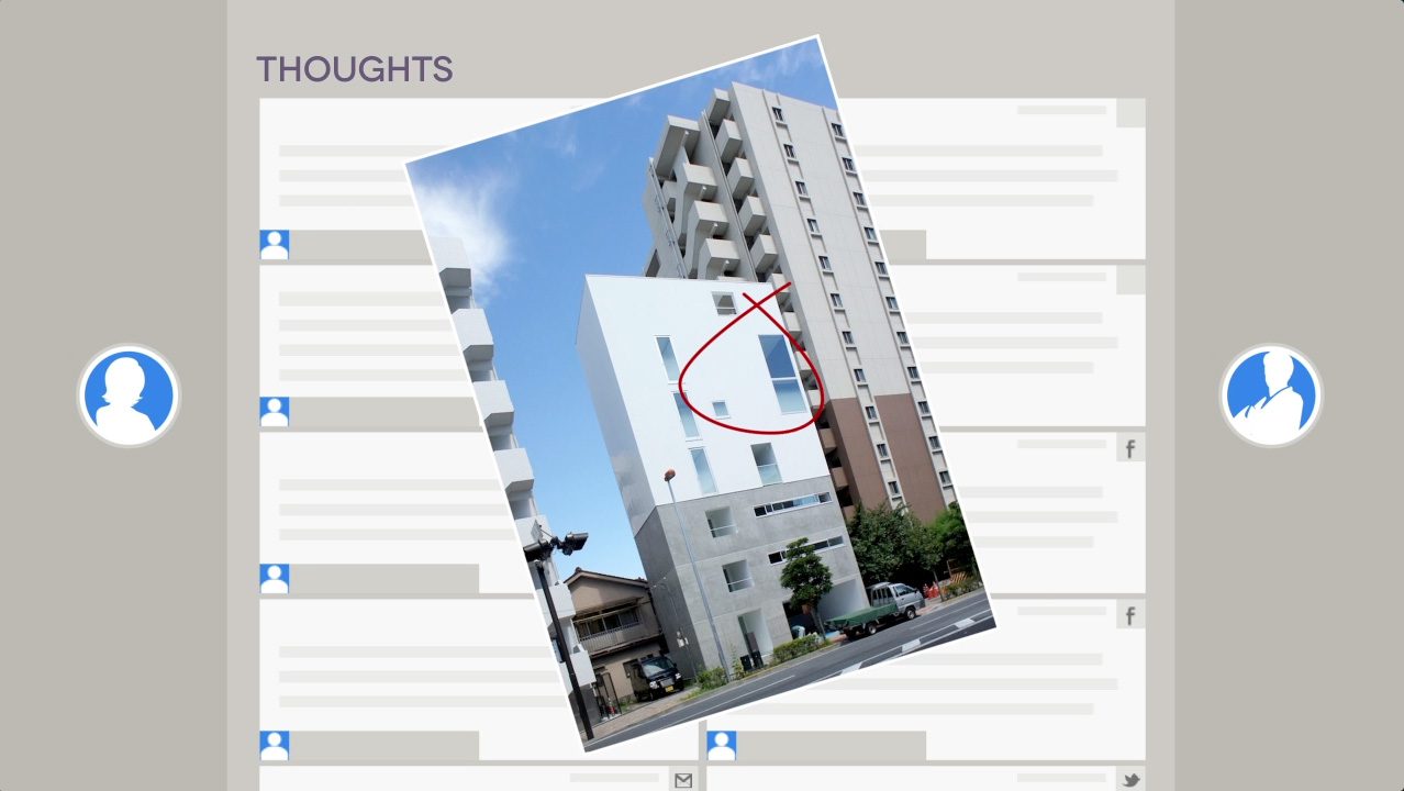
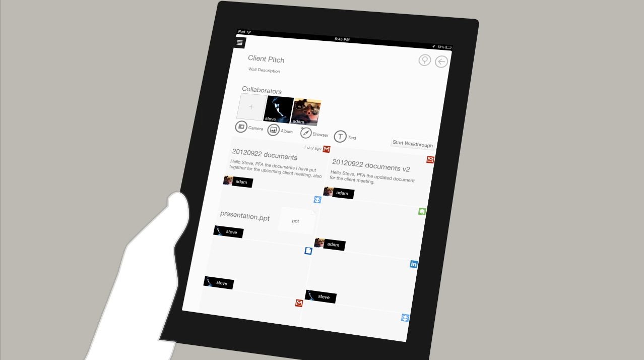
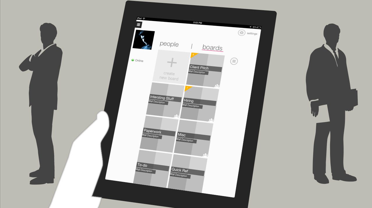
1. Unified Cloud Search & Aggregation
The primary design challenge was normalizing data from vastly different sources (e.g., a Tweet vs. a PDF in Drive) into a cohesive visual language.
- Design Solution: I designed a card-based grid interface that treated all data types as equal ‘objects’. This allowed users to view a LinkedIn profile next to a Google Doc without visual dissonance.
- Result: A ‘single pane of glass’ experience where users could search once and retrieve results from every connected service.
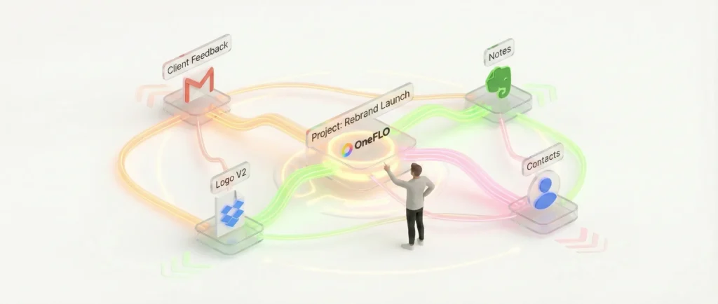
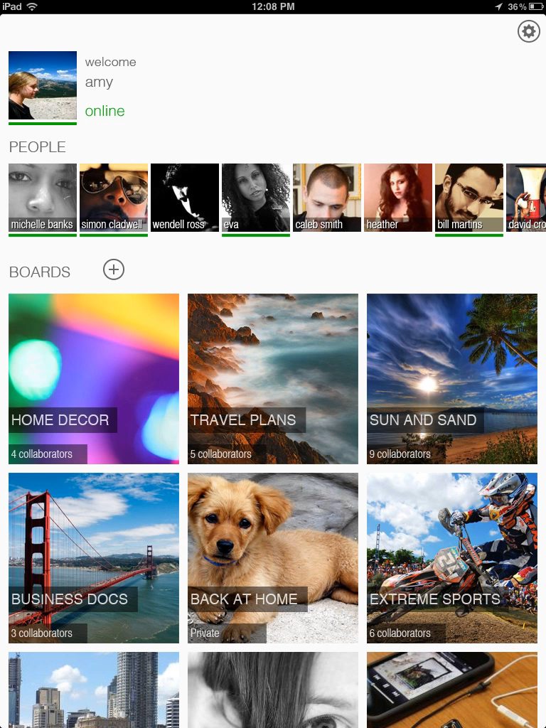
2. Semantic Organization (The Graph Model)
Unlike traditional folder structures, OneFLO used a graph-based backend to link entities.
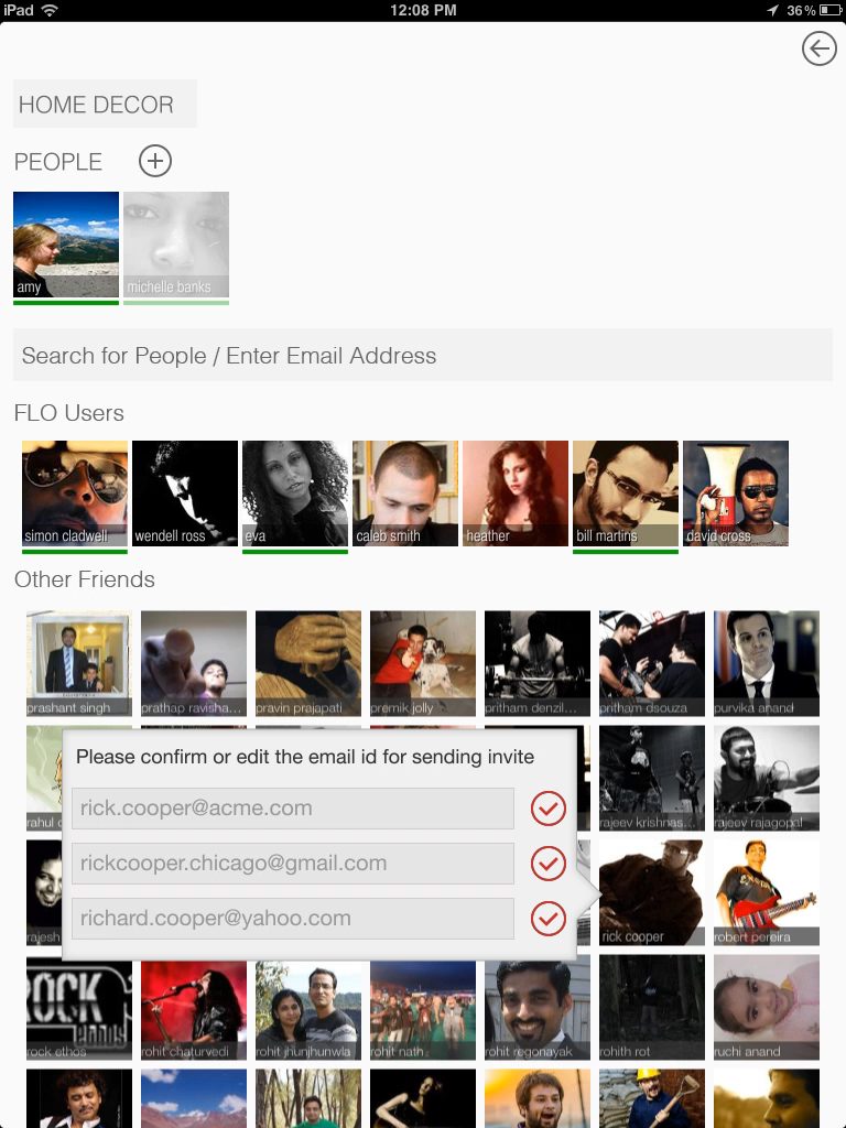
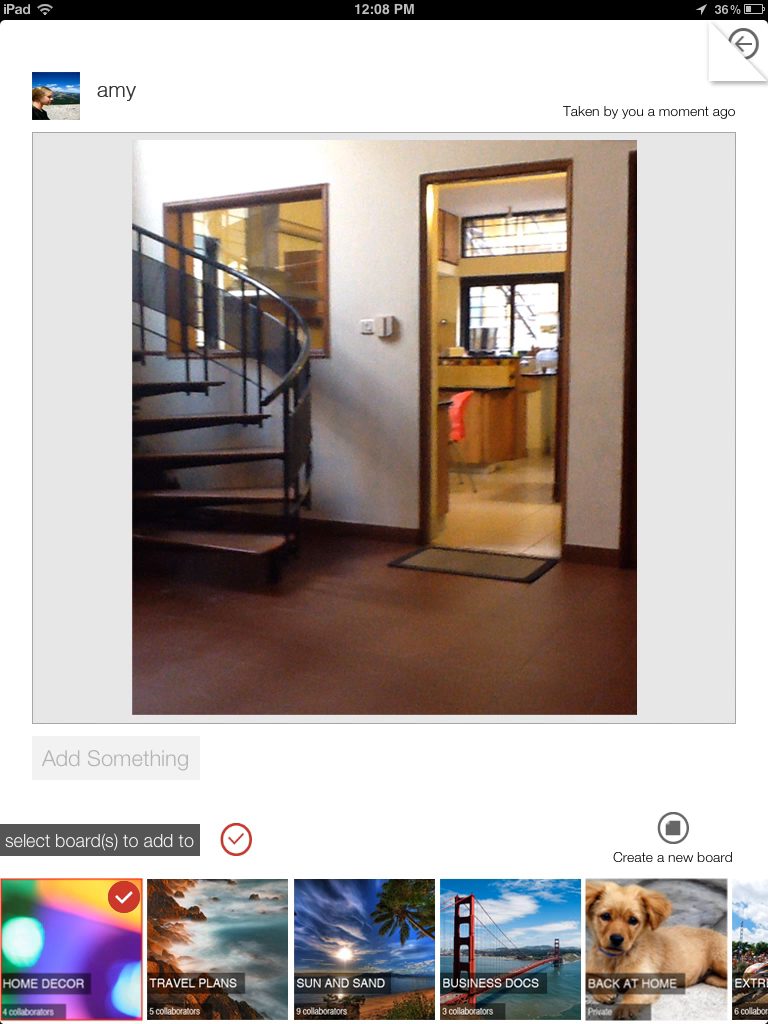
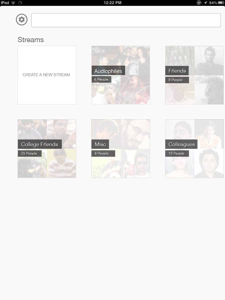
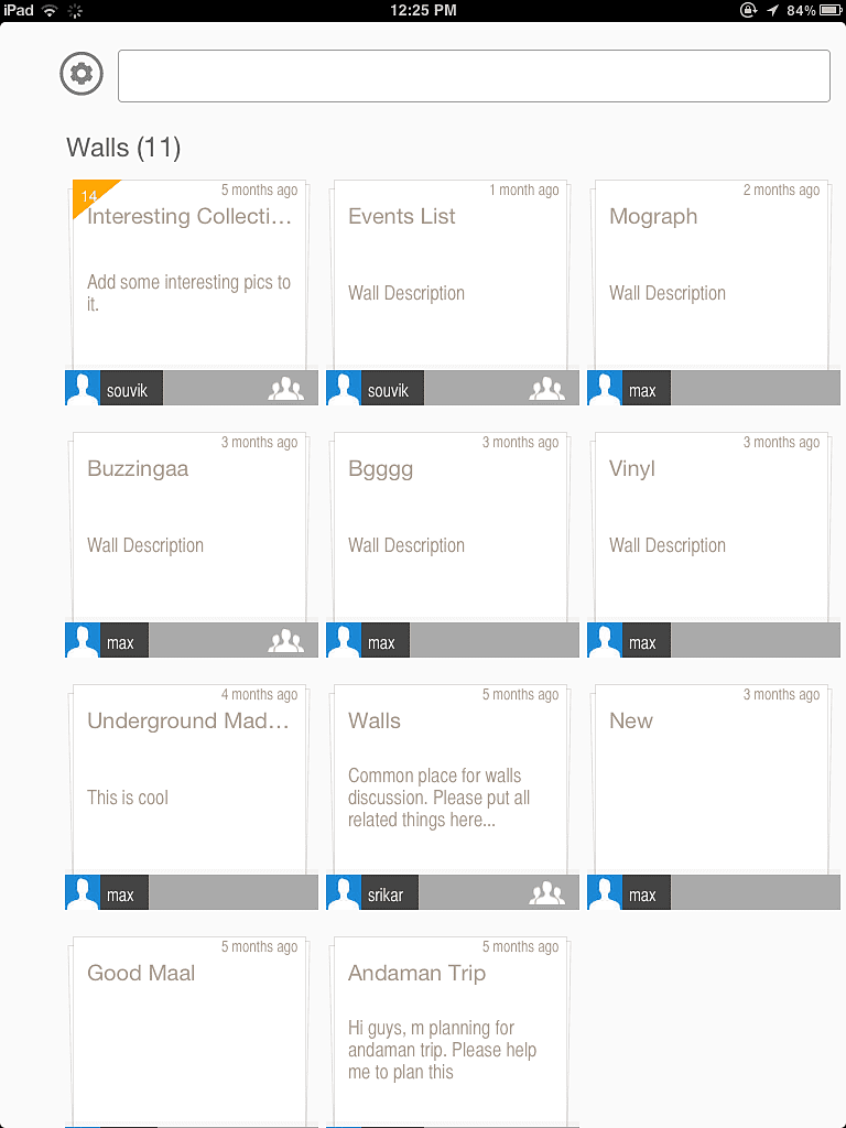
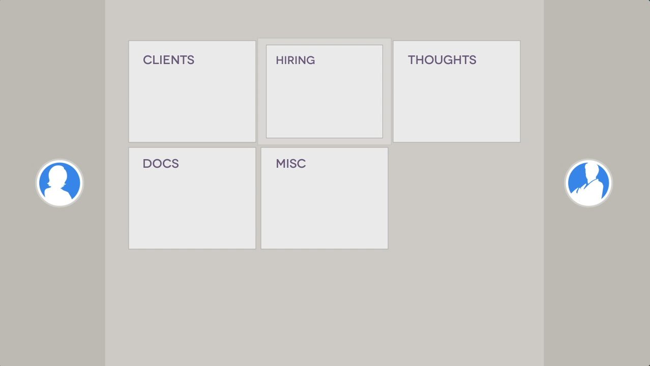
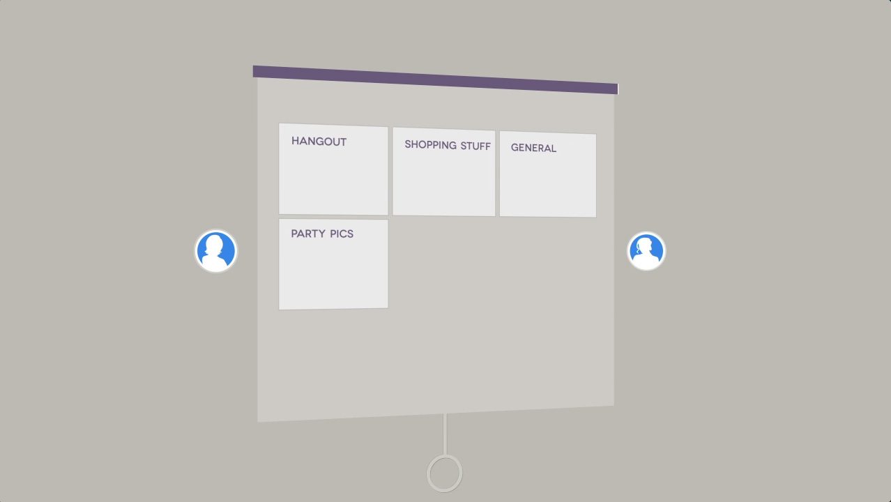
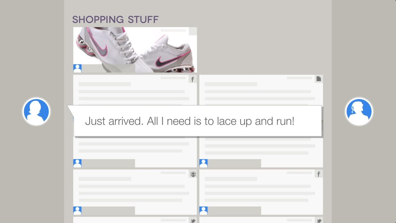
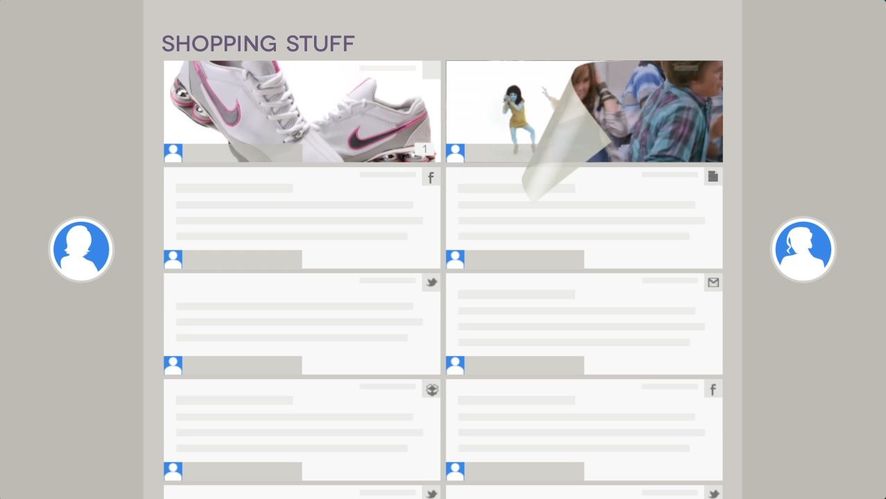
- Design Solution: We moved away from rigid directory trees. Instead, I designed flexible “stacks” and workspace boards where users could group items by topic, project, or idea, regardless of where the file physically lived.
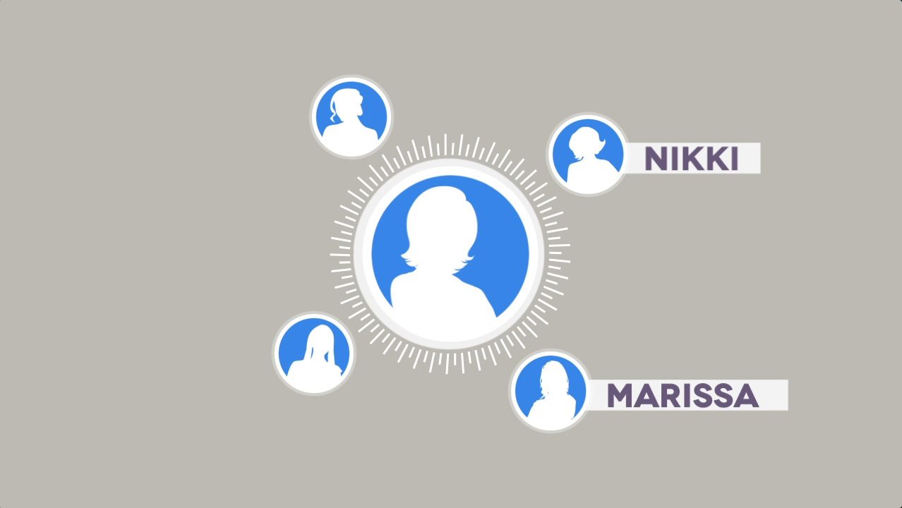
- Feature Highlight: The system automatically identified and merged duplicate entities (e.g., recognizing that ‘John Smith’ in contacts is the same ‘John Smith’ in an email thread), reducing cognitive load for the user.
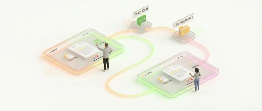
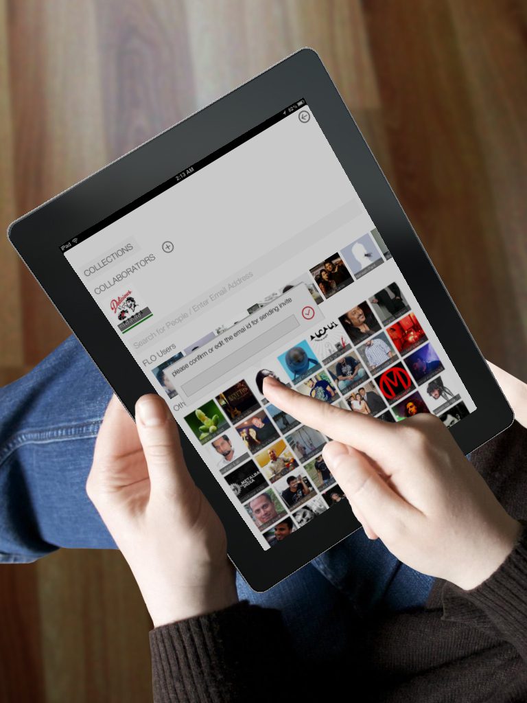
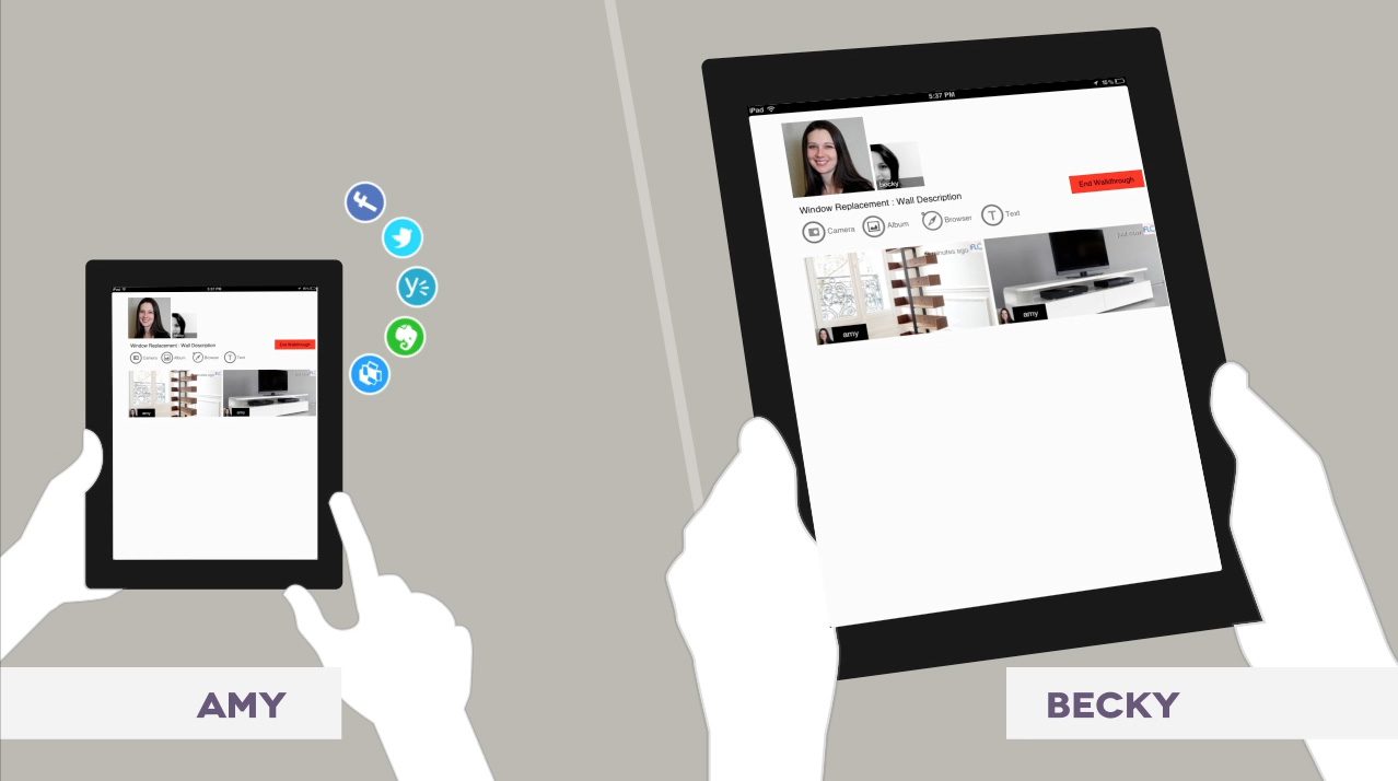
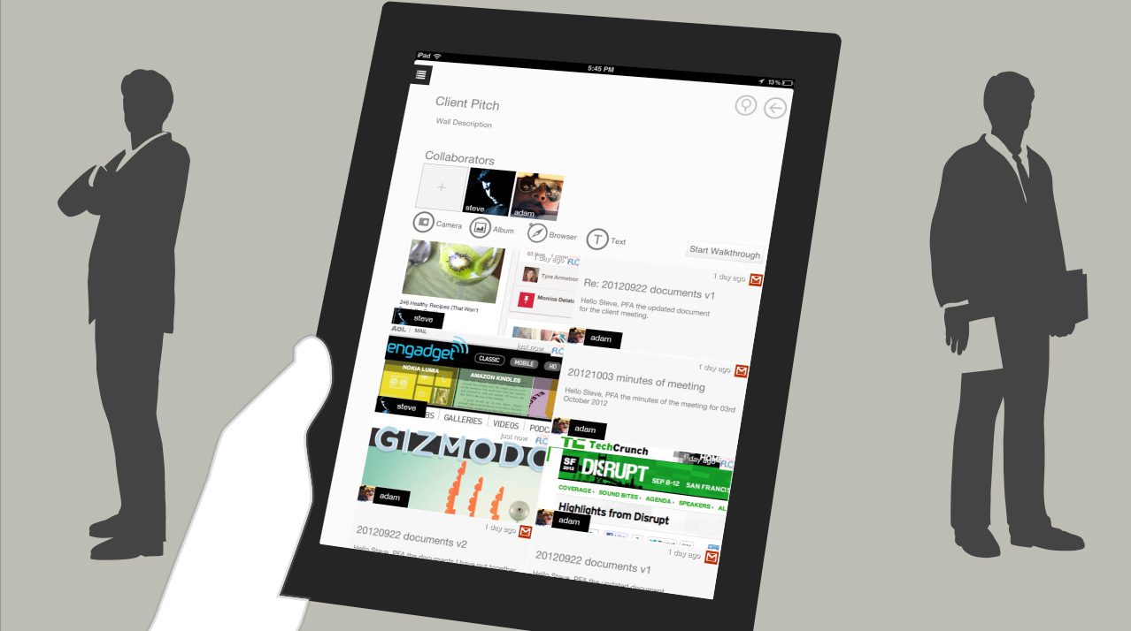
3. Real-Time Collaboration on iPad
Targeting the iPad required a move away from mouse-heavy interactions toward fluid, tactile gestures.
- Design Solution: Leveraging the XMPP protocol, I designed real-time collaboration features that felt instant. We introduced ‘Walkthroughs’, a mode where users could guide others through a board in real-time, syncing their viewports.
- Interaction Design: The UI relied heavily on drag-and-drop mechanics for organizing stacks and ‘flicking’ content to share it, utilizing the iPad’s native strengths.
Competitive Analysis (2010–2013)
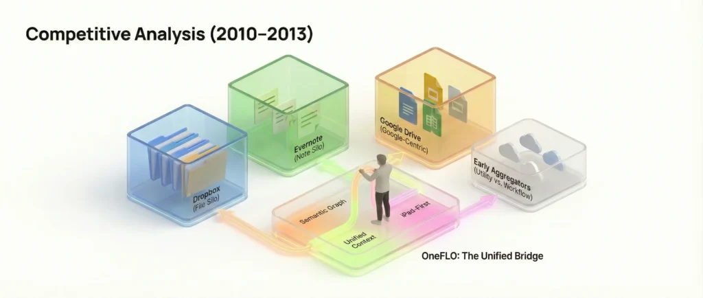
During this period, the ‘Cloud Wars’ were primarily fought over storage volume rather than interoperability. Most competitors were building walled gardens (silos), whereas OneFLO’s strategy was to build bridges (aggregation).
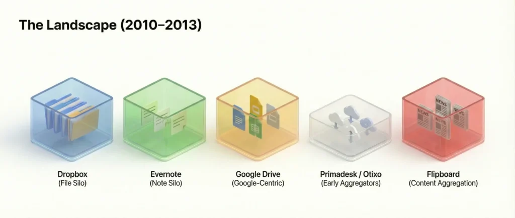
The Landscape
| Competitor | Core Value Prop | The Limitation (The Gap OneFLO Filled) |
| Dropbox | ‘Your files, anywhere’. The gold standard for file sync. | Strictly a File System. It was a rigid folder tree. It couldn’t see your emails or Evernote notes, and it lacked visual context (just a list of filenames). |
| Evernote | ‘Remember Everything’. The dominant diverse-media scrapbook. | A Silo. Great for capturing new notes, but terrible at managing existing external files (like a PDF in Drive or an email in Gmail) without duplicating them. |
| Google Drive (Launched 2012) | Real-time document collaboration. | Google-Centric. At launch, it prioritized Google Docs formats. It wasn’t a neutral ground for other file types or services. |
| Primadesk / Otixo | Early cloud aggregators (launched ~2011/2012). | Utility vs. Workflow. These were essentially ‘Finder windows for the cloud’. They allowed moving files from A to B but lacked the semantic workspace layer (Boards/Stacks) that OneFLO offered for actual creative work. |
| Content aggregation (News). | Consumption Only. Flipboard proved that touch-based aggregation was beautiful, but it was for reading news, not managing enterprise data. OneFLO applied this visual polish to productivity. |
Market Trends
Tablet sales will blow past PC sales in a couple of years, and tablet market continues to be almost totally dominated by iPad**. Mobile is already the dominant mode of consumer broadband connectivity in the world, and the growth of mobile will lead to more internet usage as well as new applications.
So far iPad has mostly been a pure entertainment device, but it is right now in the middle of the shift towards a productivity device with the cloud connectivity enabling new and powerful use-cases. And the general trend towards consumerisation of IT and BYOD is going to push it faster in that direction.
**Reference: State Of The Internet: 2012 – Henry Blodget
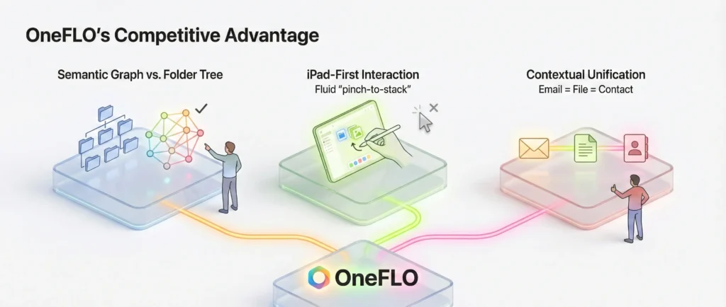
OneFLO’s Competitive Advantage
- Semantic Graph vs. Folder Tree: While Dropbox forced users to think in hierarchies (Folder A > Sub-folder B), OneFLO allowed Graph-based organization. A single file could exist in a ‘Project Board’, a ‘Client Stack’, and a ‘To-Do List’ simultaneously without duplication.
- iPad-First Interaction: Competitors like Otixo were largely web-ports. OneFLO was native iOS, utilizing multitouch (pinch-to-stack, flick-to-share) which made file management feel tactile rather than administrative.
- Contextual Unification: OneFLO was the only tool that treated an Email (communication) and a File (artifact) as equal, linkable objects on the same canvas.
User Journey Map
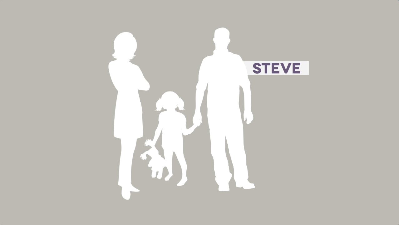
Persona: Alex, a Creative Director at a mid-sized agency.
Scenario: Alex is managing a rebrand launch. Assets are scattered: the client sends feedback via Gmail, the design team uploads mockups to Dropbox, and strategy notes live in Evernote.
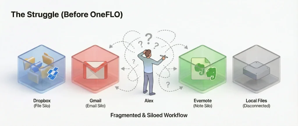
Phase 1: The Struggle (Before OneFLO)
- Trigger: Alex needs to review the latest mockup against the client’s email feedback.
- Action: Opens Dropbox app to view the image. Remembers the client asked for a specific change, closes Dropbox, opens Mail app. Searches for the email. Reads it. Switches back to Dropbox.
- Friction: ‘Context switching’ kills his flow. He can’t see the feedback and the image side-by-side. He has to take a screenshot of the email and upload it to Dropbox just to keep them together.
- Emotion: Frustrated, scattered, inefficient.
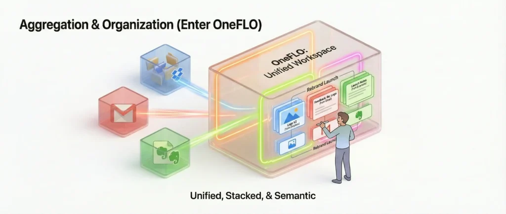
Phase 2: Aggregation & Organization (Enter OneFLO)
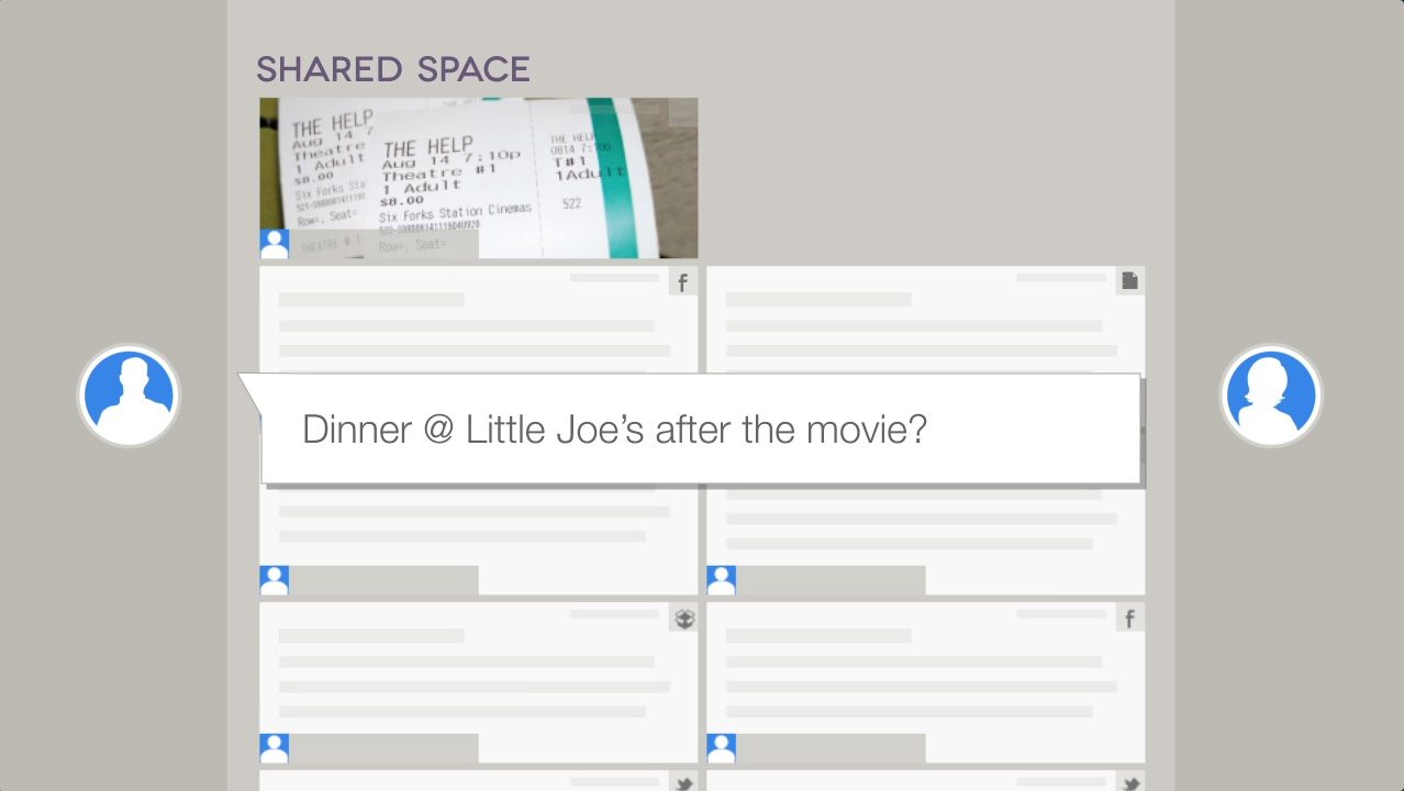
- Action: Alex opens OneFLO on his iPad. He creates a new board: ‘Rebrand Launch’.
- Search: He types ‘Logo V2’ into the OneFLO universal search. The system pulls the mockup from Dropbox and the related feedback thread from Gmail instantly.
- Organization: He drags the mockup onto the canvas. He drags the email thread right next to it. He ‘pinches’ them together to create a Stack.
- Semantic Link: He adds a note from Evernote into the stack. Now, all three disparate sources are visually grouped as one ‘task’ without moving the actual files.
- Emotion: In control, organized.
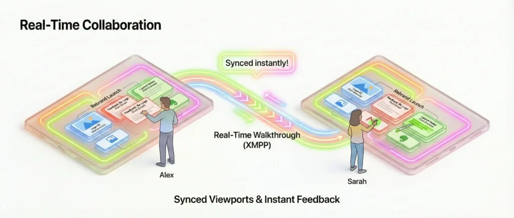
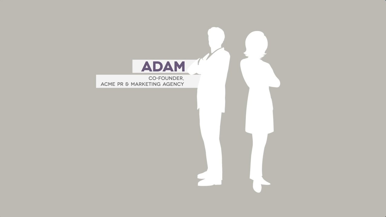
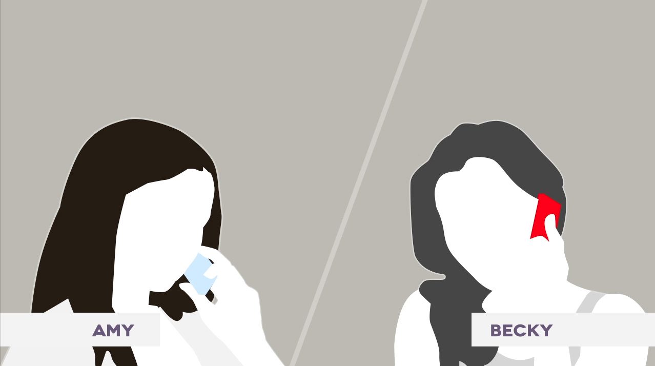
Phase 3: Real-Time Collaboration
- Trigger: He needs to show this stack to the Account Manager, Sarah, who is in another city.
- Action: He taps ‘Start Walkthrough’. Sarah accepts the invite on her iPad.
- Interaction: The screens sync. Alex physically drags the email ‘card’ to the center of the screen. On Sarah’s screen, the card slides to the center instantly. He highlights a sentence in the email and points to the logo.
- Outcome: They agree on the changes in 2 minutes.
- Emotion: Connected, productive, impressed.
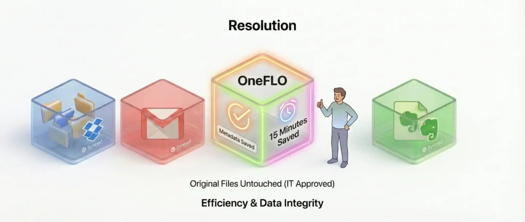
Phase 4: Resolution
- Action: Alex closes the board. The metadata changes are saved in OneFLO, but the original files remain untouched in their respective clouds, keeping the IT department happy.
- Benefit: Alex saved ~15 minutes of app-switching and ensured 100% alignment on the feedback.
Visual Design & Art Direction
As Visual Experience Designer, I established a clean, ‘digital-first’ aesthetic that prioritized content over chrome.
- Visual Hierarchy: The interface used a dark, neutral background to make content cards pop, ensuring that documents and images remained the focal point.
- Skeuomorphism vs. Flat Design: Bridging the transition era of iOS design, the app utilized subtle depth (shadows on stacks) to imply moveability while keeping the controls flat and unobtrusive.
iPad app
004
03-road-trip
02-hawaii-vacation
01-amazon-receipts
02
03
04
05
08
01
new-01
new-02
new-03
new-04
new-05
Key Takeaways
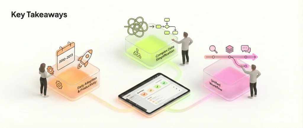
- Early Adoption of Tablet Productivity: OneFLO was ahead of its time in treating the iPad as a serious productivity tool rather than just a consumption device.
- Complex Data Simplification: The project successfully demonstrated that complex, graph-based backend technology could be masked behind a simple, intuitive user interface.
- Unified Workflow: By bringing search, organization, and communication into one view, we significantly reduced the ‘context switching’ tax for power users.
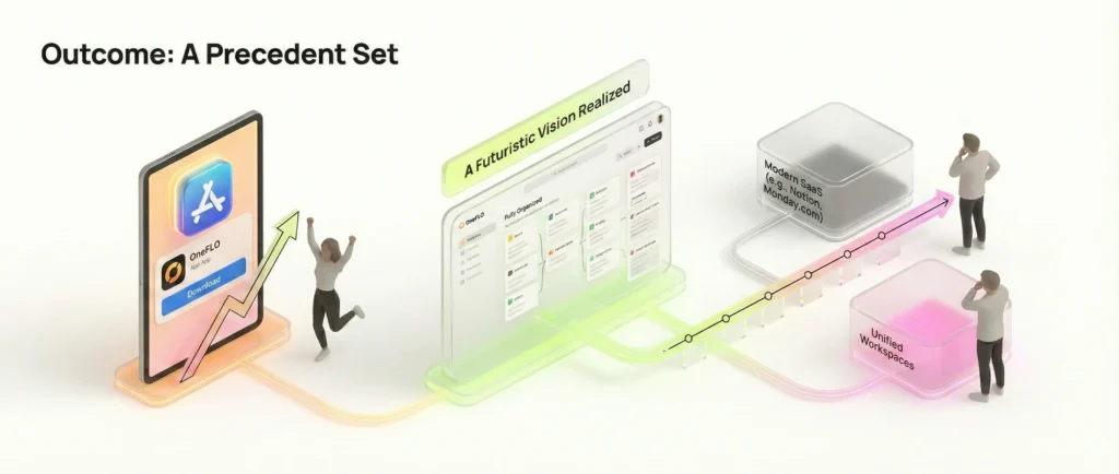
Outcome
OneFLO successfully launched on the Apple App Store, offering a futuristic look at how cloud data could be managed. It set a precedent for the ‘unified workspace’ tools that would become common in the SaaS industry years later (e.g., Notion, Monday.com).
Status: No longer available on App Store.
Promo styleframes
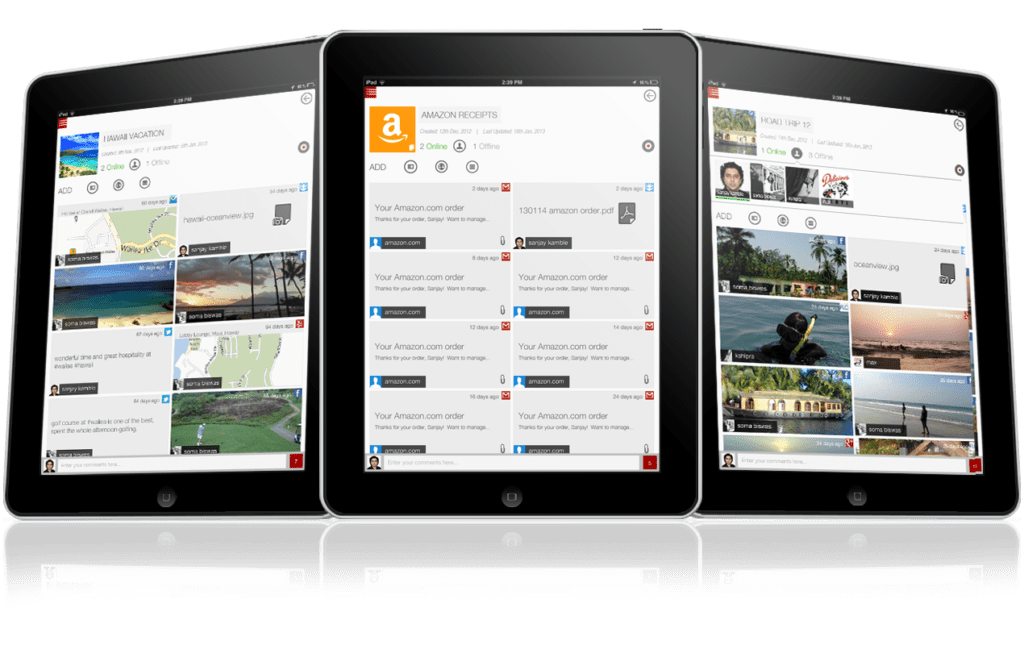
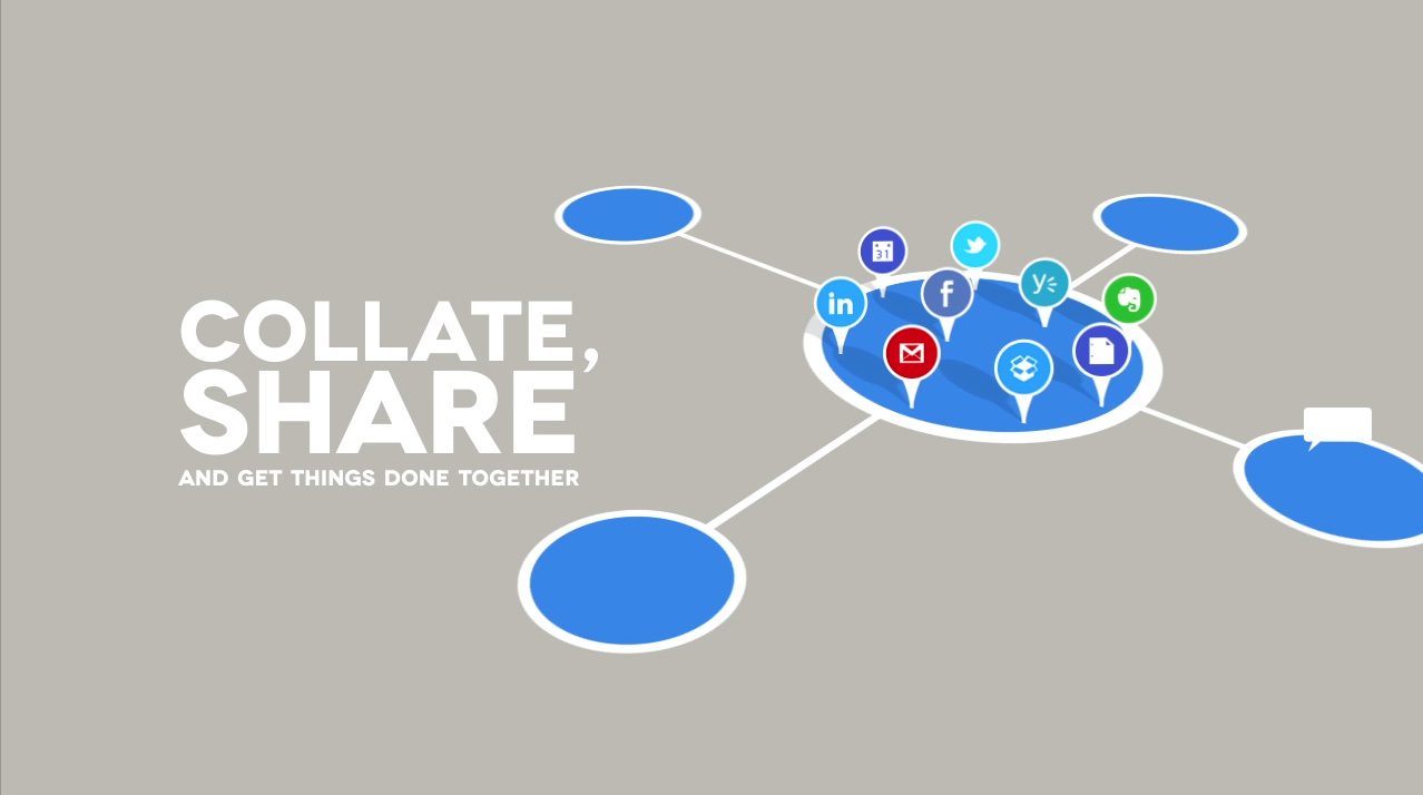
FLO Collaboration BoardThe FLO Collaboration Board™ is designed to make group collaboration using an iPad both simple and enjoyable. With the FLO iPad app, users can interact with a pin-board to collate and privately share data from various sources such as Gmail, Google Drive, Dropbox, Evernote, Facebook, Twitter, LinkedIn, Yammer, Netflix, Amazon, Pinterest, and Desktop. Real-time commenting, location sharing, and group walkthroughs facilitate efficient collaboration and task completion.
The FLO Collaboration Board™ was specifically crafted for the iPad, as it is considered the ‘ultimate’ collaboration tool. It combines visual richness, touch interaction, and instant communication, ensuring that users can share and work on the same page seamlessly.


flo__0000_01
flo__0001_02
flo__0002_03
flo__0003_04
flo__0004_05
flo__0005_06
flo__0006_07
flo__0007_08
flo__0009_10
flo__0011_12
flo__0012_13
flo__0013_14

flo__0014_15
flo__0015_16
flo__0016_17
flo__0019_20
flo__0020_21
flo__0021_22
flo__0022_23
flo__0023_24
flo__0025_26

flo__0026_27
flo__0027_28
flo__0029_30