Bridging the Critical Data Gap in Emergency Response
This MVP project, currently Work in Progress.
Project
SafetyNet
ROLE
Product Design
& UX Strategy
Duration, Stage
8 Weeks
(Discovery to MVP Prototype)
Core Skills: UX Strategy, System Thinking, B2B Product Design, Ethical AI
1. Executive Summary
Emergency Medical Services (EMS) operate in a ‘knowledge vacuum.’ When arriving at a scene, responders often have zero medical history for an unconscious patient. SafetyNet solves this by establishing a secure, immediate bridge between on-scene responders and Electronic Health Records (EHRs).
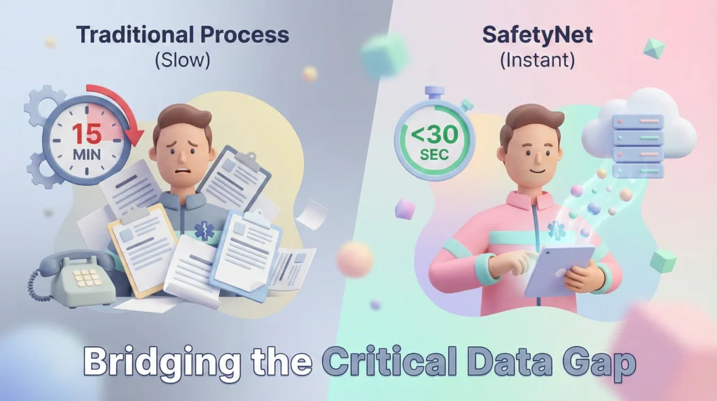
The Outcome: A POC (Proof of Concept) validated by 5 EMS professionals that reduces “Time-to-Information” from ~15 minutes (calling dispatch) to <30 seconds (biometric/OCR scan).
2. The Problem: “The Golden Minute”
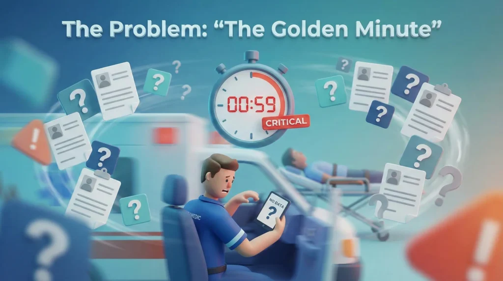
Emergency responders face a ‘Cognitive Tunnel Vision’ phenomenon.
- The Data Gap: Patients cannot speak for themselves (unconscious/shock).
- The Environment: Moving vehicles, sirens, low light, and high stress.
- The Physical Constraint: Paramedics wear thick nitrile gloves, rendering standard mobile gestures (pinch, scroll, small taps) impossible.
Problem Statement: Emergency responders struggle to access timely, accurate medical history (allergies, meds) during high-pressure situations, leading to preventable medication errors.
3. Discovery & Research
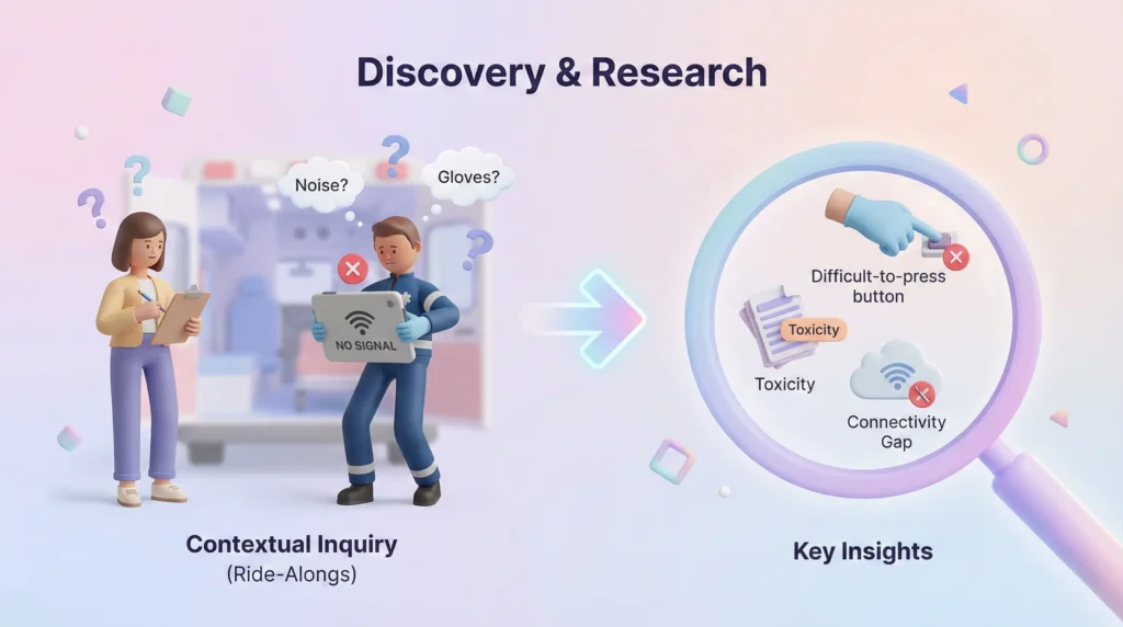
Moving beyond surveys to understand the ‘chaos’ of the field.
Methodology: Contextual Inquiry & Ride-Alongs
I conducted interviews and simulated ride-alongs to observe the physiological constraints of the job, , I uncovered the ‘Cognitive Tunnel Vision‘ phenomenon..
Key Insights:
- The ‘Gloves’ Problem: Standard iOS/Android touch targets are too small. Paramedics often remove gloves to use phones, which is a safety violation.
- Information Toxicity: Responders don’t want all the data (a 50-page PDF). They want actionable data (Allergies, Blood Type, Current Meds).
- The Connectivity Gap: 40% of rural calls happen in low-bandwidth zones. A cloud-only app is a safety risk.
Market Gap Analysis
| Feature | Traditional EHR Mobile Apps | Medical ID Bracelets | SafetyNet Opportunity |
| Data Depth | High (Too detailed) | Low (Static info) | Contextual & Curated |
| Speed | Slow (Login walls) | Instant | Instant (NFC/Biometric) |
| Connectivity | Requires Online | N/A | Offline-First Architecture |
| UX Focus | Admin/Billing | Passive | Clinical Triage |
4. The Strategic Pivot (Leadership Moment)
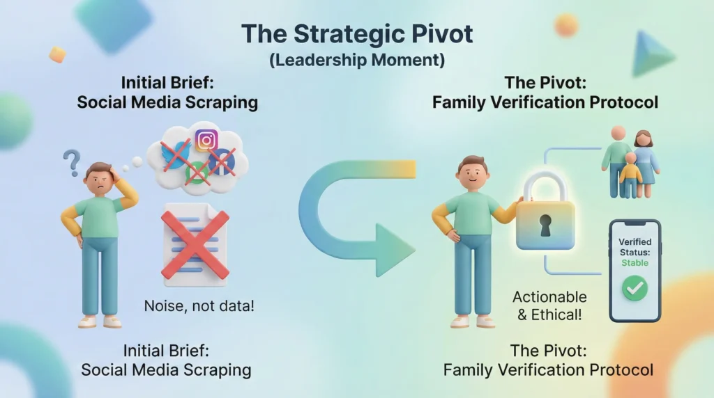
Demonstrating decision-making under ambiguity.
The Initial Brief:
The stakeholders initially requested a feature to scrape the patient’s Social Media profiles to find ‘context’ (e.g., recent posts about feeling sick).
The Pivot:
- Validation: During research, paramedics rejected this immediately. ‘If it’s not clinical, it’s noise. I don’t care about their tweets; I care if they are on blood thinners.’
- Decision: I killed the social media feature to reallocate resources to ‘Family Verification‘, a protocol allowing verified bystanders to input simple ‘last known status’ via a secure link.
- Result: Reduced development risk and aligned the product with clinical ethics.
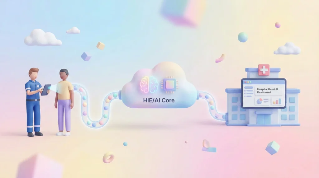
5. System Thinking: The Data Ecosystem
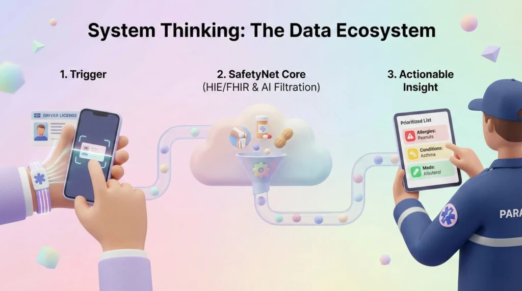
To solve this, I mapped the ecosystem using FHIR (Fast Healthcare Interoperability Resources) standards. The app isn’t just a UI; it’s a filter between the chaos of the scene and the order of the hospital.
- Trigger: Scan Patient DL or Medical ID (OCR/NFC).
- Handshake: SafetyNet pings the HIE (Health Information Exchange).
- Filtration Layer (AI): The system filters out non-acute history (e.g., a knee surgery from 1990) and prioritizes acute risks.
- Display: High-contrast presentation of the ‘Critical 3’: Allergies, Conditions, Meds.
6. The Solution: Key Workflows
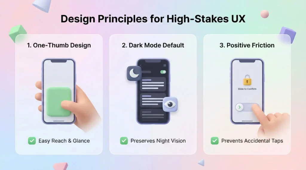
A. Design Principles for High-Stakes UX
- One Thumb, One Glance: All critical actions reachable with one thumb; data readable in 500ms.
- Dark Mode Default: Preserves night vision during night calls.
- Positive Friction: Critical actions (like overriding an allergy warning) require a ‘slide-to-confirm’ to prevent accidental taps.
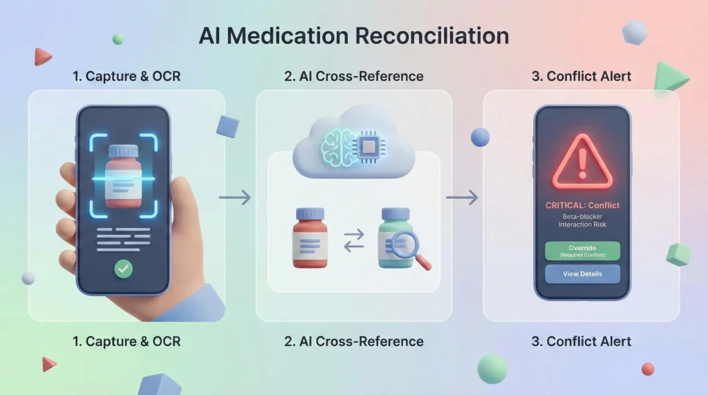
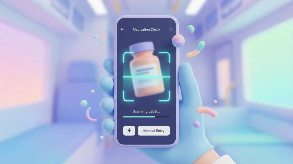
B. Core Feature: AI Medication Reconciliation
The ‘Second Pair of Eyes’ Logic.
The Flow:
- Capture: Paramedic scans a medicine bottle found at the scene using OCR.
- Compare: The AI cross-references the scanned drug against the patient’s downloaded EHR history.
- Conflict Alert:
- Green: Match found.
- Red (Critical): ‘STOP. Patient is on Beta-blockers. Interaction risk.‘
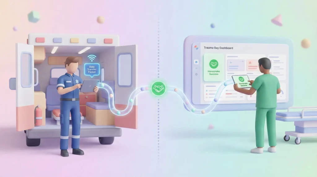
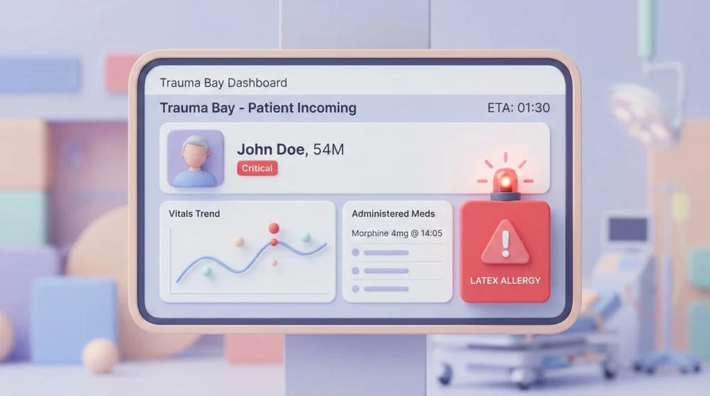
C. Service Design: The Hospital Handoff
Designing the transition from Ambulance to ER.
The “Handoff” is where most medical errors occur due to verbal miscommunication.
- The ‘Transfer Packet’: A digital card summarizing the 20-minute ride into 5 lines of data (Vitals trend + Interventions).
- Geofencing: When the ambulance breaches the hospital radius (500m), the data is ‘Broadcast’ to the ER Wallboard automatically.
- NFC Fallback: If Wi-Fi fails, the paramedic taps their phone to the ER tablet to transfer data instantly.
7. Validation & Iteration
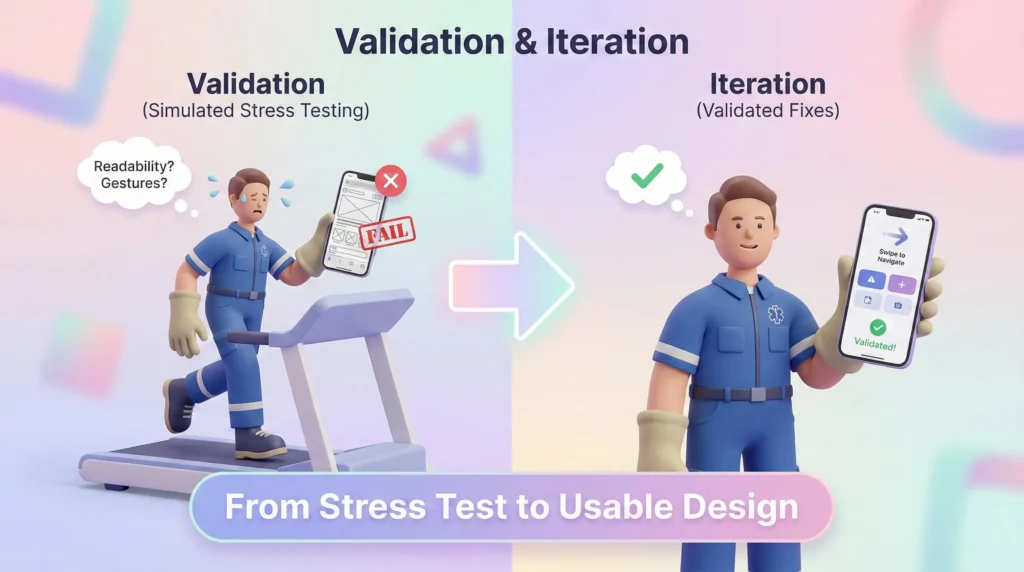
Testing MVP assumptions under stress.
Method: ‘Simulated Stress’ Testing.
We tested low-fidelity prototypes with paramedics while they walked on treadmills to mimic vehicle movement.
Findings & Fixes:
- Fail: Users couldn’t read ‘Grey on Black’ text in simulated sunlight.
- Fix: Introduced a ‘High Contrast Day Mode’ toggle.
- Fail: The ‘Back’ button was too small for gloved fingers.
- Fix: Removed the back button. Introduced ‘Swipe Right’ gestures for navigation.
- Trust Gap: Users didn’t trust the AI alerts blindly.
- Fix: Added a ‘Show Source’ button that expands to show the exact medical record date.
8. Retrospective & Leadership Reflections
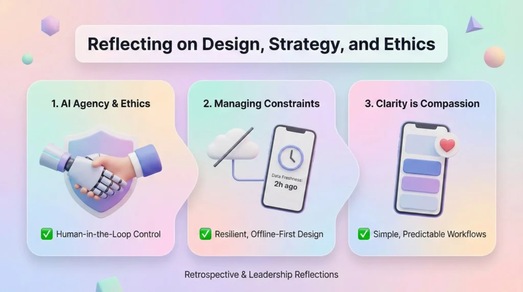
1. The Ethics of ‘AI Agency’
Integrating AI into life-or-death workflows carries the risk of Automation Bias. We deliberately designed the UI to assist, not replace. The AI flags the risk, but the human must make the final call.
2. Managing Constraints
The ‘Offline-First’ architecture was our hardest technical constraint. Designing a UI that looks trustworthy even when showing cached data required a new pattern: ‘Freshness Indicators’ (visual decay of data that is >24 hours old).
3. Final Thought
SafetyNet reinforced that in B2B enterprise domains, clarity is compassion. When a user’s cognitive load is maxed out, a predictable workflow is a safety feature.
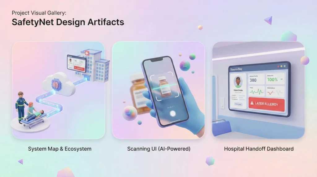
9. Visual Gallery