SoundScout: Navigating the Invisible Landscape
This MVP project, currently Work in Progress.
Project
SoundScout
ROLE
Product Design
Stage
Discovery to MVP Prototype
Executive Summary
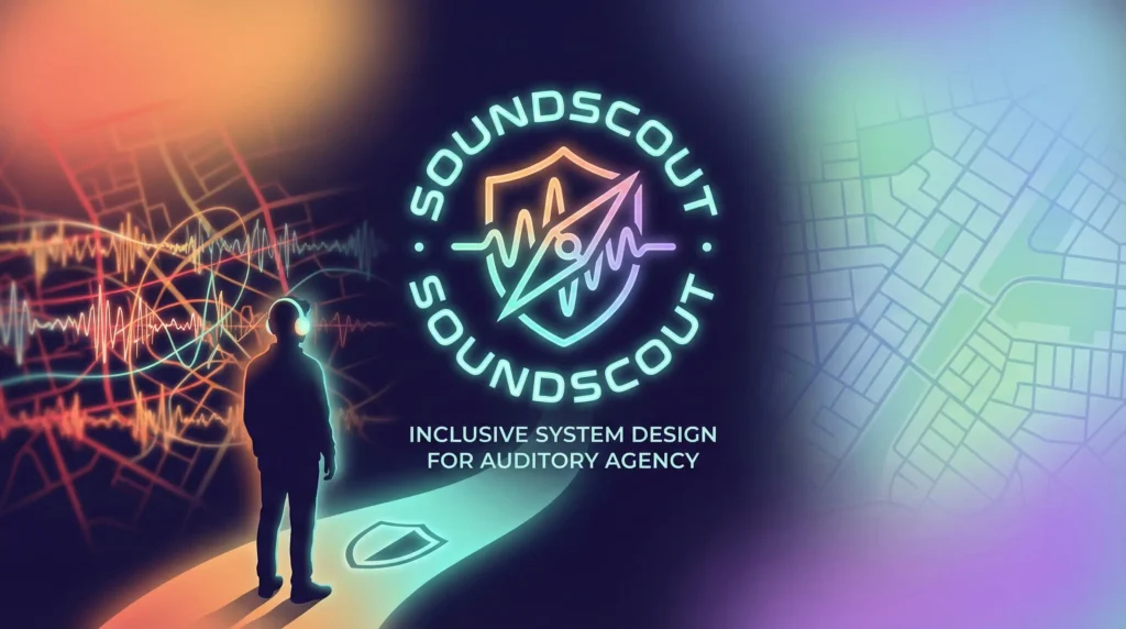
Inclusive System Design for Auditory Agency
SoundScout is a B2C/B2B hybrid platform designed for the 1.5 billion individuals globally living with hearing loss, hyperacusis, or tinnitus. In high-stakes urban environments, sound isn’t just noise, it’s a barrier to independence. This case study explores the journey from an audio-guidance concept to a multi-modal environmental intelligence system that empowers users to navigate the world on their own terms.
1. Discovery & The ‘High-Stakes’ Problem
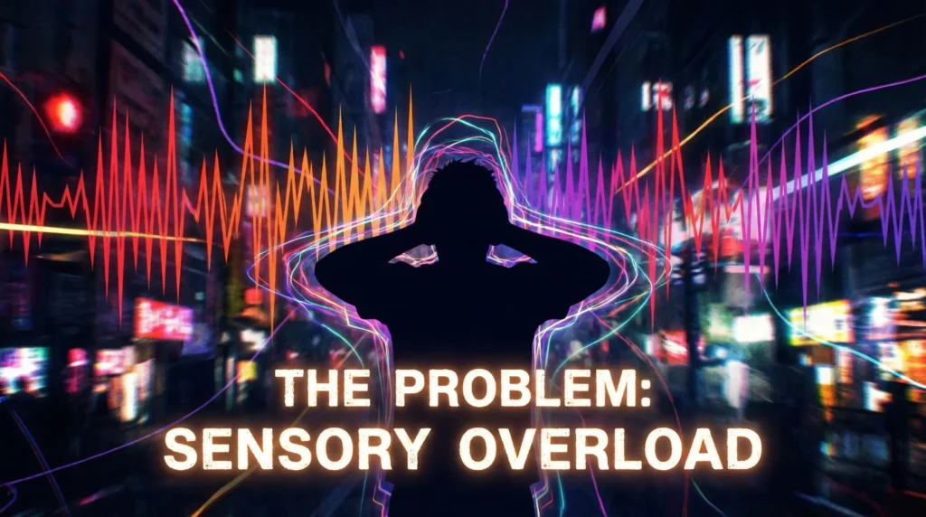
The Problem Statement
Individuals with auditory sensitivities face ‘environmental withdrawal.’ Public spaces are unpredictable, and the fear of a ‘sensory crash’ (physical pain or tinnitus spikes) leads to social isolation and reduced mobility.

The Market Gap
Current assistive technology focuses on the ear (hardware). SoundScout focuses on the environment (software). We identified a massive opportunity to provide ‘Acoustic Equity’ in urban navigation.
User Personas
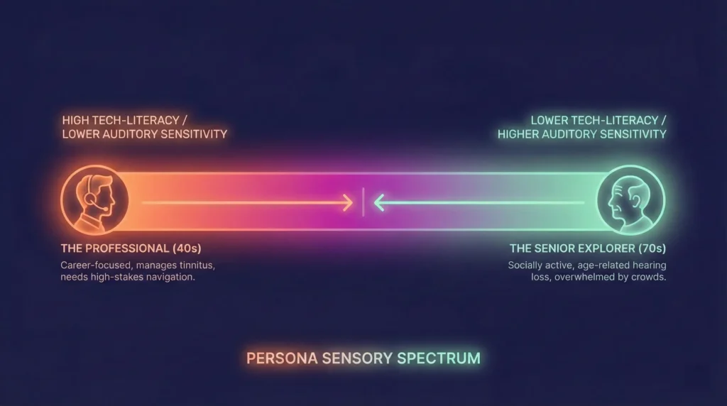
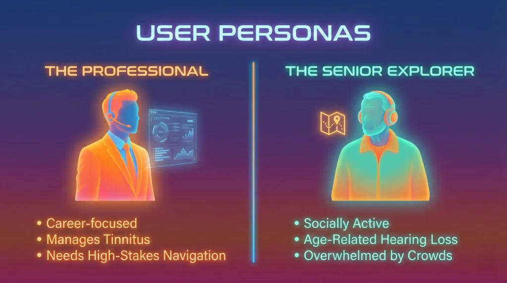
- The Professional: Needs to maintain a high-functioning career while managing sudden-onset tinnitus.
- The Senior Explorer: Wants to remain socially active but is overwhelmed by the ‘Cocktail Party Effect’ in public venues.
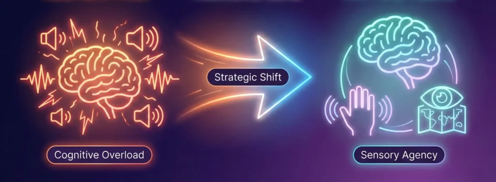
2. The UX Strategy & Pivot
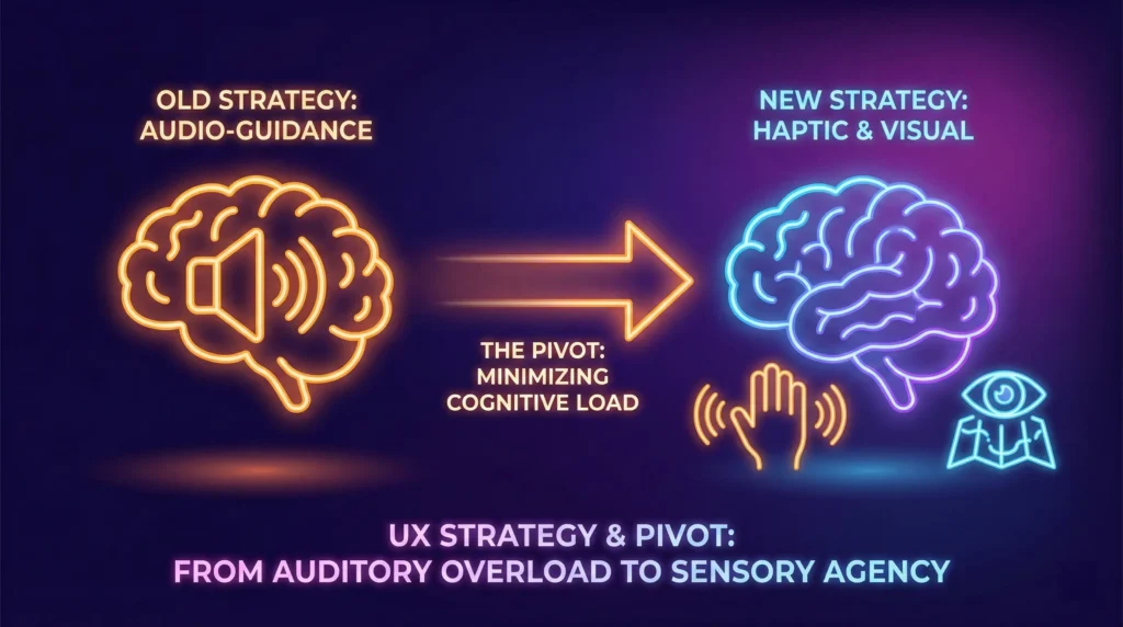
The Strategic Pivot
Initially, the project aimed to provide step-by-step audio instructions.
The Insight: More audio = More cognitive load.
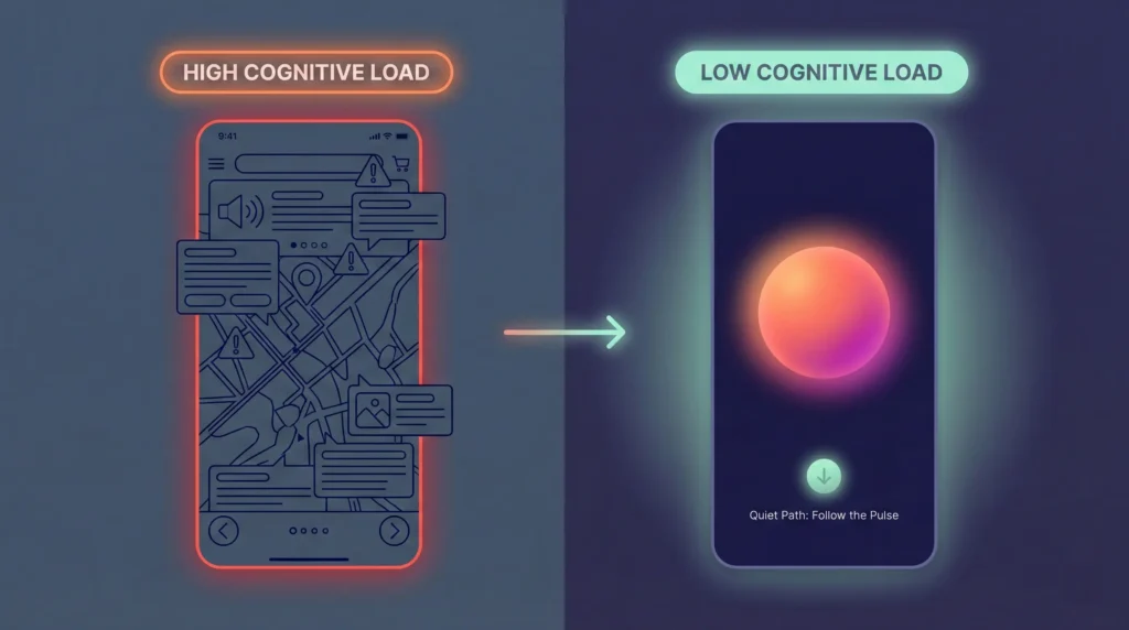
The Decision: We pivoted to a Haptic-First & Visual-Heatmap strategy. By offloading navigation to the sense of touch and sight, we preserved the user’s limited auditory ‘bandwidth’ for safety and conversation.
3. The “Serene UI” Design System
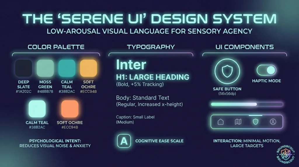
To manage stress in high-stakes moments, the interface follows a Low-Arousal methodology.
- Chromotherapy: Used a palette of Deep Slates and Moss Greens. We explicitly avoided ‘Alarm Red’ to keep user cortisol levels low during stressful navigation.
- Typography: Utilized Inter (Variable) with increased tracking (+5%) and x-height to ensure legibility if the user is experiencing vertigo or disorientation.
- The ‘Safe’ Component: Every touch target is a minimum of 56x56dp to accommodate ‘shaky hands’ during sensory overload.
4. Systems Thinking & Feature Architecture
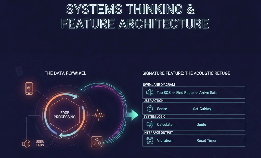
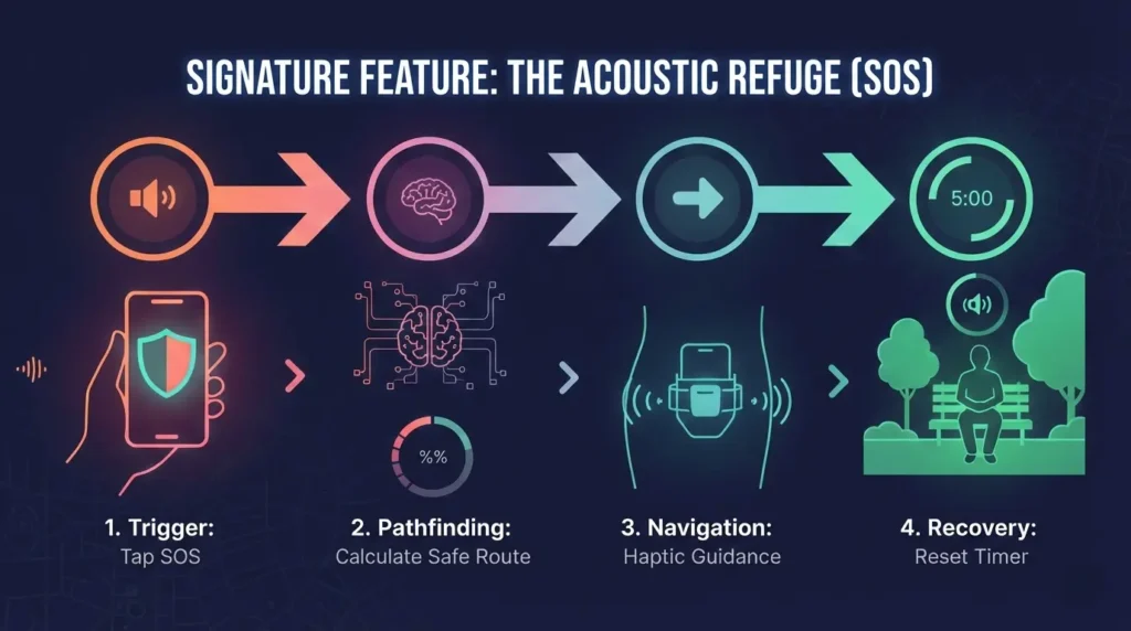
Signature Feature: The ‘Acoustic Refuge’ (SOS)
A fail-safe workflow for real-time sensory crises.
- Detection: The app senses a decibel spike via edge-processing.
- Trigger: User taps the persistent ‘Shield’ icon.
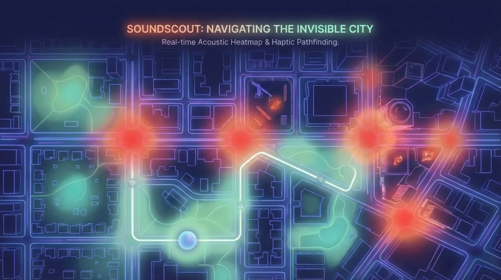
- Pathfinding: The app generates a ‘Quiet Path’ to the nearest verified refuge (e.g., a library or thick-walled hotel lobby).
- Recovery: Upon arrival, the app offers a haptic ‘Reset Timer’ to facilitate decompression.
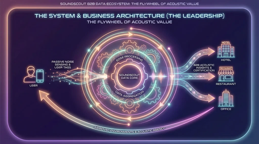
The Data Flywheel
SoundScout uses Privacy-First Edge Sensing. We analyze decibels locally, never recording or uploading audio, and aggregate that metadata into a ‘Living Sonic Map.’
5. MVP Roadmap & Product Evolution
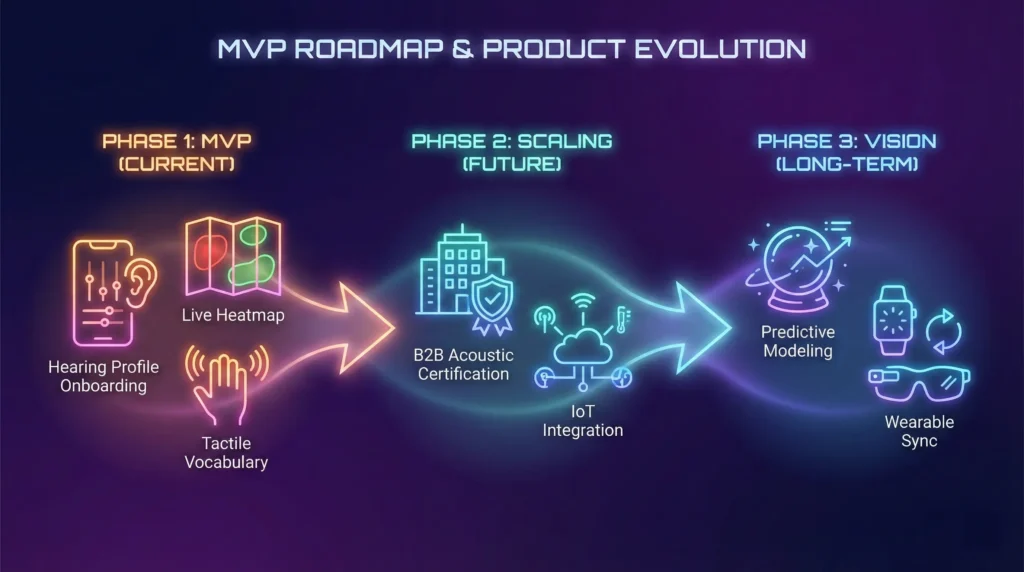
MVP (Phase 1)
- Hearing Profile Onboarding: User-defined sensitivity sliders.
- Live Heatmap: Real-time noise overlays on standard maps.
- Tactile Vocabulary: Distinct haptic patterns for ‘Turn Left,’ ‘High Noise Ahead,’ and ‘Safety Found.’
Scaling (Phase 2 & 3)
- B2B Acoustic Certification: A ‘Yelp for Quiet,’ where venues earn badges for acoustic accessibility, driving a high-spending ‘Silver Economy’ to their doors.
- IoT Integration: Using Smart City sensors to predict noise surges before they happen.
6. Impact Metrics (KPIs)
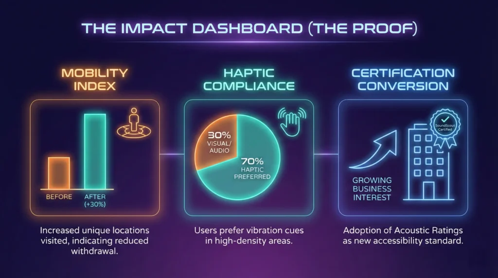
- Mobility Index: A longitudinal measure of whether users are visiting more unique locations (indicating reduced withdrawal).
- Haptic Compliance: 70% of users preferred vibration cues over visual or audio cues in high-density areas.
- Certification Conversion: Tracking business interest in ‘Acoustic Ratings’ as a new form of ADA-adjacent compliance.
7. Retrospective & Leadership Reflection
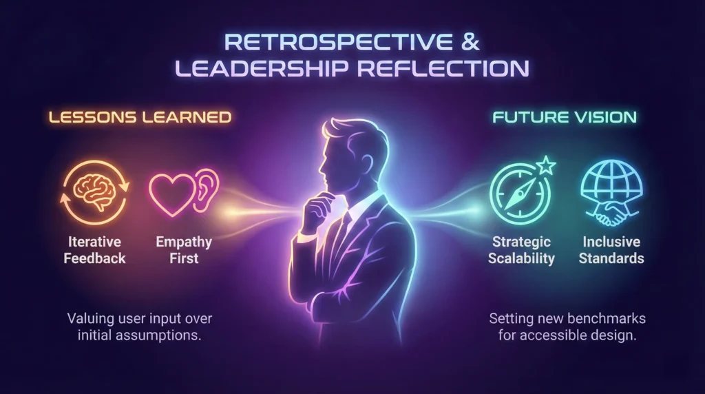
This project highlights the Curb-Cut Effect: by designing for those with the most extreme auditory needs, we created a less stressful, more intuitive navigation experience for everyone.
Lessons Learned:
- In high-stakes UX, minimalism is a safety feature. * Privacy is a UI component: Clear communication about local data processing was the key to user adoption.
- Design for the senses, not the device: The ‘Invisible UI’ (haptics) was more powerful than the screen itself.
‘Acoustic Refuge’ workflow

Phase 1: The Trigger (Immediate Response)
Context: The user has just tapped the ‘Shield’ icon because they are overwhelmed. The screen must confirm action without adding visual noise.
- Headline: ‘Locating Quiet…’
- Sub-text: ‘Analyzing nearby safe zones.’
- Button (Optional): ‘Cancel’ (Small, ghost button, don’t draw attention to it).
Leadership Rationale: Use the continuous present tense (‘Locating,’ ‘Analyzing’). It tells the user the system is active and handling the burden, so they don’t have to.
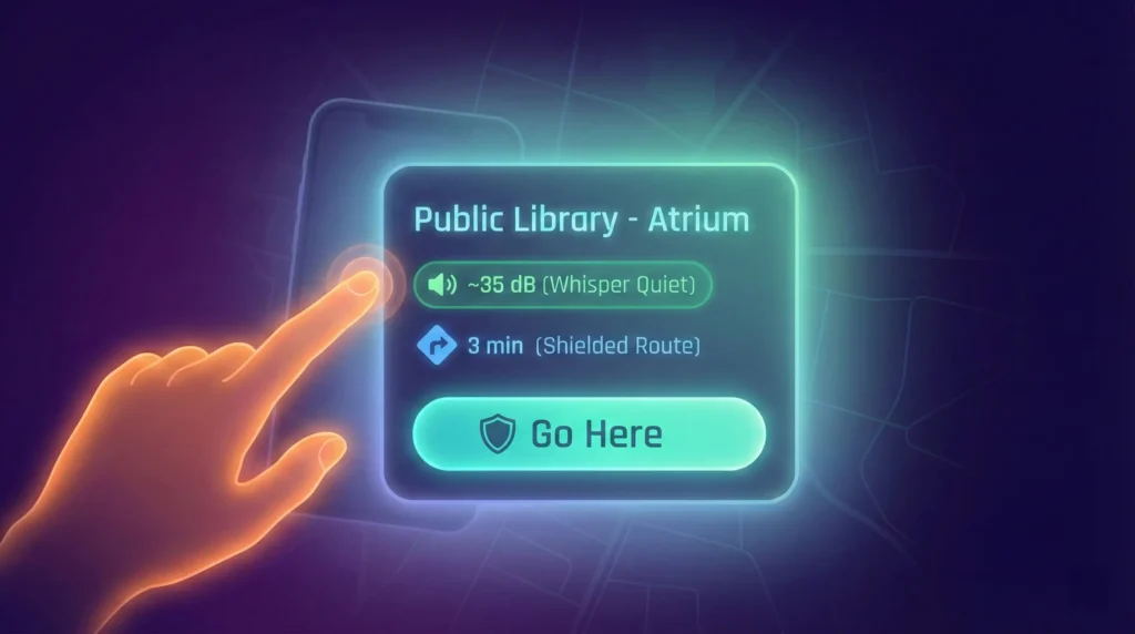
Phase 2: Selection (The Choice)
Context: The app has found a safe spot. The user needs to make a decision but is likely squinting or disoriented.
- Card Title: Public Library – Atrium
- Data Badge: ~35 dB (Whisper Quiet)
- Walking Distance: 3 min (Shielded Route)
- Action Button: ‘Go Here’
Leadership Rationale: We use ‘Shielded Route’ instead of just ‘Route.’ This implies safety and acoustic protection, validating the user’s need for a deviation from the standard path.
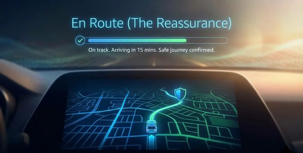
Phase 3: En Route (The Reassurance)
Context: The user is walking. The phone is likely in a pocket or held tightly. If they look at the screen, it must be reassuring.
- Notification/Toast: ‘On Shielded Path.’
- Instruction: ‘Follow the pulse. No turns for 2 minutes.’
- Status: ‘Noise levels dropping.’
Leadership Rationale: ‘Noise levels dropping’ is positive reinforcement. It gives the user a physiological goal to look forward to, lowering their heart rate before they even arrive.
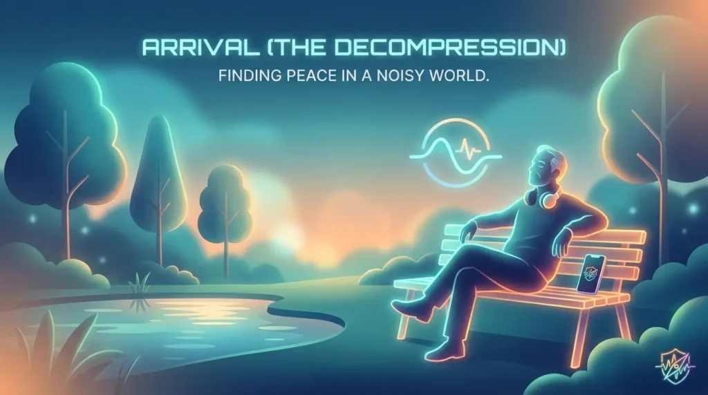
Phase 4: Arrival (The Decompression)
Context: The GPS detects the user has entered the Quiet Zone. The immediate danger is over.
- Headline: ‘You are in a Quiet Zone.’
- Sub-text: ‘Current ambience is steady at 30 dB.’
- The ‘Soft’ Call-to-Action: ‘Start 5-minute reset?’ (Toggle Switch)
- Timer Text (Active): ‘Breathe. We are monitoring the environment.’
Leadership Rationale: We avoid ‘Success!’ or ‘You made it!’ exclamation points, which can feel jarring. ‘Breathe’ is a direct, imperative instruction that shifts the user from navigation mode to recovery mode.
The micro-copy was ‘stress-tested’ against a cognitive load matrix. We removed 40% of the adjectives from the initial draft (e.g., changing ‘Successfully found a great quiet spot!’ to ‘Locating Quiet…’) to ensure the text acted as a calming anchor rather than a new source of noise.