Reclaiming Cognitive Continuity for Deep Work Teams
Project
StateTracer
Duration, Year
4 Weeks, 2025
(Discovery to MVP Concept)
ROLE
Product Design & Strategy
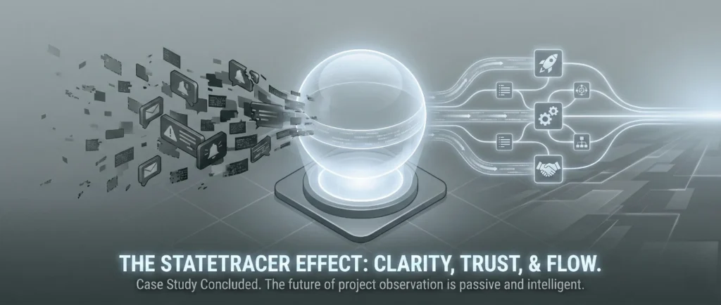
Executive Summary

Modern knowledge workers lose approximately two hours daily to ‘project-state sync’, the effort required to re-establish context after interruptions or between tasks.
‘StateTracer’ is a B2B SaaS designed to eliminate this cognitive tax. Unlike task managers that track what needs to be done, StateTracer tracks what is true right now.
By utilizing AI to passively synthesize data from disparate tools (GitHub, Figma, Docs), we created a ‘Project Globe’ that serves as a self-updating source of truth, replacing chaotic sync meetings with calm, asynchronous clarity.
1. Discovery & The Problem Space
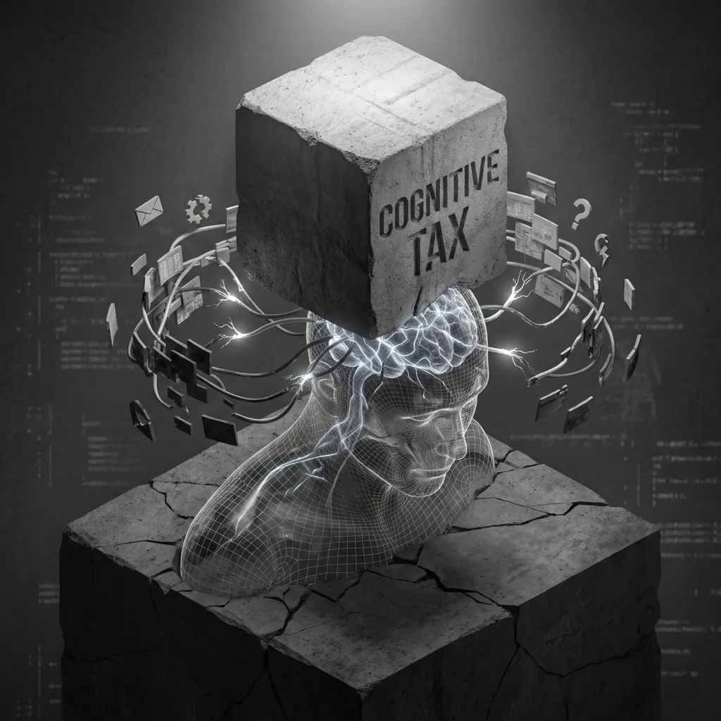
The Challenge: The Hidden Cognitive Tax
In high-stakes environments (software architecture, research, complex system design), the primary workflow bottleneck is not the difficulty of the work, but the cost of context switching.
Our initial hypothesis identified two distinct friction points:
- The Maker’s Friction: Re-acquiring ‘flow state’ after an interruption.
- The Manager’s Friction: The manual labor of triangulating status across fragmented tools (e.g., checking Jira for tickets, Slack for sentiment, and GitHub for reality).

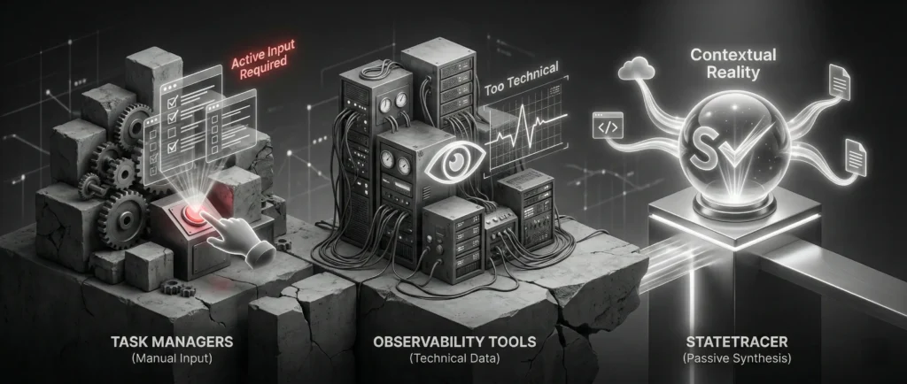
Market Analysis & Differentiation
Existing tools (Asana, Monday, Jira) focus on ‘Task Management’, future planning and ticket movement. They rely on human input, which is often delayed or biased.
- Task Managers: “Here is what you need to do.” (Active input required).
- Observability Tools: “Here is the server uptime.” (Too technical).
- StateTracer (Our Niche): “Here is the contextual reality of the project.” (Passive synthesis).
2. User Research & Personas
We conducted deep-dive interviews with 12 participants (4 Engineering Leads, 4 Product Managers, 4 Senior Designers).

Persona A: The Architect (Deep Worker)
- Goal: Maintain high-velocity output on complex code/design structures.
- Pain Point: “I dread the ‘got a minute?’ DM. It takes me 20 minutes to answer a 30-second question because I have to look up the answer, and then another 45 minutes to get my brain back into the code.”
- Motivation: Protecting focus time.
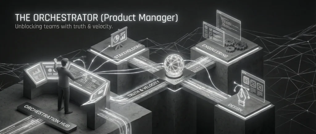
Persona B: The Orchestrator (Product Manager)
- Goal: Unblock the team and report accurate progress to stakeholders.
- Pain Point: “I feel like a nagging parent. I have to ping three different people to understand if the ‘Login Feature’ is actually blocked by Legal or if the ticket just wasn’t updated.”
- Motivation: Truth and velocity.
The ‘Aha!’ Insight
We discovered that users did not want another dashboard of notifications. They wanted a synthesis. They did not want to see “15 new commits”; they wanted to know “The backend is stable, but the frontend is blocked by a design asset.”
3. UX Strategy & The Pivot
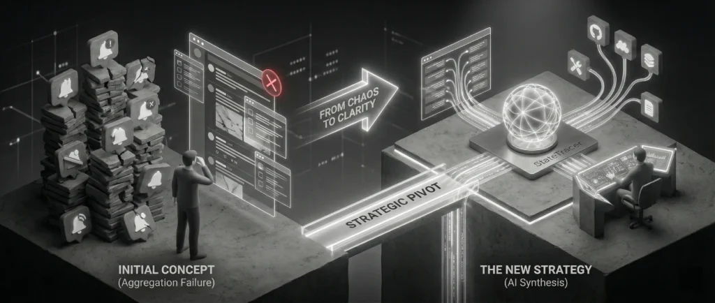
Initial Concept
A unified notification feed aggregating alerts from all tools.
The Failure
User testing revealed this increased anxiety. It was just a ‘meta-notification’ center that added noise.

The Strategic Pivot:
We shifted from ‘Aggregation’ to ‘Interpretation’.
We moved the AI from being a ‘collector’ to an ‘analyst’. The system needed to ingest raw data (commits, comments, edits) and output a semantic summary of the state.
System Thinking: The Data Model
To design the interface, we first had to design the invisible logic. I mapped the ‘State Object’ relationships:
- GitHub PR (merged) + Jira Ticket (In Progress) = ‘Discrepancy Detected’.
- Figma Comment (Client) + No Reply (2 days) = ‘Risk Factor High’.
4. The Solution: Workflows & Architecture
The core experience revolves around the ‘Project Globe’, a visualization of the project’s health and state.
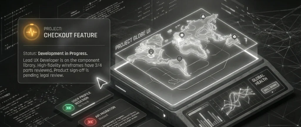
The ‘Project Globe’ UI
Instead of a list of tasks, the user lands on a topographic summary of the project.
- The Summary Layer (The ‘What’): A Natural Language Processing (NLP) generated statement.
- Example: “Status: Development in Progress. Lead UX Developer is on the component library. High-fidelity wireframes have 3/4 parts reviewed. Product sign-off is pending legal review.”
- Example: “Status: Development in Progress. Lead UX Developer is on the component library. High-fidelity wireframes have 3/4 parts reviewed. Product sign-off is pending legal review.”
- The Semantic Color System:
- Green: Coherent State (Tools match).
- Amber: Context Drift (Docs say one thing, Code says another).
- Red: Blocker (External dependency failure).
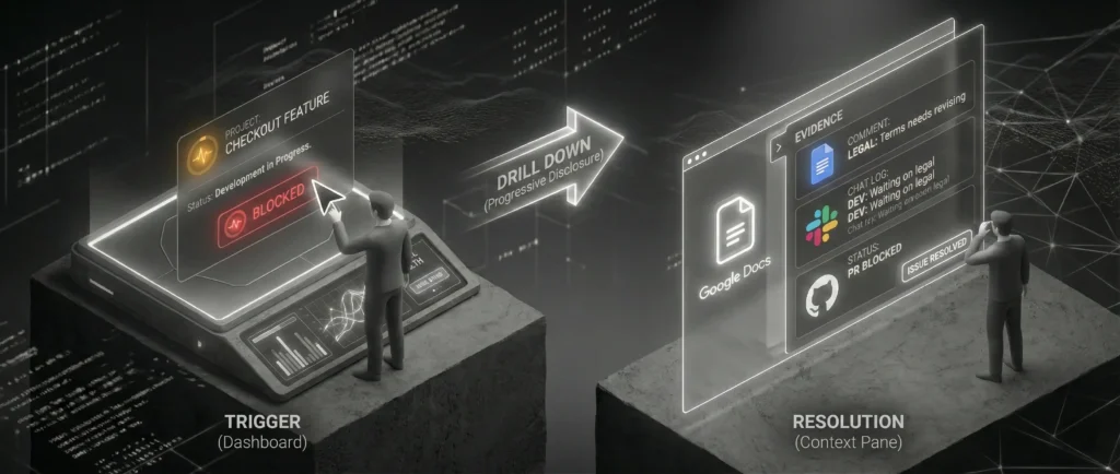
User Journey: The ‘Drill Down’
Scenario: A PM needs to verify if the new feature is ready for a demo.
- Trigger: PM opens StateTracer.
- Top-Level View: Sees the AI Summary: “Feature A is code-complete but blocked by pending copy edits in Google Docs.”
- Action: PM clicks the ‘Blocked’ indicator (Drill Down).
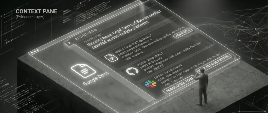
- Context Pane: The side panel slides out revealing the raw evidence:
- Source: Google Doc ‘Copy Deck v3’.
- Event: Comment by Legal Team (“Please revise terms”).
- Time: 4 hours ago.
- Resolution: PM handles the legal issue directly.
- Value: The developer was never interrupted. The status was obtained passively.


5. Detailed Design Features
Feature 1: The Context Pane (Evidence Layer)
Trust was a major barrier in user testing. Users asked, “How does the AI know this?”
- UX Solution: Every AI claim is hyperlinked to the ‘Evidence Layer’. If the AI says “Design is delayed,” the user can hover to see “Last Figma edit: 4 days ago by Alice.” This builds trust through transparency (Explainable AI).

Feature 2: Time-Travel State
Project states are ephemeral. We introduced a slider to view the state as it existed in the past.
- Use Case: “Where were we last Friday before the crash?”
- Interaction: Dragging the timeline updates the summary and metrics instantly, allowing for rapid retrospectives.
6. Wireframe Specifications
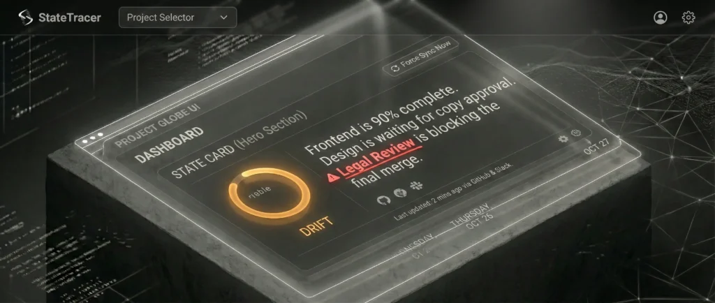
Wireframe 1: The Entry Point (Project Globe Dashboard)
Purpose: To present the high-level synthesized state and act as the trigger for the Drill Down.
- Global Header:
- Left: Branding (‘StateTracer’) and Project Selector Dropdown.
- Right: User Profile, Settings, and ‘Force Sync Now’ button.
- Central Component: The ‘State Card’ (Hero Section)
- Visual Status Indicator: A large, color-coded pulse ring on the left.
- Green: Harmonious.
- Amber: Drift.
- AI Summary Block: Large typography text block occupying the center.
- Content: “Frontend is 90% complete. Design is waiting for copy approval. Legal Review is blocking the final merge.”
- Interaction: The phrase “Legal Review” is highlighted with a red underline and a ‘warning’ icon. This is the Active Trigger.
- Meta-Data Footer: Small text indicating “Last updated: 2 mins ago via GitHub & Slack.”
- Visual Status Indicator: A large, color-coded pulse ring on the left.
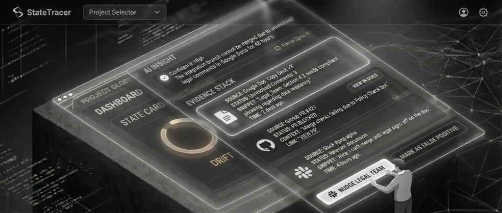
Wireframe 2: The Context Pane (The Drill Down)
Purpose: To provide the ‘Evidence Layer’, showing the raw data that supports the AI’s assertion.
- Layout: Right-Side Slide-Out Drawer.
- Section A: Header:
- Title: “Drill Down: Legal Review Blocker”
- Title: “Drill Down: Legal Review Blocker”
- Section B: The Synthesis (The ‘Why’):
- AI Insight Box: “The integration branch cannot be merged because the Terms of Service file has flagged comments in Google Docs that have not been resolved for 48 hours.”
- Confidence Score: “High (verified by 3 sources).”
- Section C: The Evidence Stack (The ‘Proof’):
- Group 1 (Google Docs): Displays raw comment: “Legal_Team: Section 4.2 needs compliant phrasing.”
- Group 2 (GitHub): Displays “Pull Request #421 (Blocked).”
- Group 3 (Slack): Displays discussion snippet “I can’t merge until legal signs off.”
- Section D: Recommended Actions:
- Buttons: “Nudge Legal Team” (Slack Integration) or “Mark as False Positive”.
7. User Journey Map
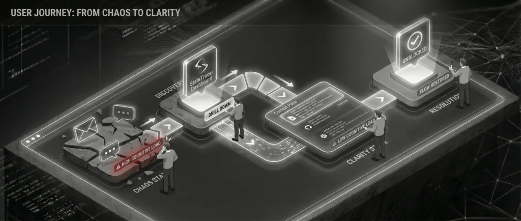
Title: From Chaos to Clarity: The ‘Truth-Seeking’ Journey
Scenario: A stakeholder meeting is in 1 hour. The PM needs to confirm if the ‘Checkout Feature’ is broken.
- Phase 1: The Trigger (High Anxiety)
- Context: PM gets a vague message: “Is Checkout broken?”
- Emotional State: Low (-2). Stress and hesitation to interrupt the dev team.
- Phase 2: First Contact (Immediate Relief)
- Action: PM loads StateTracer dashboard.
- System Response: AI Summary says: “Checkout flows are functional but running on a backup API due to maintenance.”
- Emotional State: Neutral/Positive (+1). The ‘Unknown’ becomes ‘Known’.
- Phase 3: Verification (Building Trust)
- Action: Click ‘Drill Down’.
- System Response: Shows a Slack message from the Backend Lead timestamped 4 AM confirming the maintenance.
- Emotional State: High (+3). Feeling empowered.
- Phase 4: Resolution (Actionable Confidence)
- Action: PM replies to stakeholder with the confirmed status.
- Emotional State: Peak (+4). Professional safety achieved without team interruption.
8. Validation & Impact
We validated the MVP high-fidelity prototype with the original stakeholder group.
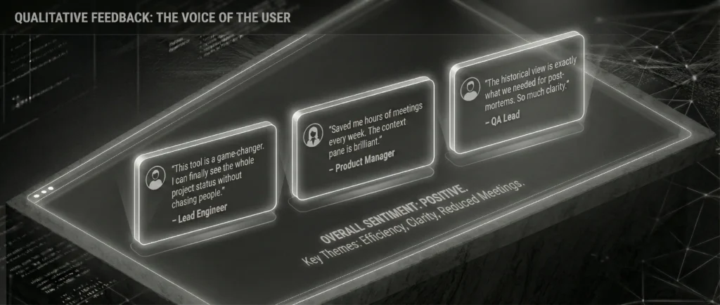
Qualitative Feedback:
- “This feels like having a project manager who never sleeps and never asks questions.” – Senior Architect
- “I can finally stop messaging people ‘what’s the status’ and just look here. It feels like a HUD for the project.” – Product Lead
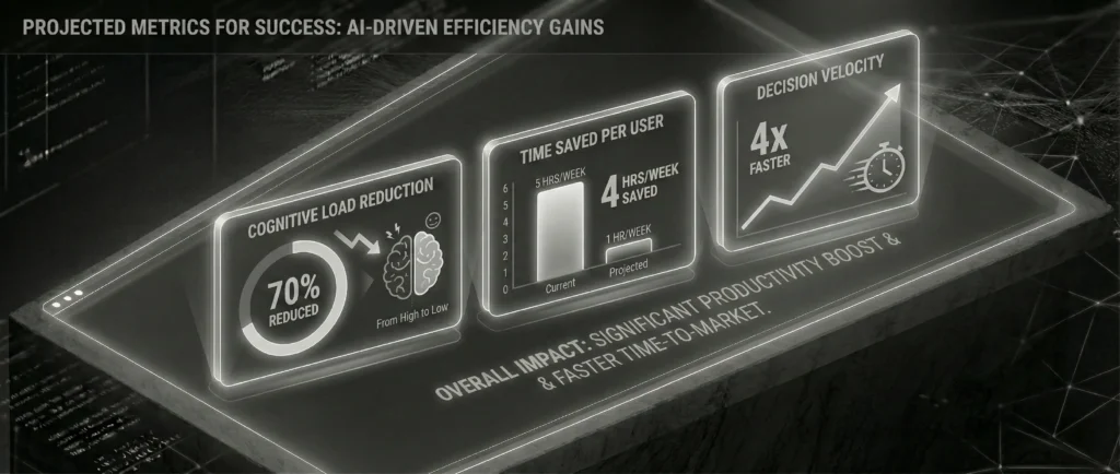
Projected Metrics for Success:
- Reduction in Slack DM volume: Target 30% decrease in ‘status check’ messages.
- Context Recovery Time: Decrease the time to start work (Time-to-First-Commit) by 15%.
- System Trust Score: User verification rate (how often they click ‘Source’ to double-check the AI). Lower is better over time.
9. Key Learnings & Retrospective: The Road to V2.0
Completing the MVP for StateTracer validated our core hypothesis: teams are drowning in data and starving for context. However, the move from a controlled POC to a scalable V2.0 revealed critical challenges.
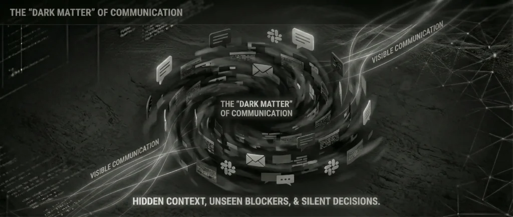
Learning 1: The ‘Dark Matter’ of Communication
Our biggest blind spot was Offline Context. Critical decisions often happened in Zoom calls, leaving no API trace.
- The V2 Strategy: Introduce a ‘lightweight input’ mechanism. If the system detects a calendar event like “Architecture Review,” it prompts a single Slack message to the lead: “Did the architecture get approved?” This hybridizes passive tracking with active verification.
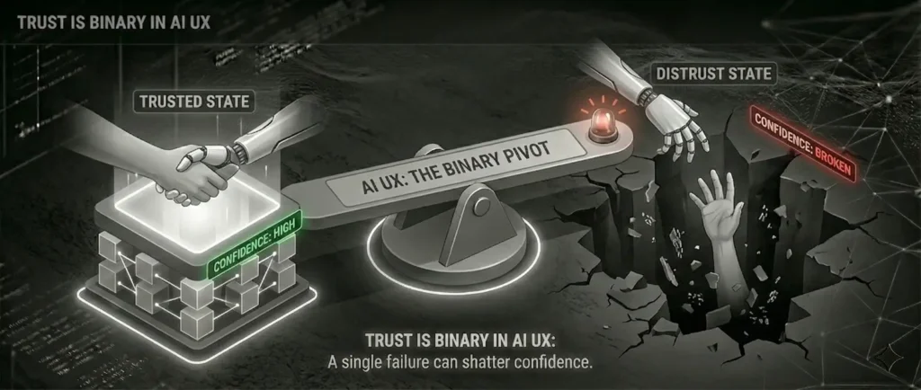
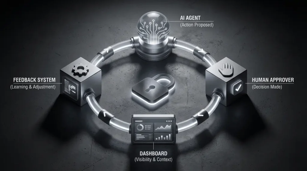
Learning 2: Trust is Binary in AI UX
We observed that if the AI summarized a status incorrectly once, users hesitated to trust it for the rest of the week.
- The Fix: We are implementing ‘Human-in-the-Loop’ (HITL) Validation. Instead of auto-publishing the state, the V2 workflow will draft the summary and ping the internal Lead for a “Thumbs Up” before it goes live. This shifts the AI from ‘Author’ to ‘Drafter’.
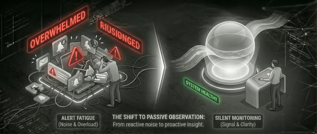
Learning 3: Alert Fatigue vs. Silent Monitoring
- Observation: Users loved the Pull mechanic (checking the dashboard) but hated the Push mechanic (notifications for state changes).
- Strategic Adjustment: We stripped all push notifications. StateTracer became a strictly ‘Pull-based’ tool. The philosophy shifted to: “The system monitors quietly so you can work loudly.”
Final Thought
StateTracer proved that in the age of AI, the role of the UX designer is evolving. We are no longer just designing interfaces for human input; we are designing the governance layer for machine interpretation.